In a taught course, this session fits one teaching block. For self-paced study, it splits naturally into two sittings, e.g. Background and Example 1 first, the rest later. Exercise 3 is open-ended and works best as a follow-up using your own data.
TipHow to Use the Code in This Session
Every code chunk below is written so you can copy it into your R console (or an R script) and run it yourself, in the order shown. Where you see a “Run It Yourself” box, stop and run the code above it before reading the explanation that follows.
5.1 When Do You Use This?
Tip
You measured haemoglobin before and after treatment in 30 patients. Or you measured body weight in 20 control mice and 20 treated mice. Or you want to know whether the mean platelet count in your patient group is below the clinical reference value. In each case, a t-test answers the same question: is this difference bigger than what I would expect from sampling variation alone?
This session is the first place you will apply the framework from Hypothesis Testing. If hypothesis testing is the logic, t-tests are one of its most common tools.
NoteTeacher Note
Open by asking the room for a “before vs after” or “treated vs control” comparison from their own work. Use one of those examples, rather than the textbook ones, to motivate the one-sample / two-sample / paired distinction in the Background section before any formula appears.
5.2 Learning Objectives
After completing this session you will be able to:
Choose the correct t-test variant for your study design (one-sample, two-sample, paired)
Understand why Welch’s t-test should be your default
Check the normality assumption and know when it matters
Run all three variants in R and read the output line by line
Report t-test results correctly in a manuscript
5.3 Background: The One Idea Behind All Three Tests
Estimated time: ~15 minutes (reading)
NoteTeacher Note
The signal-to-noise framing below is the single most important idea in this session, arguably in the whole course. A useful board exercise: write \(t = \text{signal} / \text{noise}\) and ask what happens to \(t\) if (a) the sample size doubles, (b) the measurement becomes noisier, (c) the true effect gets bigger. Work through all three before moving on to which test variant to use; the variant choice is comparatively mechanical once this idea is solid.
Before the three variants, here is the single idea that ties them all together. A t-test answers one question: is the difference I measured bigger than the noise? It takes the difference between means (the signal) and divides by the standard error (the noise: how much that difference would vary if you ran the study again on a new sample). That ratio is the t-statistic:
\[t = \frac{\text{difference between means}}{\text{standard error of that difference}} = \frac{\text{signal}}{\text{noise}}\]
A large \(|t|\) means the difference stands out against background variability: chance is an unlikely explanation. A small \(|t|\) means the difference could easily be noise. Everything below (which variant to pick, Welch versus Student, checking normality) is just this one idea adapted to your specific study design.
5.3.1 Choosing the right variant
Ask yourself two questions before running anything:
Am I comparing to a fixed value, or to another group? If comparing to a fixed value (a clinical threshold, a known reference), use a one-sample t-test. If comparing two groups, continue to question 2.
Are the two measurements on the same subjects, or on different subjects? If the same subjects appear in both groups (before/after, matched pairs, crossover trial), use a paired t-test. If different subjects are in each group, use a two-sample t-test.
Situation
Test
R syntax
Compare sample mean to a known value
One-sample
t.test(x, mu = value)
Compare means of two independent groups
Two-sample (Welch’s)
t.test(y ~ group, data = df)
Compare two measurements on the same subjects
Paired
t.test(x, y, paired = TRUE)
5.3.2 Welch’s vs Student’s: always use Welch’s
NoteTeacher Note
A common question here is “then why does Student’s t-test still get taught at all?” The short, honest answer is history, plus a handful of specialised designs that assume equal variances by construction. For everything in this course, Welch’s is the right default; treat this as a one-minute aside, not a detour.
Welch’s t-test (R default: var.equal = FALSE) does not assume the two groups have equal variances. Student’s t-test does. Since you usually cannot know in advance whether variances are equal, Welch’s is safer. The cost in power is negligible when variances are equal, but the cost of using Student’s when they are not is inflated Type I error. There is no good reason to use var.equal = TRUE.
5.3.3 Normality: what the assumption actually means
The t-test does not require your raw data to be normally distributed. It requires the sampling distribution of the mean to be normal. By the Central Limit Theorem, this holds automatically for \(n \geq 30\) even with moderately skewed data. For small samples (\(n < 30\)) with obviously non-normal distributions, check a QQ-plot. If the data are heavily skewed or have extreme outliers, use a nonparametric test (see Nonparametric Tests). For how to assess normality with Q-Q plots and the Shapiro–Wilk test – and why the test alone can mislead you at large sample sizes – see Section 2.1.
ImportantThe one thing to remember
A t-test is signal ÷ noise. A small p-value means your signal is loud relative to the noise: it does not tell you the difference is large or clinically important. Always read the p-value alongside the effect size (the mean difference) and its 95% CI.
5.4 Example 1: Animal and Lab Data
Estimated time: ~20 minutes (worked example)
NoteTeacher Note
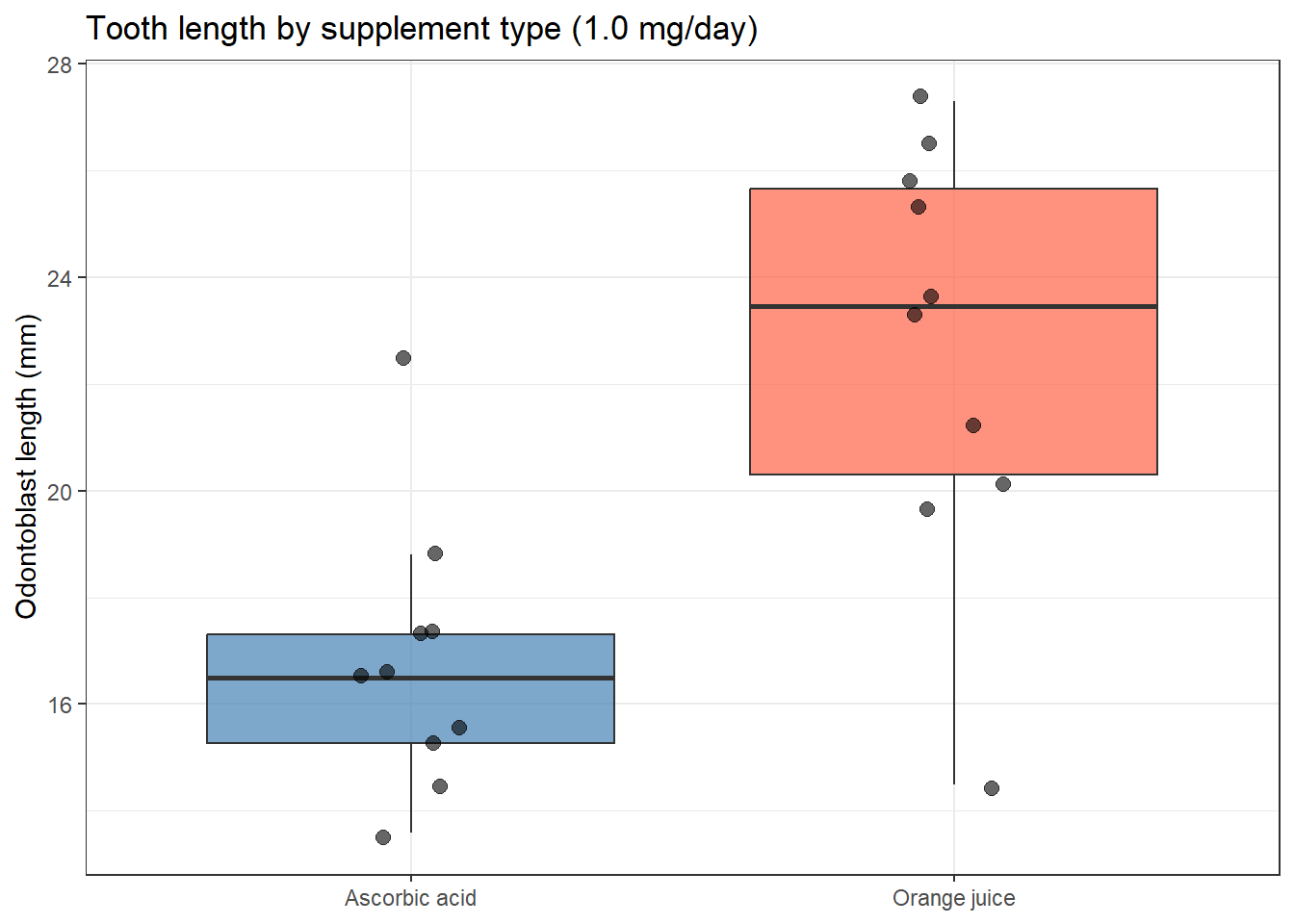
Live-session idea: before showing the boxplot below, ask students to predict which delivery method will show higher tooth growth, and by roughly how much. Reveal the plot, then run the test. The plot makes a difference look obvious; the test result (p = 0.18) tells a more cautious story. That tension, a visually convincing plot paired with an inconclusive test, is the core lesson of this example and is worth dwelling on rather than rushing past.
5.4.1 Two-sample: does supplement type affect tooth growth?
The ToothGrowth dataset records the length of odontoblast cells in 60 guinea pigs given Vitamin C either as ascorbic acid (VC) or orange juice (OJ) at three doses. At 1 mg/day, does the delivery method change tooth-cell growth?
Before running any test, look at the data. As you study the plot below, focus on one thing: does the confidence interval for the difference between groups cross zero? That is the whole story.
Execute the two chunks above. Your plot should show orange juice (OJ) somewhat higher than ascorbic acid (VC), with overlapping spread between the two groups. Your table should match: t ≈ -1.41, p.value ≈ 0.18, conf.low ≈ -8.78, conf.high ≈ 1.78. Before reading the table below, decide for yourself: based on the plot and these numbers, would you say the delivery method matters at this dose?
NoteReading the Output Line by Line
Column
What it means
statistic (t = −1.41)
The means differ by 1.41 standard errors. Negative because VC < OJ. Close to zero: the gap could easily be noise.
parameter (df = 15.36)
Welch’s degrees of freedom. Not a whole number: this is expected and correct.
p.value (0.18)
If there were truly no difference, we would see a gap this large 18% of the time from chance alone. Not significant.
conf.low / conf.high (−8.78 to 1.78)
The true difference could range from OJ being 8.78 mm better to VC being 1.78 mm better. The CI contains zero.
estimate1 / estimate2
OJ mean = 22.70 mm; VC mean = 16.77 mm. The raw difference is 5.93 mm: always report this, not just p.
The difference is not significant at 1 mg/day. At 0.5 mg/day it is: try it in Exercise 1.
5.4.2 Paired: do two sleep drugs differ?
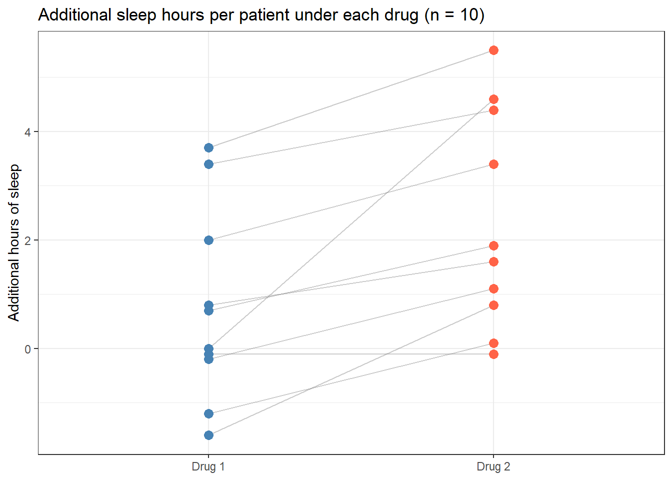
The sleep dataset records additional hours of sleep for 10 patients under each of two drugs. Each patient received both drugs, making this a paired design. The key insight: some people simply sleep longer than others regardless of the drug. A two-sample test would treat that between-person variation as noise. The paired test removes it by focusing on each patient’s within-person difference.
sleepdat <- sleep %>%as_tibble() %>%rename(drug = group, extra_hours = extra) %>%mutate(drug =factor(drug, labels =c("Drug 1", "Drug 2")))sleepdat %>%ggplot(aes(x = drug, y = extra_hours)) +geom_line(aes(group = ID), alpha =0.4, colour ="grey50") +geom_point(aes(colour = drug), size =3) +scale_colour_manual(values =c("steelblue", "tomato")) +labs(title ="Additional sleep hours per patient under each drug (n = 10)",x =NULL,y ="Additional hours of sleep" ) +theme_bw() +theme(legend.position ="none")
The connecting lines show each patient’s trajectory between drugs. Most lines slope upward from Drug 1 to Drug 2. The paired test uses exactly this information, the consistent direction of change across patients.
Run the chunk above. You should get estimate ≈ 1.58, statistic ≈ 4.06, p.value ≈ 0.0028. Compare this p-value to the two-sample result from the previous example (p ≈ 0.18). Same kind of test, a much smaller p-value: the next chunk shows why.
To see exactly why using the paired test matters, run both on the same data and compare:
bind_rows(tidy(t.test(extra_hours ~ drug, data = sleepdat, var.equal =FALSE)) %>%mutate(test ="Two-sample (wrong for this design)"),tidy(res_sleep) %>%mutate(test ="Paired (correct)")) %>%select(test, estimate, conf.low, conf.high, p.value)
# A tibble: 2 × 5
  test                               estimate conf.low conf.high p.value
  <chr>                                 <dbl>    <dbl>     <dbl>   <dbl>
1 Two-sample (wrong for this design)    -1.58   -3.37      0.205 0.0794
2 Paired (correct)                       1.58    0.700     2.46  0.00283
The paired test gives a much smaller p-value because it strips out the between-patient variability that inflates the noise estimate in the two-sample test. The same data, the same effect size, but the right design choice makes the difference detectable.
5.5 Example 2: Clinical Data (PBC)
Estimated time: ~15 minutes (worked example)
NoteTeacher Note
This example connects back to the Hypothesis Testing session’s discussion of baseline comparability in randomised trials. If the group has covered that session, ask them to recall why checking baseline balance matters before running the two-sample test below.
5.5.1 One-sample: is mean albumin different from the clinical threshold?
The lower limit of normal serum albumin is 3.5 g/dL. PBC is a progressive liver disease that can impair the liver’s ability to synthesise albumin, so it is natural to ask: in this cohort, does the average patient sit below the normal range?
Run the chunk above. You should get estimate ≈ 3.50, statistic ≈ -0.12, p.value ≈ 0.90, with the 95% CI (3.46 to 3.54) sitting almost exactly on 3.5. Notice how close estimate is to mu: this is what a genuinely null result looks like.
Read across the row: estimate is the sample mean (3.50 g/dL); statistic is the t-value (−0.12); p.value (0.90) is how often a sample this far from 3.5 would arise by chance if the true population mean really were 3.5. The 95% CI (3.46 to 3.54) sits almost exactly on 3.5: this is a precise null result. Across the whole cohort, mean albumin is indistinguishable from the lower limit of normal.
That does not mean PBC has no effect on albumin. PBC ranges from early, asymptomatic disease to advanced cirrhosis, and this cohort spans that whole spectrum. A cohort-wide average mixes patients whose albumin is still normal with patients whose albumin is severely depleted, and the two can cancel out. The next section asks a more useful question: does albumin differ between groups defined by something other than disease status, namely treatment arm at baseline.
(broom::tidy() packs the output into a data frame rather than the default printed block. Both show the same numbers; tidy() is easier to work with in reports and pipelines.)
5.5.2 Two-sample: does albumin differ between treatment groups?
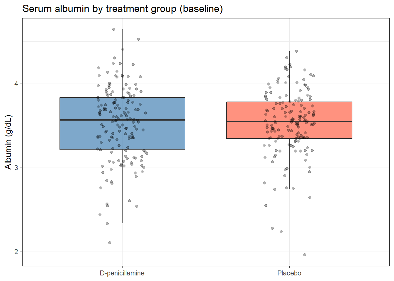
We already know from Hypothesis Testing that baseline albumin should not differ between randomised groups. Here we confirm it formally:
pbc_rand <- pbc %>%filter(!is.na(trt), !is.na(albumin))pbc_rand %>%ggplot(aes(x = trt, y = albumin, fill = trt)) +geom_boxplot(alpha =0.7, outlier.shape =NA) +geom_jitter(width =0.15, alpha =0.3, size =1.5) +scale_fill_manual(values =c("steelblue", "tomato")) +labs(title ="Serum albumin by treatment group (baseline)",x =NULL,y ="Albumin (g/dL)" ) +theme_bw() +theme(legend.position ="none")
tidy(t.test(albumin ~ trt, data = pbc_rand, var.equal =FALSE))
Run the chunk above. You should get p.value ≈ 0.87 and a confidence interval for the difference that comfortably contains zero (about −0.10 to 0.09 g/dL). This is the result you want to see when checking baseline balance: no evidence of a difference.
TipPutting the Two Results Together
“Mean serum albumin across the cohort was 3.50 g/dL (95% CI: 3.46–3.54), not significantly different from the lower limit of normal (3.5 g/dL; one-sample t-test: t(417) = −0.12, p = 0.90). There was no significant difference in baseline albumin between the D-penicillamine and placebo groups (two-sample t-test: p = 0.87), confirming comparable randomisation.”
Two tests, two null results, but they answer different questions. The first tells you the cohort average sits right at the clinical threshold, which, given the spread of disease severity in PBC, is unsurprising and not very informative on its own. The second tells you something genuinely useful for trial design: randomisation balanced albumin between arms at baseline, so a later difference between groups is unlikely to be explained by a baseline imbalance in this variable.
5.6 Checking Assumptions: QQ-plots
Estimated time: ~10 minutes (worked example)
NoteTeacher Note
Students often expect QQ-plot points to fall in a perfectly straight line and worry when \(n = 10\) produces visible wiggle. After showing the plot below, ask: “if I simulated 10 points from a true normal distribution and made this plot 20 times, would they all look identical?” Running qqnorm(rnorm(10)) a few times live is a quick, memorable way to calibrate expectations for small-sample QQ-plots.
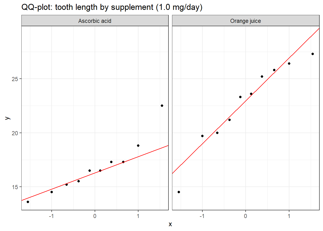
For small samples (\(n < 30\)), use a QQ-plot to check approximate normality. ToothGrowth has only 10 animals per group at each dose, exactly the situation where checking matters.
A QQ-plot compares the quantiles of your data against the quantiles of a theoretical normal distribution. If the points fall roughly along the diagonal line, normality is a reasonable assumption. What to watch for:
Heavy tails: points curve away from the line at both ends, suggesting a distribution with more extreme values than normal
With \(n = 10\), points roughly following the line are sufficient: you cannot expect perfection from ten observations. If you see a systematic curve or extreme departures, consider a Wilcoxon test (Nonparametric Tests).
5.7 What Can Go Wrong
Estimated time: ~10 minutes (reading)
NoteTeacher Note
The “Common misinterpretations” callout below works well as a quick true/false round: read each statement aloud, ask for a show of hands before revealing why it is wrong. This surfaces misconceptions the group already holds rather than just presenting them.
Using paired when data are independent, or vice versa
The paired t-test requires a genuine one-to-one link between observations. If you apply it to two independent groups, the degrees of freedom will be wrong and the p-value meaningless. If you apply a two-sample test to paired data, you throw away the within-subject information and lose statistical power. The design, not the software, determines which test is correct.
Relying on Shapiro-Wilk to decide whether to use a t-test
shapiro.test() is the wrong tool for this decision. With small samples (where normality matters most), it has low power and will miss real non-normality. With large samples (where normality matters least, because the CLT takes over), it will flag trivially small departures as “significant.” Use a QQ-plot and think about whether your outcome could plausibly come from a normal distribution.
Reporting only the p-value
“p = 0.03” tells the reader almost nothing. How big is the difference? In what direction? How precise is the estimate? Always report the mean difference, SD or SE for each group, and the 95% CI.
Forgetting that the default is Welch’s, not Student’s
t.test() in R uses var.equal = FALSE by default, which gives Welch’s test. This is the right choice. Do not override it with var.equal = TRUE unless you have a genuine scientific reason to assume equal variances, and there is rarely such a reason in biomedical research.
WarningCommon misinterpretations
“p = 0.04 means the difference is large” With 400 patients, even a 0.05 g/dL difference (clinically trivial) can produce p = 0.04. Always report the mean difference and CI.
“p = 0.07 means the groups are the same” It means the data are consistent with no difference at \(\alpha = 0.05\). With 20 patients, it may simply mean the study was underpowered. Never conclude “no difference” from a non-significant p-value alone.
“I used a one-sided test to get a smaller p-value” A one-sided test is only valid if you pre-specified the direction before collecting data. Using it because the data happened to go the right way is p-hacking.
“The paired t-test always gives a smaller p-value” Only when the within-subject measurements are correlated. If your data are genuinely independent, the paired test is simply wrong.
5.8 Exercises
NoteTeacher Note
In a live session, have students attempt Exercise 1 in pairs (~10 minutes) before revealing the solution, then work Exercise 2 individually. Exercise 3 needs each student’s own data, so it works best as a take-home or end-of-day task rather than something to complete in the room.
5.8.1 Exercise 1 (Guided): Two-Sample Test at a Different Dose
Estimated time: ~15 minutes
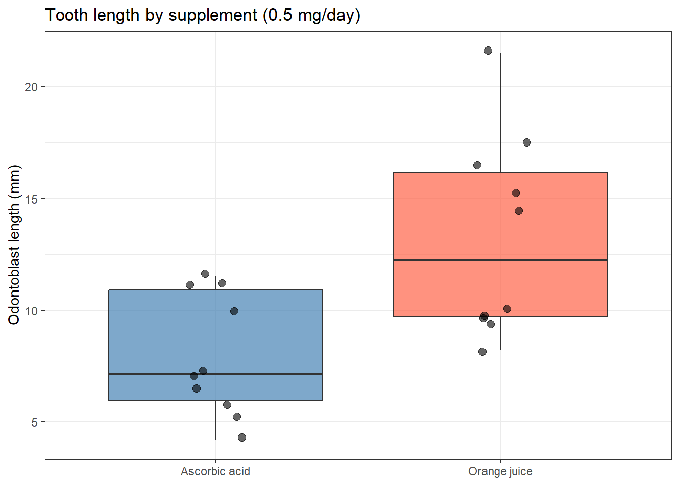
Using ToothGrowth, test whether tooth length differs by supplement type at the 0.5 mg/day dose (where the difference looks larger than at 1 mg/day).
Filter to dose = 0.5, plot, then run a Welch’s two-sample t-test.
Report the result: t-statistic, df, p-value, 95% CI, and group means.
How does the conclusion change compared to the 1 mg/day result?
At 0.5 mg/day the difference is statistically significant and the CI excludes zero. The supplement delivery method matters more at lower doses. This illustrates a dose-interaction that would need to be explored with ANOVA if you want to formally test whether the supplement effect changes across doses.
5.8.2 Exercise 2 (Semi-guided): One-Sample Test for Bilirubin
Estimated time: ~15 minutes
The upper limit of normal for bilirubin is approximately 1.2 mg/dL.
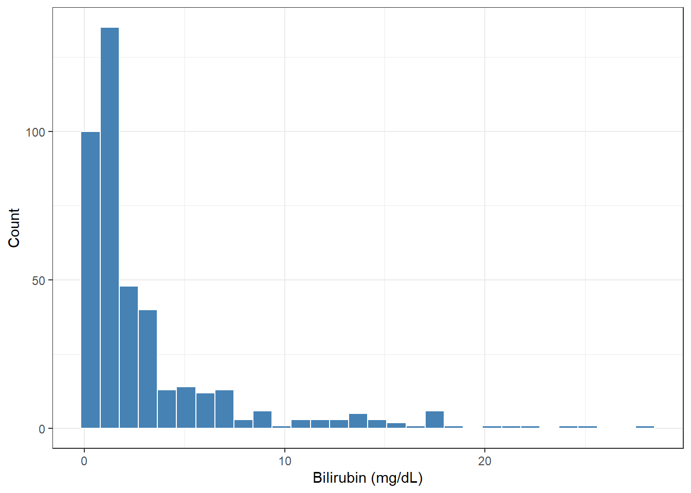
Plot the bilirubin distribution in survival::pbc. Is it symmetric?
Log-transform bilirubin. Test whether mean log(bili) equals log(1.2).
Report the geometric mean (back-transform with exp()), the 95% CI, t-statistic, df, and p-value. Write one sentence of interpretation.
TipExercise 2: Solution
ggplot(pbc, aes(x = bili)) +geom_histogram(bins =30, fill ="steelblue", colour ="white") +labs(x ="Bilirubin (mg/dL)", y ="Count") +theme_bw()
res <-t.test(log(pbc$bili), mu =log(1.2))tidy(res)
Bilirubin is strongly right-skewed, so the log scale is appropriate. The geometric mean bilirubin in PBC patients is well above 1.2 mg/dL and the difference is highly significant (p < 0.001), consistent with cholestatic liver disease.
5.8.3 Exercise 3 (Open-ended)
Estimated time: 15–30 minutes, depending on your data
Using a dataset from your own research, identify a comparison where a t-test is appropriate. Decide which variant (one-sample, two-sample, or paired) fits your design. Run the test, check assumptions with a QQ-plot, and write a complete Methods and Results paragraph as you would for a journal submission.
5.9 Comprehension Check
Estimated time: ~10 minutes
What is the difference between a one-sample, two-sample, and paired t-test? Give a concrete biomedical example for each.
Why is Welch’s t-test preferred over Student’s t-test in practice?
A QQ-plot shows points deviating from the diagonal at the upper tail. The sample size is n = 12. What should you do?
You run a two-sample t-test and get p = 0.04, 95% CI for the difference: (0.01 to 2.1 g/dL). Is this a convincing, informative result? What would you report?
A colleague says: “I ran Shapiro-Wilk and got p = 0.06, so the data are normal enough for a t-test.” What is wrong with this reasoning?
NoteAnswers
One-sample: compare a sample mean to a fixed reference value (e.g., “Is mean haemoglobin in my patients below 12 g/dL?”). Two-sample: compare means of two independent groups (e.g., “Does albumin differ between treated and untreated mice?”). Paired: compare two measurements on the same subjects (e.g., “Did blood pressure change from baseline to 6 weeks in the same patients?”).
Welch’s test does not assume equal group variances, making it more robust. The cost in statistical power when variances are equal is negligible. Using Student’s test when variances differ inflates the Type I error rate. Welch’s is the R default and should stay that way.
With n = 12 and visible non-normality, the sample is too small for the CLT to rescue you. Use a nonparametric Wilcoxon rank-sum test instead.
The result is statistically significant (p = 0.04) and the CI excludes zero, but the CI is very wide: the true difference could be as small as 0.01 g/dL (negligible) or as large as 2.1 g/dL (potentially important). A barely significant result with a wide CI tells you almost nothing about the size of the effect. Report both the p-value and the CI, and note that the estimate is imprecise.
Shapiro-Wilk with p = 0.06 does not mean the data are normal: it means non-normality was not detected at \(\alpha = 0.05\). With n = 12 the test has very low power; it would miss moderate non- normality routinely. Use a QQ-plot and domain knowledge to assess whether the normal distribution is a plausible model for your data.
5.10 How to Report
NoteReporting t-test Results
In a Methods section:
“Differences in [outcome] between [group A] and [group B] were compared using an independent-samples Welch’s t-test. A paired t-test was used for [paired outcome] because measurements were taken on the same subjects at two time points.”
In a Results section:
“[Outcome] was higher in [group A] (mean X.XX, SD Y.YY) than in [group B] (mean X.XX, SD Y.YY; t(df) = X.XX, p = .YYY, 95% CI for difference: L.LL to U.UU).”
Always include:
Means and SDs for both groups
Test statistic (t) and degrees of freedom (df)
Exact p-value (write p < 0.001 when very small; never p = 0.000)
95% CI for the mean difference
Whether the test was one- or two-sided (two-sided is standard)
Common reporting errors:
Reporting only “p < 0.05” without the actual value or the effect size
Omitting the 95% CI for the difference
Writing “mean ± SEM” in the text but calling it “mean ± SD”