penguins_clean <- penguins %>%
drop_na(bill_length_mm, bill_depth_mm, body_mass_g, flipper_length_mm, species)10 Correlation and Association
NoteSession at a Glance
Total core time: about 130 minutes (a little over 2 hours).
| Section | Time | Type |
|---|---|---|
| When Do You Use This? + Learning Objectives | 5 min | Reading |
| The Key Idea: What Does r Actually Tell You? | 10 min | Reading |
| Background: Measuring Linear Association | 15 min | Reading |
| Example 1: Ecology Data (palmerpenguins) | 30 min | Worked example |
| Example 2: Clinical Data (PBC) | 20 min | Worked example |
| What Can Go Wrong | 10 min | Reading |
| Exercises 1 & 2 | 30 min | Practice |
| Comprehension Check | 10 min | Self-test |
In a taught course, this session fits one teaching block. For self-paced study, split it into two sittings, e.g. the Key Idea, Background, and Example 1 first, Example 2 onward later. Exercise 3 is open-ended and works best as a follow-up using a dataset from your own field.
TipHow to Use the Code in This Session
Every code chunk below is written so you can copy it into your R console (or an R script) and run it yourself, in the order shown. Where you see a “Run It Yourself” box, stop and run the code above it before reading the explanation that follows.
10.1 When Do You Use This?
Tip
Before fitting a regression model, you want to understand the pairwise relationships between continuous variables: which variables move together, how strong those associations are, and in what direction. Correlation gives you a standardised measure of association that is independent of the units of measurement. Does albumin decline as bilirubin rises? Is platelet count associated with prothrombin time? Start here.
NoteTeacher Note
Ask the room for a pair of continuous variables from their own work that they expect to be related (e.g. dose and response, age and a lab value). Keep this pair in mind through the session – after Example 1 and Example 2, ask whether they’d use Pearson or Spearman for their pair, and why.
10.2 Learning Objectives
After completing this session you will be able to:
- Distinguish Pearson, Spearman, and Kendall correlation coefficients and choose appropriately
- Calculate correlations and test their significance in R
- Visualise correlation matrices with
GGally::ggpairs() - Explain why correlation does not imply causation
- Recognise spurious correlation from confounding
10.3 The Key Idea: What Does r Actually Tell You?
Estimated time: ~10 minutes (reading)
Correlation answers a simple question: “when X is above average, does Y tend to be above average too?” If yes, r is positive. If higher X goes with lower Y, r is negative. If there is no pattern, r is near zero.
But r has an important limitation: it only captures linear relationships. You can have a perfect U-shaped relationship (Y rises steeply, then falls) and get r = 0. Always plot your data first. A scatter plot takes 10 seconds and can save you from a completely wrong interpretation.
One more thing before the formulas: r = 0.6 does not mean “60% association.” The variance explained by the relationship is r², not r. With r = 0.6, the two variables share r² = 0.36, or 36%, of their variance. Keep that in mind when someone tells you “there’s a moderate correlation.”
NoteTeacher Note
Draw a quick U-shape on the board (e.g. Y high at both small and large X, low in the middle). Ask: “if I compute Pearson’s r for these points, roughly what value do I get?” Most people guess a moderate positive or negative number; the answer is close to zero, because r only measures linear trend. This motivates “always plot first.”
10.4 Background: Measuring Linear Association
Estimated time: ~15 minutes (reading)
Pearson’s r measures the strength and direction of a linear relationship between two continuous variables:
\[r = \frac{\sum (x_i - \bar{x})(y_i - \bar{y})}{\sqrt{\sum (x_i - \bar{x})^2 \sum (y_i - \bar{y})^2}}\]
\(r\) ranges from -1 (perfect negative) to +1 (perfect positive). \(r = 0\) means no linear association.
When not to use Pearson’s r: - One or both variables are heavily skewed or contain outliers - The relationship is clearly non-linear (e.g., exponential) - Data are ordinal (ranked categories)
Spearman’s \(\rho\) and Kendall’s \(\tau\) work on the ranks of the data. They detect any monotonic relationship (not just linear) and are robust to outliers.
| Coefficient | Assumes | Best for |
|---|---|---|
| Pearson \(r\) | Linearity, approximately bivariate normal | Continuous, symmetric variables |
| Spearman \(\rho\) | Monotonic relationship | Skewed data, small n, ordinal |
| Kendall \(\tau\) | Monotonic relationship | Small n, many ties |
10.5 Example 1: Ecology Data (palmerpenguins)
Estimated time: ~30 minutes (worked example)
NoteTeacher Note
Before running the first cor.test(), ask students to predict the sign and rough size of the correlation between bill length and body mass: positive or negative, and small/medium/large? Then check the real result together. Later, the Simpson’s Paradox subsection is a good moment to slow down – make sure everyone sees both the overall (negative) and within-species (positive) correlations before moving on.
Penguin body measurements are intuitive: does a longer bill go with a deeper bill? Does body mass predict flipper length? The palmerpenguins dataset is ideal for introducing correlation because the biology makes sense and it contains a famous cautionary tale about confounding.
10.5.1 Pearson Correlation: Bill Length vs Body Mass
cor.test(penguins_clean$bill_length_mm, penguins_clean$body_mass_g, method = "pearson")
    Pearson's product-moment correlation

data:  penguins_clean$bill_length_mm and penguins_clean$body_mass_g
t = 13.654, df = 340, p-value < 2.2e-16
alternative hypothesis: true correlation is not equal to 0
95 percent confidence interval:
 0.5220040 0.6595358
sample estimates:
      cor
0.5951098
NoteReading the
cor.test() Output Line by Line
Pearson's product-moment correlation
t = 13.65, df = 340, p-value < 2.2e-16
95 percent confidence interval:  0.52  0.66
sample estimates: cor = 0.60| Output | What it means |
|---|---|
| t = 13.65 | Test statistic for H0: r = 0. Calculated as r x sqrt(n-2) / sqrt(1-r^2). Large absolute value = strong evidence r != 0. |
| df = 340 | Degrees of freedom = n - 2 |
| p < 2.2e-16 | If true r were zero, we would almost never see this by chance |
| 95% CI: 0.52 to 0.66 | Plausible range for the true population correlation. CI excludes zero. |
| r = 0.60 | Medium-to-large positive association. Longer bills go with heavier birds. |
r^2 ≈ 0.35: bill length explains about 35% of variance in body mass. Effect size benchmarks (Cohen, 1988): |r| = 0.10 small / 0.30 medium / 0.50 large.
TipRun It Yourself
Run the chunk above. You should get t = 13.65, df = 340, p-value < 2.2e-16, a 95% CI of about (0.52, 0.66), and cor = 0.60. Does the sign and rough size match what you predicted in the Teacher Note above?
penguins_clean %>%
  ggplot(aes(x = bill_length_mm, y = body_mass_g, colour = species)) +
  geom_point(alpha = 0.6) +
  geom_smooth(method = "lm", se = FALSE, colour = "grey30", linetype = "dashed") +
  scale_colour_manual(values = c("steelblue", "tomato", "seagreen")) +
  labs(title = "Bill length vs body mass (all species combined)",
       x = "Bill length (mm)", y = "Body mass (g)") +
  theme_bw()
`geom_smooth()` using formula = 'y ~ x'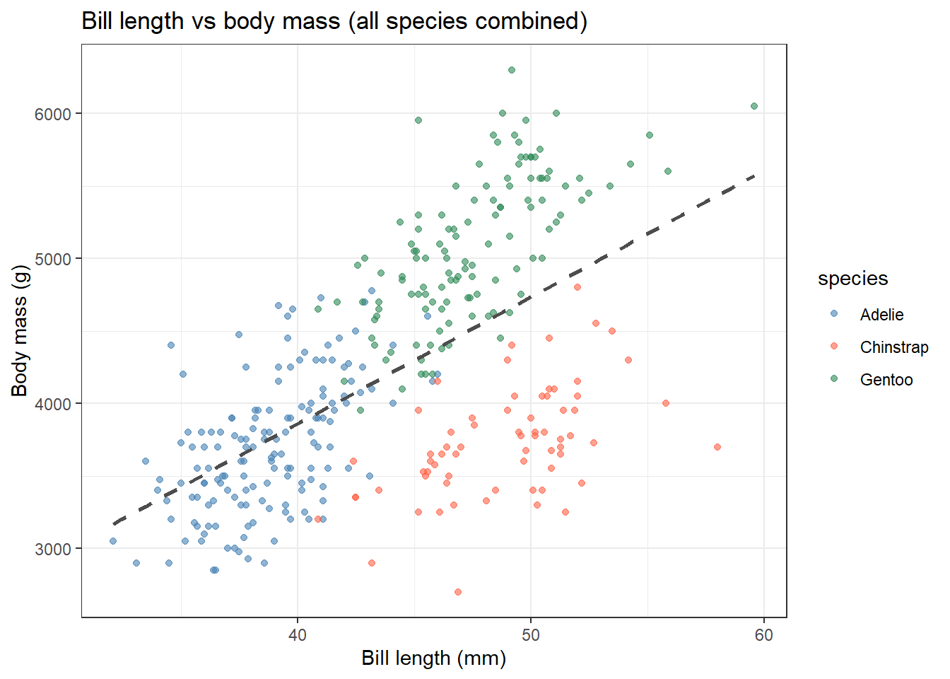
10.5.2 Correlation Matrix
peng_num <- penguins_clean %>%
  select(bill_length_mm, bill_depth_mm, flipper_length_mm, body_mass_g)

cor(peng_num, method = "pearson") %>% round(2)
bill_length_mm bill_depth_mm flipper_length_mm body_mass_g
bill_length_mm 1.00 -0.24 0.66 0.60
bill_depth_mm -0.24 1.00 -0.58 -0.47
flipper_length_mm 0.66 -0.58 1.00 0.87
body_mass_g 0.60 -0.47 0.87 1.00ggpairs(
peng_num,
lower = list(continuous = wrap("points", alpha = 0.3, size = 0.8)),
upper = list(continuous = wrap("cor", method = "pearson")),
diag = list(continuous = wrap("densityDiag"))
) + theme_bw(base_size = 10)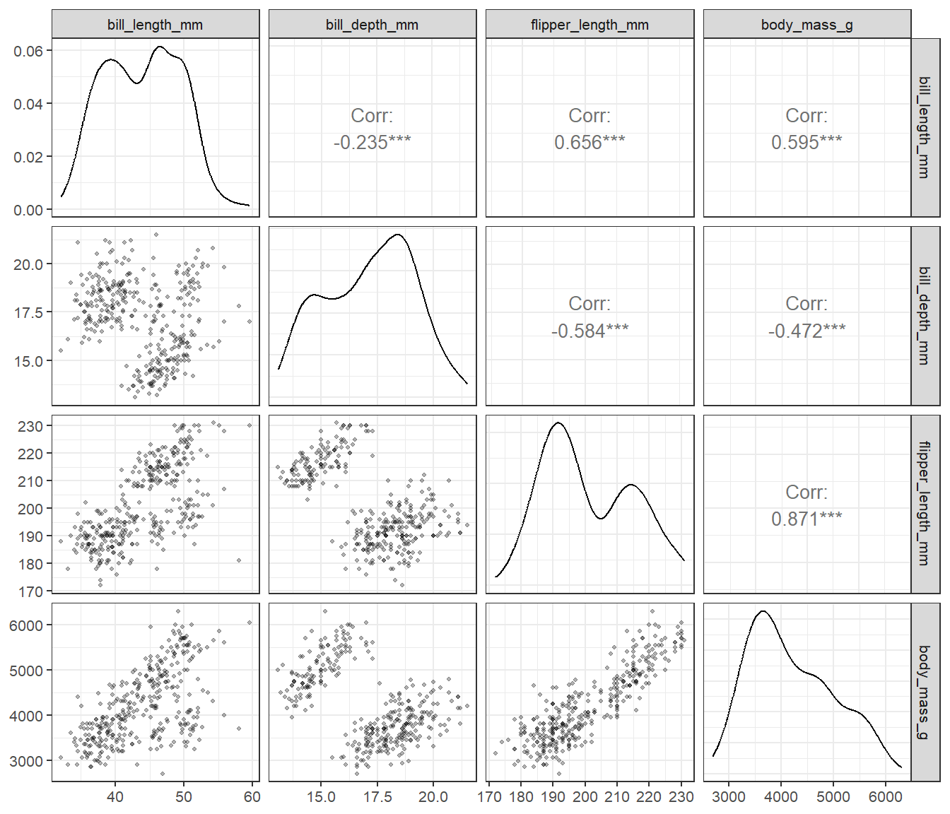
GGally::ggpairs() shows scatterplots (lower), Pearson correlations (upper), and density plots (diagonal) in one call. Flipper length and body mass are strongly correlated (r ~ 0.87).
10.5.3 Simpson’s Paradox: Bill Dimensions
The overall correlation between bill length and bill depth is negative (-0.24, see the correlation matrix above). Within each species it is positive. This is Simpson’s Paradox – always check for a grouping variable before reporting an unexpected correlation.
penguins_clean %>%
  ggplot(aes(x = bill_length_mm, y = bill_depth_mm, colour = species)) +
  geom_point(alpha = 0.6) +
  geom_smooth(method = "lm", se = FALSE) +
  geom_smooth(aes(group = 1), method = "lm", se = FALSE,
              colour = "black", linetype = "dashed") +
  scale_colour_manual(values = c("steelblue", "tomato", "seagreen")) +
  labs(title = "Simpson's Paradox: bill dimensions in penguins",
       subtitle = "Dashed = overall (negative); coloured = within-species (positive)",
       x = "Bill length (mm)", y = "Bill depth (mm)") +
  theme_bw()
`geom_smooth()` using formula = 'y ~ x'
`geom_smooth()` using formula = 'y ~ x'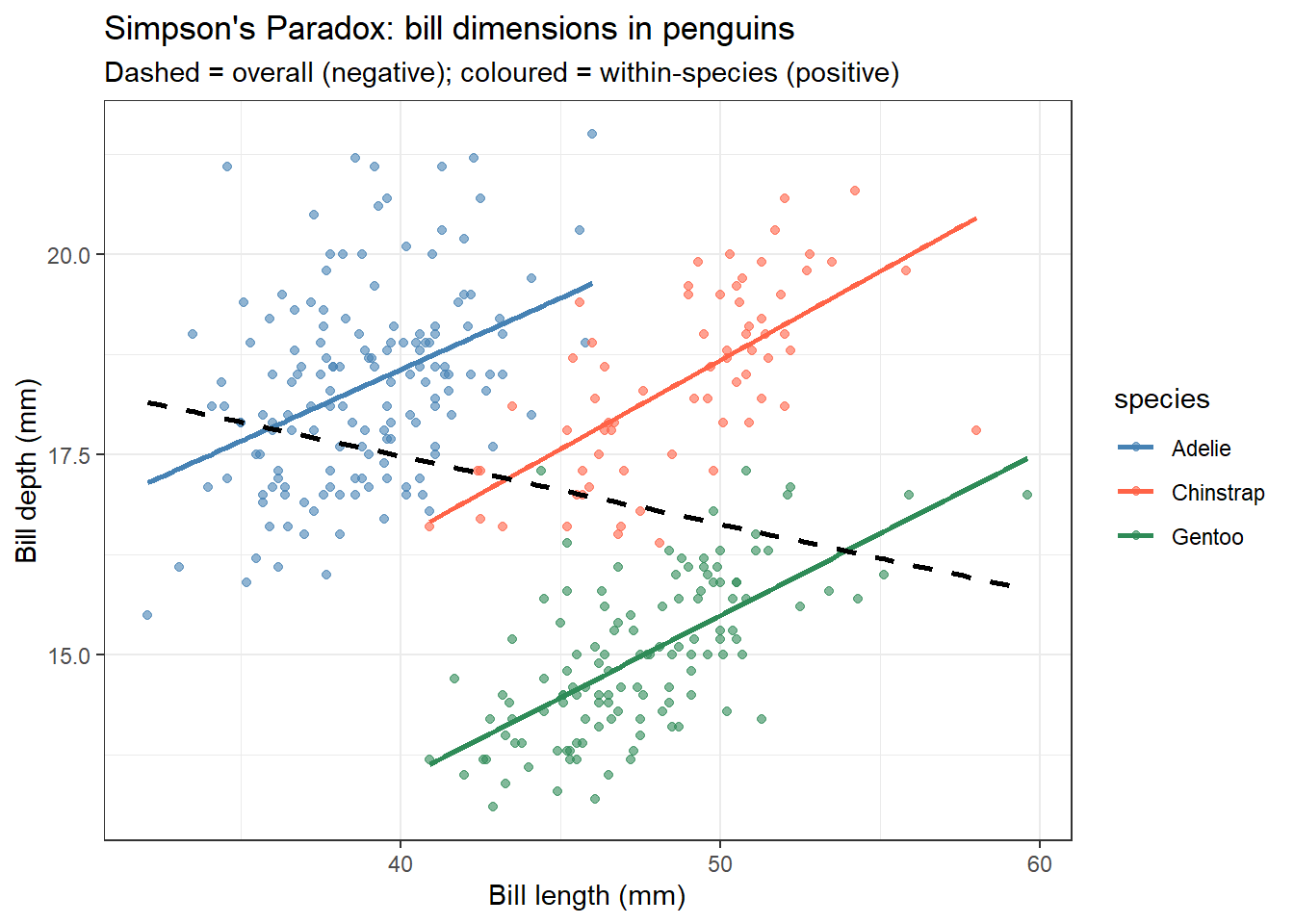
# Within-species correlations
penguins_clean %>%
  group_by(species) %>%
  summarise(r = round(cor(bill_length_mm, bill_depth_mm, method = "pearson"), 2), n = n())
# A tibble: 3 × 3
species r n
<fct> <dbl> <int>
1 Adelie 0.39 151
2 Chinstrap 0.65 68
3 Gentoo 0.64 123
TipRun It Yourself
Run the chunk above. You should get within-species correlations of Adelie r = 0.39, Chinstrap r = 0.65, Gentoo r = 0.64 – all positive, even though the overall correlation (ignoring species) is negative (-0.24). Species is a confounder here: each species has its own characteristic bill shape, and those between-species differences dominate the overall correlation.
10.6 Example 2: Clinical Data (PBC)
Estimated time: ~20 minutes (worked example)
NoteTeacher Note
This example reuses the PBC dataset from earlier sessions, now focused on whether albumin and bilirubin move together. Ask students to predict the sign before running the code: as bilirubin rises (liver dysfunction), do they expect albumin to rise or fall?
Clinical biomarkers are often skewed and require a careful choice between Pearson and Spearman correlation. This example shows how to make that decision and how to build a clinical correlation matrix for exploratory analysis.
pbc <- survival::pbc %>%
  as_tibble() %>%
  janitor::clean_names() %>%
  filter(!is.na(albumin), !is.na(bili), !is.na(protime), !is.na(platelet))
10.6.1 Pearson vs Spearman: Albumin and Bilirubin
Bilirubin is heavily right-skewed. Always plot first to decide which correlation to use.
pbc %>%
  ggplot(aes(x = log(bili), y = albumin)) +
  geom_point(alpha = 0.4, size = 1.5) +
  geom_smooth(method = "lm", colour = "tomato", se = TRUE) +
  labs(title = "Albumin vs log(bilirubin) in PBC",
       x = "log(Bilirubin)", y = "Albumin (g/dL)") +
  theme_bw()
`geom_smooth()` using formula = 'y ~ x'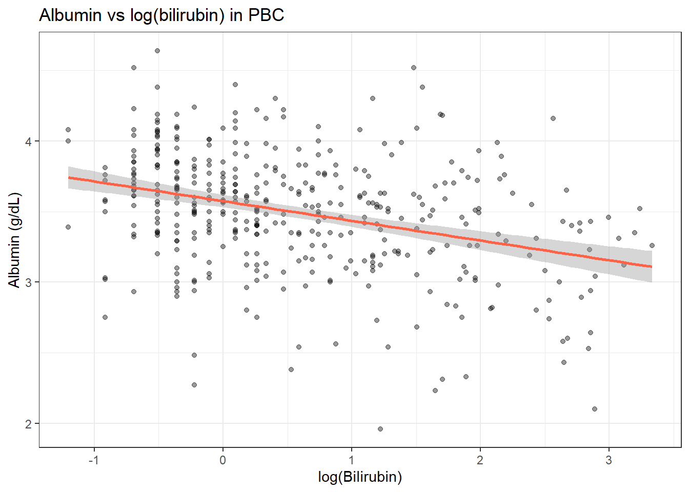
# Pearson on log-transformed bilirubin
tidy(cor.test(pbc$albumin, log(pbc$bili), method = "pearson"))
# A tibble: 1 × 8
estimate statistic p.value parameter conf.low conf.high method alternative
<dbl> <dbl> <dbl> <int> <dbl> <dbl> <chr> <chr>
1 -0.338 -7.21 2.79e-12 403 -0.422 -0.249 Pearson'… two.sided # Spearman on raw bilirubin (robust to skew)
tidy(cor.test(pbc$albumin, pbc$bili, method = "spearman"))Warning in cor.test.default(pbc$albumin, pbc$bili, method = "spearman"): Cannot
compute exact p-value with ties# A tibble: 1 × 5
estimate statistic p.value method alternative
<dbl> <dbl> <dbl> <chr> <chr>
1 -0.329 14718822. 1.05e-11 Spearman's rank correlation rho two.sided
TipRun It Yourself
Run the chunk above. Pearson on log(bilirubin) gives an estimate of about -0.34 (t ≈ -7.21, df = 403, p ≈ 2.8e-12, 95% CI -0.42 to -0.25). Spearman on the raw bilirubin gives rho ≈ -0.33 (p ≈ 1.0e-11; R warns that it cannot compute an exact p-value because of ties – expected with real clinical data). The two estimates are close (-0.34 vs -0.33), even though one is computed on log-transformed values and the other on ranks of the raw values.
Both methods point in the same direction (negative association). Report Spearman when data are skewed; use log-Pearson when you want a linear model interpretation.
10.6.2 Clinical Correlation Matrix
pbc_num <- pbc %>%
  mutate(log_bili = log(bili)) %>%
  select(albumin, log_bili, protime, platelet)

ggpairs(
  pbc_num,
  lower = list(continuous = wrap("points", alpha = 0.3, size = 0.8)),
  upper = list(continuous = wrap("cor", method = "spearman")),
  diag  = list(continuous = wrap("densityDiag"))
) + theme_bw(base_size = 10)
Warning in cor.test.default(x, y, method = method, use = use): Cannot compute
exact p-value with ties
Warning in cor.test.default(x, y, method = method, use = use): Cannot compute
exact p-value with ties
Warning in cor.test.default(x, y, method = method, use = use): Cannot compute
exact p-value with ties
Warning in cor.test.default(x, y, method = method, use = use): Cannot compute
exact p-value with ties
Warning in cor.test.default(x, y, method = method, use = use): Cannot compute
exact p-value with ties
Warning in cor.test.default(x, y, method = method, use = use): Cannot compute
exact p-value with ties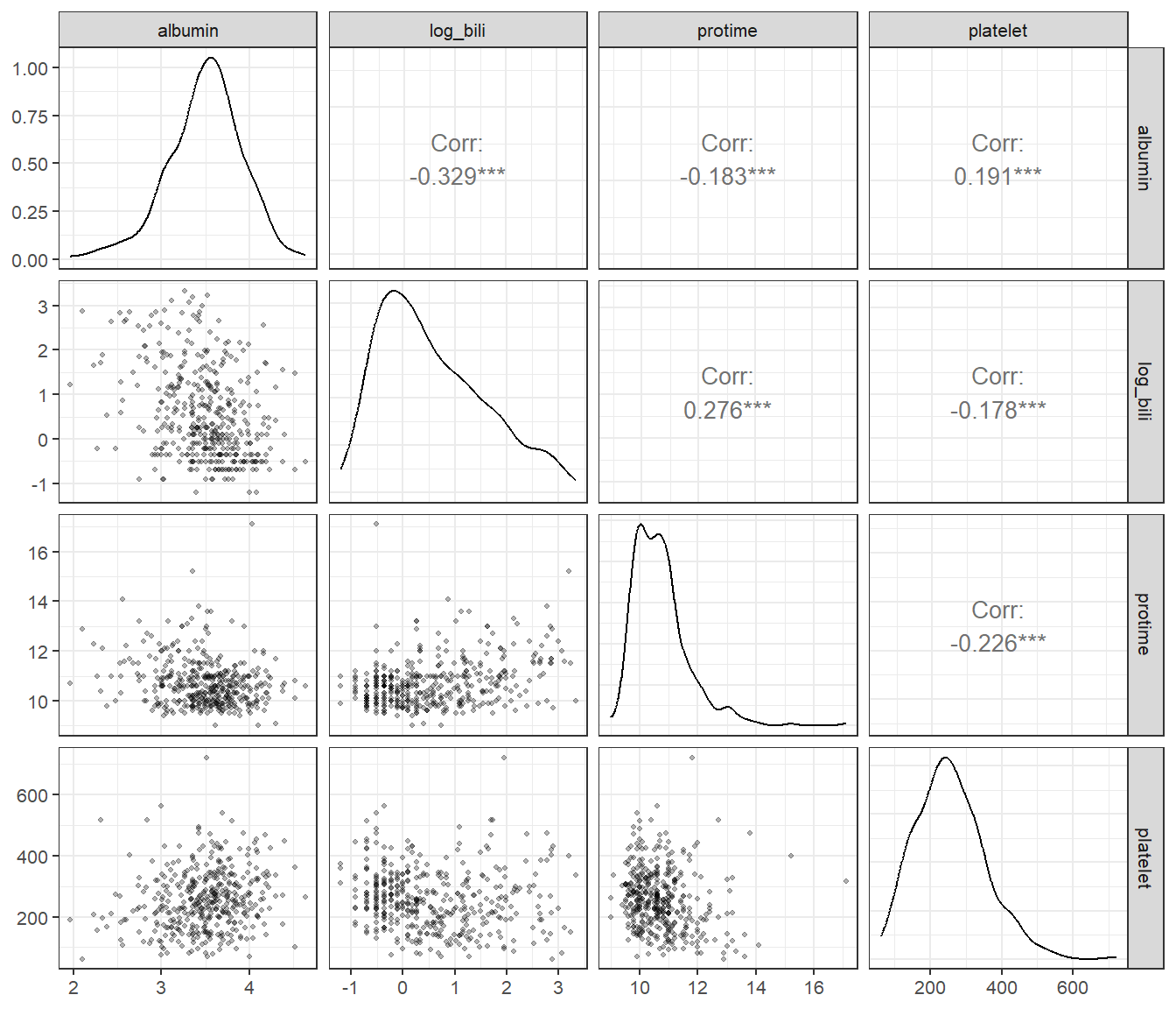
10.6.3 Multiple Correlations with Adjustment
When testing many correlations at once, adjust p-values to control the false discovery rate:
pbc_num %>%
  pivot_longer(-albumin, names_to = "variable", values_to = "value") %>%
  group_by(variable) %>%
  summarise(
    r = cor(albumin, value, use = "complete.obs", method = "spearman"),
    tidy(cor.test(albumin, value, method = "spearman"))
  ) %>%
  select(variable, r, p.value) %>%
  mutate(p_adj = p.adjust(p.value, method = "holm"))
Warning: There were 3 warnings in `summarise()`.
The first warning was:
ℹ In argument: `tidy(cor.test(albumin, value, method = "spearman"))`.
ℹ In group 1: `variable = "log_bili"`.
Caused by warning in `cor.test.default()`:
! Cannot compute exact p-value with ties
ℹ Run `dplyr::last_dplyr_warnings()` to see the 2 remaining warnings.# A tibble: 3 × 4
variable r p.value p_adj
<chr> <dbl> <dbl> <dbl>
1 log_bili -0.329 1.05e-11 3.15e-11
2 platelet 0.191 1.09e- 4 2.18e- 4
3 protime -0.183 2.14e- 4 2.18e- 4
TipRun It Yourself
Run the chunk above. You should get three correlations with albumin: log_bili r ≈ -0.33 (p_adj ≈ 3.2e-11), platelet r ≈ 0.19 (p_adj ≈ 2.2e-4), and protime r ≈ -0.18 (p_adj ≈ 2.2e-4). Even after the Holm adjustment for testing three correlations at once, all three remain well below 0.05 – but notice how much smaller the platelet and protime correlations are than the bilirubin one.
NoteWhere to Find Data Like This
palmerpenguins (used in Example 1): Four continuous body measurements with a species grouping variable. Perfect for teaching Pearson correlation and Simpson’s Paradox.
survival::pbc (used in Example 2): Multiple skewed clinical biomarkers (albumin, bilirubin, protime, platelet). Real-world case for choosing Spearman over Pearson.
NHANES: nhanesA or nhanes package: population-level continuous variables (blood pressure, cholesterol, BMI, age).
10.7 What Can Go Wrong
Estimated time: ~10 minutes (reading)
Warning
Correlation ≠ causation. Two variables can correlate strongly because they share a common cause, not because one causes the other. Always think mechanistically before interpreting a correlation.
Using Pearson’s r with skewed data or outliers. A single extreme outlier can drive a large r. Always plot your data before computing a correlation. Use Spearman’s ρ for robustness when data are skewed.
Multiple comparisons in correlation matrices. Testing all \(p(p-1)/2\) pairs from a correlation matrix inflates the Type I error rate. Adjust p-values with p.adjust() when reporting multiple correlations.
Range restriction. If you select subjects based on one of the variables (e.g., only patients with bilirubin > 5), the correlation in that subset will differ from the population correlation, usually attenuated.
Ecological correlation. Correlations computed on group averages (e.g., countries, hospitals) are typically stronger than individual-level correlations. Do not interpret ecological correlations as individual-level associations.
WarningCommon Misinterpretations
“r = 0.37 means 37% of variance is explained.” No. The variance explained is r², not r. With r = 0.37, bilirubin explains r² = 0.14 = 14% of variance in albumin. Always report r² alongside r.
“A statistically significant correlation is a strong correlation.” With n = 400 patients, even r = 0.10 will be statistically significant (p < 0.05). Statistical significance tells you that r ≠ 0; it does not tell you the association is clinically important. Report the r value and confidence interval, not just “p < 0.05”.
“Spearman ρ means the same as Pearson r.” Both range from −1 to +1, but they measure different things. Pearson measures linear association between raw values. Spearman measures monotonic association using ranked values. They are not interchangeable; do not compare Pearson r from one study to Spearman ρ from another.
“A high correlation means I should include that predictor in regression.” High zero-order correlations can be misleading. After adjusting for other predictors, the partial effect may be much smaller. Use correlation matrices for exploration, not for selecting predictors. For that, see the multiple regression session.
“A negative correlation means the variables are inversely proportional.” A negative r means higher X tends to go with lower Y; that is all. It says nothing about proportionality or causation.
NoteTeacher Note
Quick true/false check, drawing on the points above:
- “A correlation of r = 0.37 means 37% of the variance is explained.” (False – it’s r² = 0.14, or 14%.)
- “With a large enough sample, even a clinically trivial correlation can be statistically significant.” (True – significance tells you r != 0, not that it’s important.)
- “A high zero-order correlation between a predictor and an outcome means that predictor will have a strong effect in a multiple regression model.” (False – the partial effect can shrink once other predictors are included; see Multiple Regression.)
10.8 Exercises
NoteTeacher Note
Pair students up for these exercises. Exercise 1 revisits the penguins data with a new variable pair (flipper length and body mass) – before running the solution, ask pairs to predict whether the overall and within-species correlations will point in the same direction this time, or show another Simpson’s Paradox reversal like bill length vs bill depth. Exercise 2 returns to PBC with a new variable pair (albumin and prothrombin time).
10.8.1 Exercise 1 (Guided): Flipper Length vs Body Mass (penguins)
Estimated time: ~15 minutes
- Plot flipper length vs body mass in
penguins_clean. Does the relationship look linear? - Compute Pearson and Spearman correlations. Do they agree?
- Now add
colour = speciesto the plot. Does the relationship look consistent across species? - Compute within-species correlations. Report r, 95% CI, and p-value for one species.
TipExercise 1: Solution
pg <- penguins %>% drop_na(flipper_length_mm, body_mass_g, species)

# 1. Plot
pg %>%
  ggplot(aes(x = flipper_length_mm, y = body_mass_g)) +
  geom_point(alpha = 0.4) +
  geom_smooth(method = "lm", colour = "tomato") +
  labs(x = "Flipper length (mm)", y = "Body mass (g)") + theme_bw()
`geom_smooth()` using formula = 'y ~ x'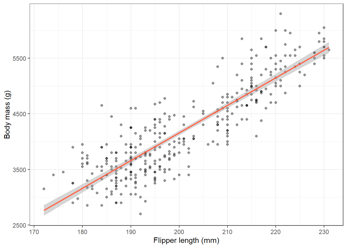
# 2. Both correlations
tidy(cor.test(pg$flipper_length_mm, pg$body_mass_g, method = "pearson"))
# A tibble: 1 × 8
estimate statistic p.value parameter conf.low conf.high method alternative
<dbl> <dbl> <dbl> <int> <dbl> <dbl> <chr> <chr>
1 0.871 32.7 4.37e-107 340 0.843 0.895 Pearson… two.sided tidy(cor.test(pg$flipper_length_mm, pg$body_mass_g, method = "spearman"))Warning in cor.test.default(pg$flipper_length_mm, pg$body_mass_g, method =
"spearman"): Cannot compute exact p-value with ties# A tibble: 1 × 5
estimate statistic p.value method alternative
<dbl> <dbl> <dbl> <chr> <chr>
1 0.840 1066875. 2.76e-92 Spearman's rank correlation rho two.sided # 3-4. Within-species
pg %>%
group_by(species) %>%
summarise(
r = round(cor(flipper_length_mm, body_mass_g, method = "pearson"), 2),
n = n()
)# A tibble: 3 × 3
species r n
<fct> <dbl> <int>
1 Adelie 0.47 151
2 Chinstrap 0.64 68
3 Gentoo 0.7 123# Full cor.test for Adelie
tidy(cor.test(
pg$flipper_length_mm[pg$species == "Adelie"],
pg$body_mass_g[pg$species == "Adelie"],
method = "pearson"
))# A tibble: 1 × 8
estimate statistic p.value parameter conf.low conf.high method alternative
<dbl> <dbl> <dbl> <int> <dbl> <dbl> <chr> <chr>
1 0.468 6.47 1.34e-9 149 0.333 0.584 Pears… two.sided 10.8.2 Exercise 2 (Semi-guided): Albumin and Prothrombin Time (PBC)
Estimated time: ~15 minutes
Using survival::pbc, explore the association between albumin and prothrombin time.
- Plot albumin vs prothrombin time. Does the relationship look linear? Try a log transform.
- Compute both Pearson (on log-transformed protime) and Spearman correlations.
- Build a Spearman correlation matrix for albumin, log(bili), protime, and platelet.
- Adjust p-values for multiple comparisons using Holm’s method.
TipExercise 2: Solution
pbc <- survival::pbc %>%
  as_tibble() %>%
  janitor::clean_names() %>%
  filter(!is.na(albumin), !is.na(bili), !is.na(protime), !is.na(platelet))

# 1. Plot
pbc %>%
  ggplot(aes(x = protime, y = albumin)) +
  geom_point(alpha = 0.4, size = 1.5) +
  geom_smooth(method = "loess", colour = "tomato") +
  labs(x = "Prothrombin time (s)", y = "Albumin (g/dL)") + theme_bw()
`geom_smooth()` using formula = 'y ~ x'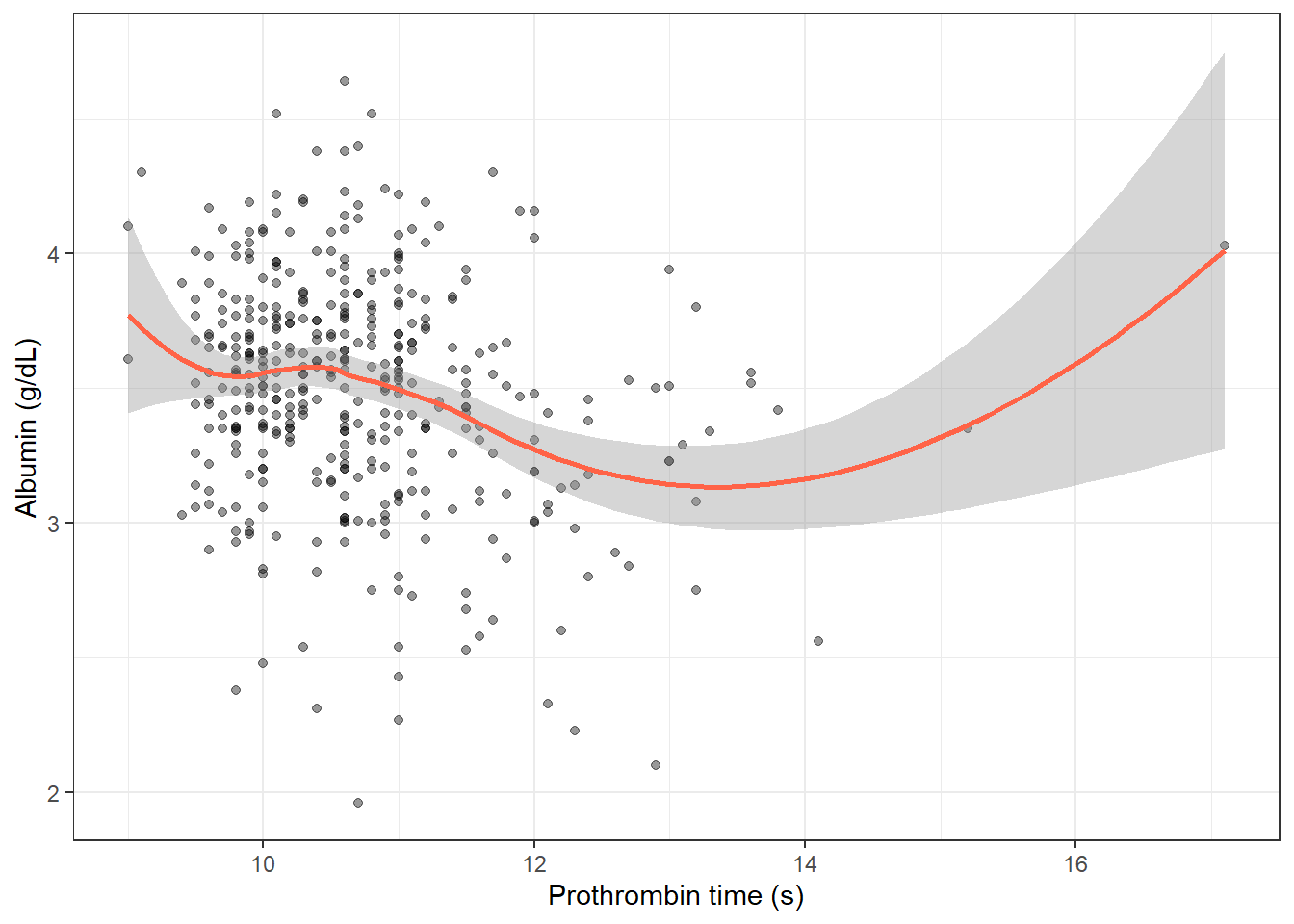
# 2. Both correlations
tidy(cor.test(pbc$albumin, log(pbc$protime), method = "pearson"))
# A tibble: 1 × 8
estimate statistic p.value parameter conf.low conf.high method alternative
<dbl> <dbl> <dbl> <int> <dbl> <dbl> <chr> <chr>
1 -0.203 -4.17 0.0000370 403 -0.295 -0.108 Pearson… two.sided tidy(cor.test(pbc$albumin, pbc$protime, method = "spearman"))Warning in cor.test.default(pbc$albumin, pbc$protime, method = "spearman"):
Cannot compute exact p-value with ties# A tibble: 1 × 5
estimate statistic p.value method alternative
<dbl> <dbl> <dbl> <chr> <chr>
1 -0.183 13097381. 0.000214 Spearman's rank correlation rho two.sided # 3-4. Matrix with p-adjustment
pbc_num <- pbc %>% mutate(log_bili = log(bili)) %>%
select(albumin, log_bili, protime, platelet)
pbc_num %>%
pivot_longer(-albumin, names_to = "variable", values_to = "value") %>%
group_by(variable) %>%
summarise(
r = cor(albumin, value, use = "complete.obs", method = "spearman"),
tidy(cor.test(albumin, value, method = "spearman"))
) %>%
select(variable, r, p.value) %>%
mutate(p_adj = p.adjust(p.value, method = "holm"))Warning: There were 3 warnings in `summarise()`.
The first warning was:
ℹ In argument: `tidy(cor.test(albumin, value, method = "spearman"))`.
ℹ In group 1: `variable = "log_bili"`.
Caused by warning in `cor.test.default()`:
! Cannot compute exact p-value with ties
ℹ Run `dplyr::last_dplyr_warnings()` to see the 2 remaining warnings.# A tibble: 3 × 4
variable r p.value p_adj
<chr> <dbl> <dbl> <dbl>
1 log_bili -0.329 1.05e-11 3.15e-11
2 platelet 0.191 1.09e- 4 2.18e- 4
3 protime -0.183 2.14e- 4 2.18e- 410.8.3 Exercise 3 (Open-ended)
Estimated time: 15–30 minutes
Using your own data, identify two continuous variables you expect to be related. Plot them, compute the appropriate correlation, and test the significance. Write a two-sentence result. Now think of a third variable that might confound the relationship - how would you check for it?
10.9 Comprehension Check
Estimated time: ~10 minutes (self-test)
- When should you use Spearman’s ρ instead of Pearson’s r?
- You compute r = 0.85, p < 0.001 between two blood biomarkers. Can you conclude one biomarker causes changes in the other?
- A correlation matrix of 10 variables has 45 pairwise tests. Three are significant at p < 0.05. Is this noteworthy?
- You observe a strong negative correlation between overall bill length and bill depth in penguins, but a positive correlation within each species. What is this called, and what causes it?
- You want to correlate a Likert-scale pain score (1–10) with serum CRP. Which coefficient should you use?
NoteAnswers
- Use Spearman when (1) one or both variables are skewed or contain outliers, (2) the relationship is monotonic but not necessarily linear, or (3) one variable is ordinal.
- No. Correlation describes the strength of association, not direction of causation. The two biomarkers may both reflect a third underlying process (confounding), or the direction of causality could run either way.
- Not necessarily. With 45 tests at α = 0.05, you expect 45 × 0.05 = 2.25 false positives by chance. Three significant results is only slightly above the expected false-positive count. Adjust for multiple testing and scrutinise the findings carefully.
- This is Simpson’s Paradox. The species variable is a confounder: different species have distinct bill morphologies, and within each species the relationship is positive. The overall correlation is dominated by between-species variation, which moves in the opposite direction.
- Spearman’s ρ (or Kendall’s τ). Pain scores are ordinal; the difference between 4 and 5 is not necessarily the same as between 7 and 8; so rank-based methods are more appropriate than Pearson’s r.
10.10 How to Report
10.10.1 Reporting Correlation Coefficients
Note
In a methods section: “The association between [variable 1] and [variable 2] was assessed using Pearson’s correlation coefficient. Spearman’s rank correlation was used for [skewed variable] because [reason].”
In results: “There was a [strong/moderate/weak] [positive/negative] correlation between [variable 1] and [variable 2] (r = X, 95% CI [L, U], p = Y, n = N).”
Correlation benchmarks (Cohen):
| r | |
|---|---|
| < 0.1 | Negligible |
| 0.1–0.3 | Small |
| 0.3–0.5 | Moderate |
| > 0.5 | Large |
What to always include:
- Correlation coefficient (r for Pearson, 3c1 for Spearman)
- 95% CI for the coefficient
- Sample size (n)
- Which method was used (Pearson or Spearman) and why
Never report r² alone: the sign (direction) is lost and readers cannot recover it.
10.11 Further Reading
- Bland (2015): Correlation in An Introduction to Medical Statistics
- Dalgaard (2008): Chapter on correlation and regression
?cor.testin R: documentation covering all three methodsGGally::ggpairs()vignette for visualising multivariate relationships
Bland, Martin. 2015. An Introduction to Medical Statistics. 4th ed. Oxford University Press.
Dalgaard, Peter. 2008. Introductory Statistics with r. 2nd ed. Springer.