pbc <- survival::pbc %>%
  as_tibble() %>%
  clean_names() %>%
  mutate(
    died      = as.integer(status == 2),
    log_bili  = log(bili),
    log_proto = log(protime),
    sex       = factor(sex, levels = c("f", "m"), labels = c("Female", "Male")),
    stage     = factor(stage, levels = 1:4, labels = paste("Stage", 1:4)),
    trt       = factor(trt, levels = c(1, 2), labels = c("D-penicillamine", "Placebo"))
  ) %>%
filter(!is.na(bili), !is.na(protime), !is.na(albumin), !is.na(stage))13 Logistic Regression
ImportantBefore You Start
Logistic regression shares the same structure as linear regression but models a binary outcome. If you have not done so yet, complete the Linear Regression and Multiple Regression sessions first.
NoteSession at a Glance
Total core time: ~150 minutes (plus extra time for Exercise 3, which is open-ended).
| Section | Time | Type |
|---|---|---|
| The Key Idea: Why Not Just Use Linear Regression? | ~10 min | Concept |
| Background: The Logistic Model | ~15 min | Concept |
| Example 1: Clinical Data (PBC) | ~45 min | Walkthrough |
| Example 2: Melanoma Data | ~15 min | Walkthrough |
| What Can Go Wrong | ~10 min | Reading |
| Exercise 1 (Guided) | ~15 min | Practice |
| Exercise 2 (Semi-guided) | ~15 min | Practice |
| Exercise 3 (Open-ended) | 15–30 min | Practice |
| Comprehension Check | ~10 min | Self-test |
If you are working through this self-paced and have limited time, the Example 1 walkthrough (PBC data) is the core of this session – it covers everything from fitting a model to checking discrimination with a ROC curve. Example 2 (melanoma) repeats the same steps on a smaller dataset and can be skimmed or done as homework. Exercise 3 is open-ended: budget extra time if you want to apply this to your own data.
TipHow to Use the Code in This Session
Every code chunk below is written so you can copy it into your R console (or an R script) and run it yourself, in the order shown. Where you see a “Run It Yourself” box, stop and run the code above it before reading the explanation that follows.
13.1 When Do You Use This?
Tip
Your outcome is binary (yes/no, alive/dead, event/no event) and you want to model how one or more predictors change the probability of that outcome. Logistic regression gives you odds ratios with confidence intervals and lets you adjust for confounders. For example: predicting whether a patient died from liver disease, or whether a tumour responded to treatment.
NoteTeacher Note
If learners have just finished Multiple Regression, remind them that glm() uses the same model-fitting syntax as lm() – the difference is family = binomial and the fact that the coefficients live on the log-odds scale until you exponentiate them. Ask learners to predict: in earlier sessions, higher bilirubin was associated with lower albumin. Would you expect higher bilirubin to be associated with higher or lower odds of death in PBC patients, and why?
13.2 Learning Objectives
After completing this session you will be able to:
- Explain the logistic model and why ordinary linear regression is not appropriate for binary outcomes
- Fit a logistic regression with
glm(..., family = binomial)in R - Interpret odds ratios and convert them to probabilities
- Assess model discrimination with ROC curves and the C-statistic
- Build a multivariable logistic model and adjust for confounders
13.3 The Key Idea: Why Not Just Use Linear Regression?
Estimated time: ~10 minutes (concept)
Consider predicting whether a patient dies (0 or 1) from their bilirubin level. If you fit a straight line, nothing stops it from predicting a probability of −0.2 or 1.7, which makes no sense. Probabilities must stay between 0 and 1.
Logistic regression solves this by modelling the log-odds (logit) of the outcome instead of the probability directly. The log-odds can range freely from −∞ to +∞, and when you transform it back, the probability is always between 0 and 1.
The trade-off: coefficients are now on the log-odds scale, which is hard to read directly. We exponentiate them to get odds ratios (OR), and those are what you report in a paper.
13.4 Background: The Logistic Model
Estimated time: ~15 minutes (concept)
A binary outcome \(Y \in \{0, 1\}\) is modelled as:
\[\log\left(\frac{P(Y=1)}{1-P(Y=1)}\right) = \beta_0 + \beta_1 X_1 + \cdots + \beta_p X_p\]
Exponentiating the coefficients gives odds ratios:
\[OR = e^{\beta_j}\]
An OR > 1 means the odds of the event increase with \(X_j\); OR < 1 means they decrease.
The predicted probability for a patient is:
\[\hat{P} = \frac{1}{1 + e^{-(\hat{\beta}_0 + \hat{\beta}_1 X_1 + \cdots)}}\]
Key distinction: The OR is not the relative risk (RR). For rare outcomes (< 10%), they are approximately equal. For common outcomes, the OR exaggerates the association. Always specify which measure you are reporting.
13.5 Example 1: Clinical Data (PBC)
Estimated time: ~45 minutes (walkthrough)
NoteTeacher Note
This example has six natural stopping points: (1) fit fit_log and read the summary() output, (2) extract odds ratios with tidy(), (3) compute predicted probabilities, (4) fit the multivariable model fit_multi, (5) assess discrimination with the ROC curve and C-statistic, and (6) check glance() output. For a self-paced learner with limited time, stops 1, 2, and 5 give the core story (single-predictor model, odds ratio, discrimination); stops 3, 4, and 6 can be done as homework or skimmed.
13.5.1 Predict Mortality from Bilirubin
Think before you run: Among the 410 PBC patients in this dataset, about 38% (156 patients) died from liver disease during follow-up. Do you expect higher bilirubin to be associated with higher mortality? What direction would you predict for the OR?
Always visualise first:
pbc %>%
  ggplot(aes(x = log_bili, y = died)) +
  geom_jitter(height = 0.05, alpha = 0.3, size = 1.5) +
  geom_smooth(method = "glm", method.args = list(family = "binomial"),
              colour = "tomato", se = TRUE) +
  labs(title = "Probability of death by log(bilirubin)",
       x = "log(Bilirubin)", y = "Died (0/1)") +
  theme_bw()
`geom_smooth()` using formula = 'y ~ x'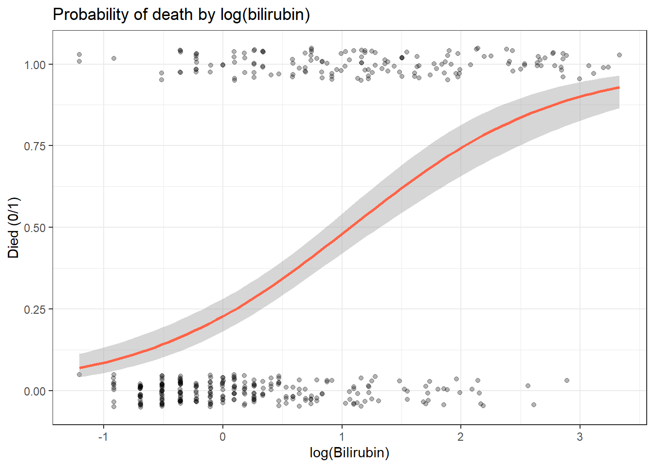
fit_log <- glm(died ~ log_bili, data = pbc, family = binomial)
summary(fit_log)
Call:
glm(formula = died ~ log_bili, family = binomial, data = pbc)

Coefficients:
            Estimate Std. Error z value Pr(>|z|)
(Intercept)  -1.2191     0.1450  -8.408   <2e-16 ***
log_bili      1.1413     0.1306   8.736   <2e-16 ***
---
Signif. codes:  0 '***' 0.001 '**' 0.01 '*' 0.05 '.' 0.1 ' ' 1

(Dispersion parameter for binomial family taken to be 1)

    Null deviance: 544.73  on 409  degrees of freedom
Residual deviance: 442.71  on 408  degrees of freedom
AIC: 446.71

Number of Fisher Scoring iterations: 3
NoteReading the
summary() Output for Logistic Regression
Logistic regression output looks similar to linear regression but the numbers mean different things.
Coefficients: table
              Estimate Std. Error z value Pr(>|z|)
(Intercept)  -1.22      0.15     -8.41    <2e-16 ***
log_bili 1.14 0.13 8.74 <2e-16 ***| Column | What it means |
|---|---|
| Estimate | The log-odds coefficient. Not directly interpretable: exponentiate to get an odds ratio. |
| Std. Error | Uncertainty in the estimate. |
| z value | Estimate / Std. Error (note: z, not t; logistic regression uses a normal approximation). |
| Pr(>|z|) | p-value: same interpretation as in linear regression. |
Null deviance: 544.73 on 409 degrees of freedom The deviance of a model with no predictors (intercept only). This is the baseline.
Residual deviance: 442.71 on 408 degrees of freedom The deviance of your model. A large drop from null to residual deviance (here: about 102 units, for the cost of a single predictor) means log_bili explains a lot.
AIC: 446.71 Lower AIC = better fit (penalised for complexity). Use AIC to compare models, not to interpret a single model in isolation.
TipWhat Does This Actually Tell Us?
The coefficient for log_bili is 1.14 on the log-odds scale. To interpret it:
- Exponentiate to get an odds ratio: \(e^{1.14} \approx 3.13\)
- Translate: Each one-unit increase in log(bilirubin) (roughly a 2.7-fold increase in bilirubin) multiplies the odds of death by about 3.1.
- Write it up: “Higher bilirubin is strongly associated with mortality in PBC patients. Each 2.7-fold increase in bilirubin is associated with about 3.1 times higher odds of death (OR = 3.13, 95% CI: 2.45–4.09, p < 0.001).”
Remember: odds ratios are not the same as relative risk. An OR of 3.13 does not mean the risk triples. For rare outcomes (< 10%), OR ≈ RR; for common outcomes (like death here, at 38%), OR exaggerates the association.
TipRun It Yourself
Run the glm-fit chunk above and check your summary(fit_log) output against the table above: (Intercept) ≈ −1.22 and log_bili ≈ 1.14 (both with p < 2e-16), residual deviance ≈ 442.71 on 408 df, and AIC ≈ 446.71. Predict before you check: since log_bili has a positive coefficient, do you expect the odds ratio (once you exponentiate it) to be greater than 1 or less than 1?
13.5.2 Extracting Odds Ratios
tidy(fit_log, conf.int = TRUE, exponentiate = TRUE) %>%
  select(term, estimate, conf.low, conf.high, p.value)
# A tibble: 2 × 5
term estimate conf.low conf.high p.value
<chr> <dbl> <dbl> <dbl> <dbl>
1 (Intercept) 0.295 0.220 0.389 4.17e-17
2 log_bili 3.13 2.45 4.09 2.41e-18
TipRun It Yourself
Run the chunk above. You should get log_bili with estimate ≈ 3.13 (95% CI: 2.45–4.09, p.value ≈ 2.41e-18) and (Intercept) ≈ 0.295 (95% CI: 0.220–0.389). The intercept’s “odds ratio” here is just the baseline odds of death when log_bili = 0 (i.e. bilirubin = 1 mg/dL) – it is not usually reported on its own. Check: does the 95% CI for log_bili include 1? What does that tell you about statistical significance?
13.5.3 Predicted Probabilities
new_d <- tibble(log_bili = log(c(1, 2, 5, 10, 20)))
new_d %>%
  mutate(pred_prob = predict(fit_log, newdata = new_d, type = "response"))
# A tibble: 5 × 2
log_bili pred_prob
<dbl> <dbl>
1 0 0.228
2 0.693 0.395
3 1.61 0.650
4 2.30 0.804
5 3.00 0.900
TipRun It Yourself
Run the chunk above. For bilirubin = 1, 2, 5, 10, and 20 mg/dL, the predicted probability of death is approximately 0.228, 0.395, 0.650, 0.804, and 0.900. Notice how the probability rises steeply but then levels off as it approaches 1 – this is the S-shaped logistic curve from the “Key Idea” section, not a straight line. Check: does the difference in predicted probability between bilirubin = 1 and bilirubin = 2 (about 0.17) equal the difference between bilirubin = 10 and bilirubin = 20 (about 0.10)? Why not, if the odds ratio per log-unit is constant?
13.5.4 Multivariable Logistic Model
fit_multi <- glm(died ~ log_bili + log_proto + albumin + stage,
                 data = pbc, family = binomial)

tidy(fit_multi, conf.int = TRUE, exponentiate = TRUE) %>%
  select(term, estimate, conf.low, conf.high, p.value) %>%
  mutate(across(where(is.numeric), \(x) round(x, 3)))
# A tibble: 7 × 5
term estimate conf.low conf.high p.value
<chr> <dbl> <dbl> <dbl> <dbl>
1 (Intercept) 0 0 0 0
2 log_bili 2.53 1.93 3.36 0
3 log_proto 1523. 67.6 43432. 0
4 albumin 0.755 0.399 1.42 0.383
5 stageStage 2 3.50 0.723 28.0 0.165
6 stageStage 3 4.15 0.904 32.3 0.106
7 stageStage 4 6.52 1.42 50.2 0.033
TipRun It Yourself
Run the chunk above. log_bili now has OR ≈ 2.53 (95% CI: 1.93–3.36, p < 0.001) – still significant, though attenuated from 3.13 once we adjust for prothrombin time, albumin, and stage. albumin has OR ≈ 0.755 (95% CI: 0.399–1.42, p = 0.383, not significant), and only stageStage 4 reaches significance versus Stage 1 (OR ≈ 6.52, 95% CI: 1.42–50.2, p = 0.033).
Look closely at log_proto: OR ≈ 1523 with a 95% CI of roughly 67.6–43432. This is a red flag, not a strong effect. A 95% CI that spans several orders of magnitude usually signals near-separation or an unstable estimate – here, prothrombin time has a narrow range in this dataset, so a moderate coefficient on the log scale translates into a huge OR per one-unit change in log(protime) (which corresponds to a 2.7-fold change in protime – far outside the range actually observed). Always check the range of a predictor before reporting an OR for “a one-unit increase.”
13.5.5 Model Discrimination: ROC Curve and C-statistic
The C-statistic (area under the ROC curve) measures how well the model separates cases from non-cases. C = 0.5 is random; C = 1.0 is perfect discrimination.
pred_prob <- predict(fit_multi, type = "response")
roc_obj   <- roc(pbc$died, pred_prob, quiet = TRUE)

cat("C-statistic:", round(auc(roc_obj), 3), "\n")
C-statistic: 0.825 ggroc(roc_obj, colour = "steelblue", linewidth = 1) +
geom_abline(intercept = 1, slope = 1, linetype = "dashed", colour = "grey60") +
labs(title = paste("ROC curve - AUC =", round(auc(roc_obj), 3)),
x = "1 - Specificity", y = "Sensitivity") +
theme_bw()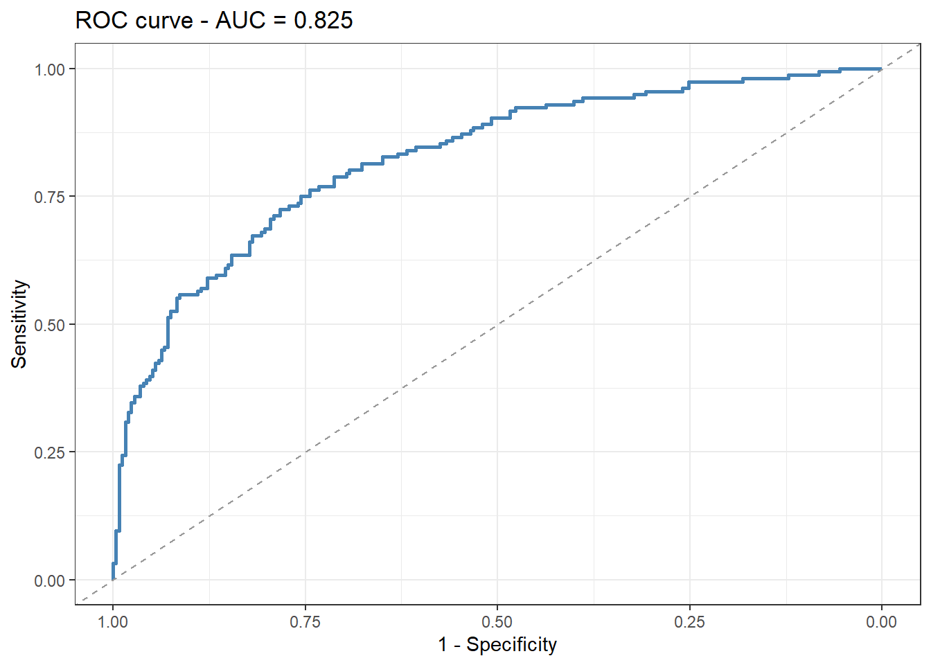
TipRun It Yourself
Run the chunk above. You should get a C-statistic of about 0.825, meaning the model assigns a higher predicted probability of death to the patient who died, versus the patient who survived, in about 83% of all possible (died, survived) pairs. Check: is 0.825 closer to the 0.75 considered “moderate” or the 0.90+ considered “excellent” discrimination in the Comprehension Check question below? Remember that this C-statistic still says nothing about calibration.
13.5.6 Diagnostic Accuracy: Sensitivity, Specificity, and Predictive Values
The ROC curve summarises the model across all thresholds. In practice you often have to pick one threshold and turn each predicted probability into a yes/no call – “flag this patient as high-risk” or not. Once you do, the model behaves like a diagnostic test, and the same 2x2 table clinicians use to judge any test applies. Here we classify a patient as predicted-to-die when the model’s predicted probability is at least 0.5.
# Turn predicted probabilities into a yes/no classification at a 0.5 cutoff
pred_class <- as.integer(pred_prob >= 0.5)

# 2x2 table: predicted (rows) vs what actually happened (columns)
cm <- table(Predicted = factor(pred_class, levels = c(0, 1)),
            Actual    = factor(pbc$died,   levels = c(0, 1)))
cm
Actual
Predicted 0 1
0 220 64
1 34 92TP <- cm["1", "1"]; FP <- cm["1", "0"]
FN <- cm["0", "1"]; TN <- cm["0", "0"]
round(c(
sensitivity = TP / (TP + FN), # of those who died, fraction correctly flagged
specificity = TN / (TN + FP), # of survivors, fraction correctly cleared
ppv = TP / (TP + FP), # of those flagged, fraction who actually died
npv = TN / (TN + FN), # of those cleared, fraction who survived
LR_pos = (TP / (TP + FN)) / (1 - TN / (TN + FP)),
LR_neg = (1 - TP / (TP + FN)) / (TN / (TN + FP))
), 3)sensitivity specificity ppv npv LR_pos LR_neg
0.590 0.866 0.730 0.775 4.406 0.474
TipRun It Yourself
Run the chunk above. At the 0.5 cutoff the model flags 126 patients as high-risk (92 of whom died) and clears 284 (220 of whom survived). That gives:
- Sensitivity 0.59 – of the 156 patients who died, the model flagged 59%. Four in ten deaths are missed at this cutoff.
- Specificity 0.87 – of the 254 survivors, 87% were correctly cleared.
- PPV 0.73 – of those flagged high-risk, 73% actually died.
- NPV 0.78 – of those cleared, 78% actually survived.
- LR+ 4.4 – a positive call makes death about 4.4 times more likely; LR- 0.47 – a negative call roughly halves the odds of death.
Two lessons clinicians never forget. First, sensitivity and specificity trade off against the threshold: lower the 0.5 cutoff and you catch more deaths (higher sensitivity) at the cost of more false alarms (lower specificity) – the ROC curve above is simply every such trade-off plotted at once. Second, PPV and NPV depend on prevalence. Here 38% of patients died, which is part of why the PPV is so high; apply the same model where only 5% die and the PPV falls sharply even though sensitivity and specificity are unchanged. That is why a test that looks excellent in a sick cohort can flood a healthy population with false positives.
13.5.7 Goodness of Fit
glance(fit_multi)# A tibble: 1 × 8
null.deviance df.null logLik AIC BIC deviance df.residual nobs
<dbl> <int> <dbl> <dbl> <dbl> <dbl> <int> <int>
1 545. 409 -201. 416. 444. 402. 403 410
TipRun It Yourself
Run the chunk above. You should see null.deviance ≈ 545 (409 df), deviance ≈ 402 (403 df), AIC ≈ 416, and nobs = 410. Compare this AIC to the single-predictor fit_log model’s AIC of 446.71: the multivariable model is about 31 AIC points lower, indicating a meaningfully better fit despite adding three more predictors – consistent with the higher C-statistic (0.825 vs the discrimination you would get from log_bili alone).
A large drop from null to residual deviance indicates good model fit. Compare AIC between models to choose the best specification.
13.6 Example 2: Melanoma Data
Estimated time: ~15 minutes (walkthrough)
NoteTeacher Note
This example repeats the same steps as Example 1 on a smaller dataset with a different multivariable model – use it to check whether learners can apply the workflow independently. Before running the chunk below, ask: which of log_thick, ulceration, and sex do you expect to be the strongest predictor of melanoma death, and in which direction?
We predict melanoma mortality from tumour thickness and ulceration.
mel <- boot::melanoma %>%
  as_tibble() %>%
  mutate(
    died       = as.integer(status == 1),
    ulceration = factor(ulcer, levels = c(0, 1), labels = c("No", "Yes")),
    sex        = factor(sex, levels = c(0, 1), labels = c("Female", "Male")),
    log_thick  = log(thickness)
  )

fit_mel <- glm(died ~ log_thick + ulceration + sex,
               data = mel, family = binomial)

tidy(fit_mel, conf.int = TRUE, exponentiate = TRUE) %>%
  select(term, estimate, conf.low, conf.high, p.value)
# A tibble: 4 × 5
term estimate conf.low conf.high p.value
<chr> <dbl> <dbl> <dbl> <dbl>
1 (Intercept) 0.117 0.0600 0.209 1.13e-11
2 log_thick 1.84 1.21 2.89 5.91e- 3
3 ulcerationYes 2.85 1.34 6.21 7.29e- 3
4 sexMale 1.43 0.713 2.84 3.09e- 1
TipRun It Yourself
Run the chunk above. You should get log_thick with OR ≈ 1.84 (95% CI: 1.21–2.89, p ≈ 0.006) and ulcerationYes with OR ≈ 2.85 (95% CI: 1.34–6.21, p ≈ 0.007) – both significant, with ulceration roughly doubling the odds of death on top of tumour thickness. sexMale has OR ≈ 1.43 (95% CI: 0.713–2.84, p ≈ 0.31), not statistically significant once thickness and ulceration are accounted for. Check: does the direction of the log_thick and ulceration effects match what you predicted in the Teacher Note above?
mel %>%
  ggplot(aes(x = log_thick, y = died, colour = ulceration)) +
  geom_jitter(height = 0.05, alpha = 0.4, size = 1.5) +
  geom_smooth(method = "glm", method.args = list(family = "binomial"), se = TRUE) +
  scale_colour_manual(values = c("steelblue", "tomato")) +
  labs(title = "Melanoma mortality by tumour thickness and ulceration",
       x = "log(Thickness)", y = "Died from melanoma (0/1)") +
  theme_bw()
`geom_smooth()` using formula = 'y ~ x'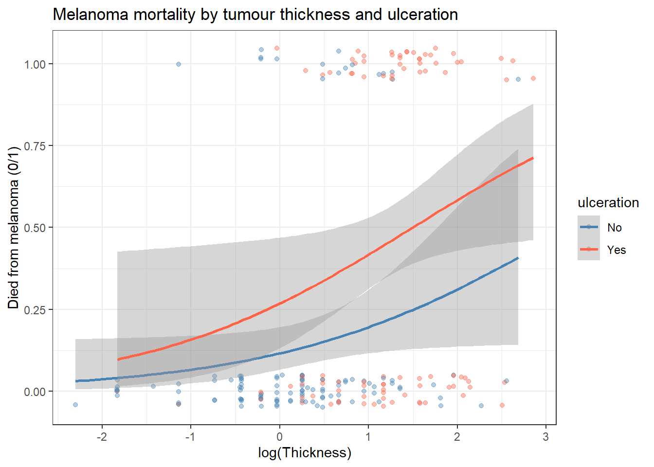
NoteWhere to Find Data Like This
PBC dataset: survival::pbc: binary mortality outcome with multiple continuous and categorical predictors.
boot::melanoma: Binary mortality with tumour characteristics; good for a smaller example.
MASS::birthwt: Low birth weight (binary) with maternal predictors, commonly used in logistic regression teaching.
medicaldata package: Multiple clean clinical trial datasets with binary outcomes.
13.7 What Can Go Wrong
Estimated time: ~10 minutes (reading)
Warning
Separation (complete or quasi-complete). If a predictor perfectly separates the outcome, the algorithm fails to converge and produces extreme coefficients with huge SEs. Check with a contingency table or histogram. Use Firth’s penalised logistic regression (logistf package) as a remedy.
Interpreting ORs as relative risks for common outcomes. When the outcome prevalence is > 15–20%, OR > RR substantially. If you report ORs, state them clearly and note that they do not equal relative risks.
Events per variable (EPV) rule of thumb. Logistic models require approximately 10–20 events per predictor variable for stable estimates. Our fit_multi model above has 156 deaths and 6 predictors (log_bili, log_proto, albumin, and three stage dummies), giving EPV ≈ 26 – comfortably above the rule of thumb. If you had a dataset with, say, 50 events and 6 predictors, EPV ≈ 8 would be borderline, and you would want to reduce predictors or use penalised methods. (Note that the unstable log_proto estimate we saw earlier was not an EPV problem – it was a scale problem, caused by the narrow real-world range of prothrombin time.)
Not checking calibration. A high C-statistic does not guarantee good calibration (that predicted probabilities match observed proportions). Use a calibration plot (val.prob() from the rms package) for clinical prediction models.
WarningCommon Misinterpretations
“OR = 3.13 means the risk is 3.13 times higher.” An odds ratio of 3.13 means the odds increased about 3-fold, not the risk. When the outcome is common (> 15% – and death occurs in 38% of this PBC sample), the OR substantially overestimates the relative risk. If you want relative risk, use a Poisson model with robust standard errors or a log-binomial model.
“C-statistic = 0.80 means my model is good.” The C-statistic measures discrimination: can the model rank a case above a non-case? It says nothing about calibration: are predicted probabilities accurate? A model can discriminate well but be badly miscalibrated. Always check both.
“My predictor has OR = 1.02, so it has no effect.” On the odds ratio scale, even small ORs can be meaningful for very common exposures. Conversely, a large OR for a rare predictor may have little population impact. Report the OR alongside the absolute risk change at clinically relevant predictor values.
“I adjusted for many variables so my result is unconfounded.” Adjusting for more variables does not automatically remove confounding. You can only adjust for confounders you measured. Unmeasured confounders remain a threat in all observational studies.
“Quasi-complete separation means my predictor is too good.” Separation causes coefficient inflation and numerical instability. It usually means you have too few events. Use Firth’s penalised logistic regression (logistf::logistf()).
NoteTeacher Note: True or False?
Pose these statements to learners (true/false, with justification):
- “An OR of 3.13 means patients with higher bilirubin are 3.13 times more likely to die.” (False – this confuses odds with probability/risk.)
- “A C-statistic of 0.825 means the model’s predicted probabilities are well calibrated.” (False – C-statistic measures discrimination, not calibration.)
- “Because
log_protohad OR ≈ 1523 infit_multi, prothrombin time is the most important predictor of death.” (False – the huge OR and CI spanning orders of magnitude signal an unstable, scale-dependent estimate, not a strong real effect.) - “Adding
stageto the model means we have fully adjusted for disease severity.” (False – we have adjusted for measured severity as captured by histologic stage; unmeasured aspects of severity could still confound.)
13.8 Exercises
NoteTeacher Note
Before learners run Exercise 1, ask them to predict: of log_bili, albumin, log_proto, and stage, which single predictor do they expect to have the strongest association with death (largest OR away from 1, smallest p-value)? After they run it, discuss why log_proto’s huge OR is misleading (same issue as in fit_multi above) even though it has the smallest p-value.
13.8.1 Exercise 1 (Guided): Univariable Predictors of Mortality
Estimated time: ~15 minutes (practice)
Using pbc:
- Fit separate logistic regressions for each of:
log_bili,albumin,log_proto,stage. - Report OR (95% CI) and p-value for each.
- Which single predictor has the largest OR?
TipExercise 1: Solution
predictors <- c("log_bili", "albumin", "log_proto")

results <- map_dfr(predictors, function(pred) {
  f <- as.formula(paste("died ~", pred))
  m <- glm(f, data = pbc, family = binomial)
  tidy(m, conf.int = TRUE, exponentiate = TRUE) %>%
    filter(term != "(Intercept)") %>%
    mutate(predictor = pred)
})

results %>%
  select(predictor, estimate, conf.low, conf.high, p.value) %>%
  arrange(p.value)
# A tibble: 3 × 5
predictor estimate conf.low conf.high p.value
<chr> <dbl> <dbl> <dbl> <dbl>
1 log_bili 3.13 2.45 4.09 2.41e-18
2 log_proto 43331. 2392. 986265. 3.39e-12
3 albumin 0.258 0.151 0.430 3.60e- 7fit_s <- glm(died ~ stage, data = pbc, family = binomial)
tidy(fit_s, conf.int = TRUE, exponentiate = TRUE)# A tibble: 4 × 7
term estimate std.error statistic p.value conf.low conf.high
<chr> <dbl> <dbl> <dbl> <dbl> <dbl> <dbl>
1 (Intercept) 0.111 0.745 -2.95 0.00320 0.0177 0.385
2 stageStage 2 3.00 0.783 1.40 0.161 0.783 19.8
3 stageStage 3 4.04 0.765 1.82 0.0682 1.11 26.0
4 stageStage 4 12.4 0.764 3.30 0.000969 3.42 80.2 Sorted by p-value, the univariable results are: log_proto (OR ≈ 43331, 95% CI: 2392–986265, p ≈ 3.4e-12), log_bili (OR ≈ 3.13, 95% CI: 2.45–4.09, p ≈ 2.4e-18), and albumin (OR ≈ 0.258, 95% CI: 0.151–0.430, p ≈ 3.6e-7 – albumin is protective, so higher albumin is associated with lower odds of death). By p-value alone, log_bili looks “strongest,” but log_proto’s astronomically large OR and CI are the same scale-instability problem flagged earlier, not evidence of a uniquely powerful predictor.
For fit_s (died ~ stage), only stageStage 4 is significant versus Stage 1 (OR ≈ 12.4, 95% CI: 3.42–80.2, p ≈ 0.001); stageStage 2 (OR ≈ 3.00, p ≈ 0.16) and stageStage 3 (OR ≈ 4.04, p ≈ 0.07) are not. This mirrors what we saw for stage inside fit_multi.
13.8.2 Exercise 2 (Semi-guided): Multivariable Melanoma Model
Estimated time: ~15 minutes (practice)
Using boot::melanoma:
- Fit a univariable model:
died ~ log_thick. - Add
ulceration. How does the OR for thickness change? - Add
sex. Is it a significant predictor? - Compare all three models by AIC.
TipExercise 2: Solution
m1 <- glm(died ~ log_thick,               data = mel, family = binomial)
m2 <- glm(died ~ log_thick + ulceration,  data = mel, family = binomial)
m3 <- glm(died ~ log_thick + ulceration + sex, data = mel, family = binomial)

bind_rows(
  tidy(m1, exponentiate = TRUE) %>% mutate(model = "1: thickness"),
  tidy(m2, exponentiate = TRUE) %>% mutate(model = "2: + ulceration"),
  tidy(m3, exponentiate = TRUE) %>% mutate(model = "3: + sex")
) %>%
  filter(term == "log_thick") %>%
  select(model, estimate, p.value)
# A tibble: 3 × 3
model estimate p.value
<chr> <dbl> <dbl>
1 1: thickness 2.53 0.00000336
2 2: + ulceration 1.91 0.00332
3 3: + sex 1.84 0.00591 AIC(m1, m2, m3) df AIC
m1 2 219.3203
m2 3 213.3625
m3 4 214.3350The OR for log_thick shrinks each time a new predictor is added: about 2.53 (model 1, p ≈ 3.4e-6) → about 1.91 (model 2, after adding ulceration, p ≈ 0.003) → about 1.84 (model 3, after adding sex, p ≈ 0.006). Thickness remains a significant predictor throughout, but part of its univariable association is shared with ulceration – thicker tumours are more likely to be ulcerated. Comparing AIC: model 1 ≈ 219.3, model 2 ≈ 213.4, model 3 ≈ 214.3. Adding ulceration improves the model (AIC drops by about 6), but adding sex on top makes AIC slightly worse (it rises by about 1), consistent with sexMale not being a significant predictor in fit_mel above (p ≈ 0.31). Model 2 is the best fit by AIC.
13.8.3 Exercise 3 (Open-ended)
Estimated time: 15–30 minutes (practice)
Using your own data, identify a binary outcome and at least two predictors. Fit a multivariable logistic regression. Report: ORs with 95% CIs, C-statistic, and a calibration check. Write a one-paragraph Methods section and a one-paragraph Results section as you would for a clinical paper.
13.9 Comprehension Check
Estimated time: ~10 minutes (self-test)
- You fit logistic regression and get a coefficient of 0.8 for log_bili. What is the odds ratio, and what does it mean?
- Your outcome occurs in 40% of the study sample. A colleague reports OR = 2.5 as “roughly a doubling of risk.” Is this correct?
- You have 30 events and want to include 8 predictors. What is the concern?
- C-statistic = 0.75. Is this a good model? What additional checks should you do?
- Your model fails to converge. The output shows a coefficient of 25 with SE = 1000 for one predictor. What is likely happening?
NoteAnswers
- OR = exp(0.8) = 2.23. Each one-unit increase in log(bilirubin) is associated with 2.23 times higher odds of the event (e.g., death), holding other predictors constant.
- No. When the outcome is common (40%), OR ≠ RR. OR = 2.5 for a 40% baseline corresponds to a RR considerably less than 2.5. The colleague is conflating the odds ratio with the risk ratio. Use the formula \(RR = OR / (1 - P_0 + P_0 \times OR)\) to convert.
- With EPV = 30/8 = 3.75, the model is severely underpowered. Coefficients will be unstable and confidence intervals very wide. Reduce the number of predictors to at most 2–3, or use Firth’s penalised logistic regression.
- C = 0.75 indicates moderate discrimination. However, a high C-statistic does not guarantee good calibration. Also produce a calibration plot (observed vs predicted proportions across deciles of risk) to confirm the model gives accurate probabilities.
- This is (quasi-)complete separation: the predictor almost perfectly predicts the outcome, so the algorithm tries to push the coefficient to ±∞ and fails. Check by tabulating the predictor against the outcome. Remedy: use Firth’s penalised logistic regression (
logistf::logistf()).
13.10 How to Report
Note
In a methods section: “Logistic regression was used to examine the association between [predictor] and [binary outcome]. Results are expressed as odds ratios (OR) with 95% confidence intervals. [Confounders] were included as covariates.”
In results: “Patients with [predictor level] had X-fold higher odds of [outcome] compared with [reference] (OR = X, 95% CI [L, U], p = Y).”
Always include:
- Odds ratio (OR): not the log-odds coefficient
- 95% CI for the OR
- Reference category (e.g., “compared with Stage 1”)
- Number of events and total sample size (e.g., “87 deaths among 312 patients”)
AUC/ROC: If you report a ROC curve, include AUC with 95% CI. Do not report only p-values without ORs and CIs.
13.11 Further Reading
- Hosmer, Lemeshow, and Sturdivant (2013): Applied Logistic Regression, the standard reference
- Bland (2015): Logistic regression in An Introduction to Medical Statistics
?glmin R: full documentation for generalised linear modelspROCpackage vignette for ROC analysislogistfpackage for Firth’s penalised logistic regression
Bland, Martin. 2015. An Introduction to Medical Statistics. 4th ed. Oxford University Press.
Hosmer, David W., Stanley Lemeshow, and Rodney X. Sturdivant. 2013. Applied Logistic Regression. 3rd ed. John Wiley & Sons.