2Describing Data: Distributions, Variance, and Normality
NoteSession at a Glance
Total core time: about 125 minutes (~2 hours).
Section
Time
Type
When Do You Use This? + Learning Objectives
5 min
Reading
Central Tendency: Mean, Median, Mode
10 min
Worked example
Spread: Range, IQR, Variance, and SD
15 min
Worked example
The Normal Distribution and the Shape of Data
15 min
Reading
Assessing Normality
15 min
Worked example
“Normalize” Demystified: Transform, Standardize, or Scale?
20 min
Worked example
What Can Go Wrong
10 min
Reading
Exercises 1 & 2
25 min
Practice
Comprehension Check
10 min
Self-test
This is the foundation chapter for everything that follows. If you are short on time, the two sections that pay off most across the rest of the course are Spread: Variance and SD and “Normalize” Demystified – those concepts reappear in every inference and regression session. Exercise 3 is open-ended and works best later, using your own data.
TipHow to Use the Code in This Session
Every code chunk below is written so you can copy it into your R console (or an R script) and run it yourself, in the order shown. Where you see a “Run It Yourself” box, stop and run the code above it before reading the explanation that follows.
2.1 When Do You Use This?
Tip
Before you run a single test, you have to describe your data: where is the centre, how spread out is it, what shape is it, and does that shape matter for the method you are about to use? Every later session – t-tests, ANOVA, regression – quietly assumes you can already do this. A reviewer asks “why did you report the median instead of the mean?” or “did you check normality?” or “why did you log-transform?” This session is where those answers come from.
NoteTeacher Note
Ask the room what the “average” income of a country is, then what the “typical” person earns. The gap between those two questions – mean pulled up by a few billionaires, median describing the typical person – is the entire intuition behind skew, and it motivates everything in this session before any formula appears. Keep a right-skewed variable (here, bilirubin) and a roughly symmetric one (albumin) side by side throughout.
2.2 Learning Objectives
After completing this session you will be able to:
Choose between the mean and the median based on the shape of the data
Explain what variance and standard deviation actually measure, and read them in the units of your data
Recognise the normal distribution and use the 68–95–99.7 rule
Assess normality with histograms, Q-Q plots, and the Shapiro–Wilk test – and know why the test alone can mislead you
Tell apart the three things people call “normalising” – transforming, standardising, and min–max scaling – and decide when to do each (and when not to)
2.3 Central Tendency: Mean, Median, Mode
Estimated time: ~10 minutes (worked example)
Three numbers claim to describe “the centre”:
Mean – the arithmetic average. Uses every value, but a few extreme values drag it around.
Median – the middle value when sorted. Half the data sit below it. Unmoved by extreme values (it is resistant).
Mode – the most common value. Mostly useful for categories, rarely for continuous measurements.
We will use two variables from the PBC liver-disease dataset throughout: serum bilirubin (a waste product that rises in liver disease) and serum albumin (a protein that falls in liver disease).
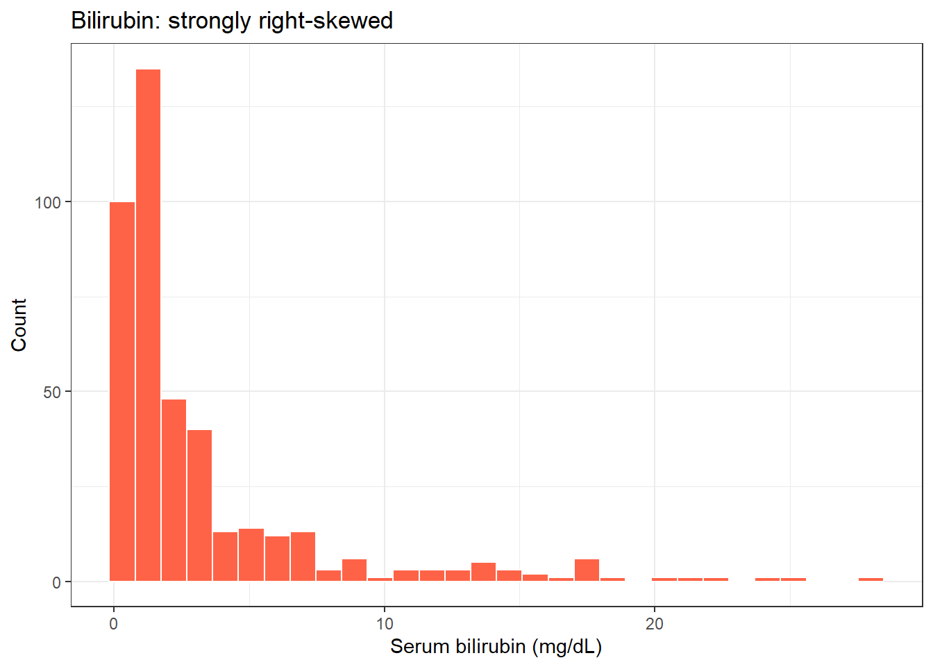
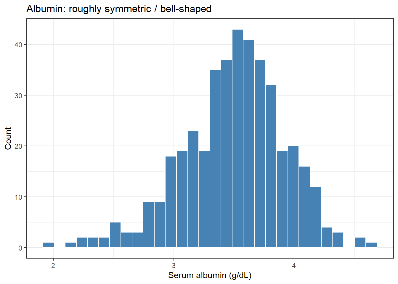
Run the chunk above. For bilirubin, the mean is about 3.22 mg/dL but the median is only 1.40 – the mean is more than double the median. That gap is the signature of right skew: a long tail of high-bilirubin patients pulls the mean up, while the median stays put at the typical patient. For albumin, the mean (3.50 g/dL) and median (3.53) are almost identical – the hallmark of a roughly symmetric variable.
The rule: when mean and median disagree, the data are skewed and the median is the more honest summary of “typical”. When they agree, either is fine.
2.4 Spread: Range, IQR, Variance, and SD
Estimated time: ~15 minutes (worked example)
The centre is only half the story. Two groups can share a mean and look nothing alike if one is tightly clustered and the other widely scattered. Four measures of spread, from crudest to most useful:
Range = max − min. One outlier and it is meaningless.
IQR (interquartile range) = the spread of the middle 50% (75th − 25th percentile). Resistant, like the median.
Variance = the average squared distance from the mean.
Standard deviation (SD) = the square root of the variance.
What variance actually is. Take each value, subtract the mean to get its deviation, square that deviation (so positives and negatives do not cancel, and big deviations count for much more), then average those squared deviations. Squaring is what makes variance work – and also what makes it hard to read, because the units are squared (mg/dL² for bilirubin, which means nothing physical). The standard deviation fixes that by taking the square root, landing back in the original units. That is why you report SD, not variance: SD is “the typical distance of a value from the mean”, in the data’s own units.
Run the chunk above. Bilirubin’s variance is about 19.4 – but 19.4 what? Squared mg/dL, a unit with no physical meaning. Its SD is 4.41 mg/dL, which does mean something: bilirubin values typically sit about 4.4 mg/dL away from their mean. Albumin’s SD is just 0.43 g/dL – a much tighter variable.
Notice the SD (4.41) for bilirubin is actually larger than the mean (3.22). That is only possible for a strongly skewed, all-positive variable, and it is another red flag that the mean and SD are a poor summary here – the IQR (2.60) and median describe it far better.
2.5 The Normal Distribution and the Shape of Data
Estimated time: ~15 minutes (reading)
A histogram shows the shape of a variable – where values pile up and how the tails behave. The most important shape in statistics is the normal distribution: the symmetric “bell curve”. It matters not because real data are always normal (they often are not), but because the mathematics of many methods (t-tests, regression, confidence intervals) is built on it.
ggplot(pbc, aes(bili)) +geom_histogram(bins =30, fill ="tomato", colour ="white") +labs(title ="Bilirubin: strongly right-skewed",x ="Serum bilirubin (mg/dL)", y ="Count") +theme_bw()
ggplot(pbc, aes(albumin)) +geom_histogram(bins =30, fill ="steelblue", colour ="white") +labs(title ="Albumin: roughly symmetric / bell-shaped",x ="Serum albumin (g/dL)", y ="Count") +theme_bw()
The 68–95–99.7 rule. For a normal distribution, about 68% of values lie within 1 SD of the mean, 95% within 2 SD, and 99.7% within 3 SD. This is what makes the SD so useful: it is a ruler for “how unusual is this value?”
Run the chunk above. For albumin, 68.4% of patients fall within 1 SD of the mean and 94.7% within 2 SD – almost exactly the 68% and 95% the rule predicts. That is strong evidence albumin is close to normal. Try the same two lines on pbc$bili: the percentages will not match, because the rule only holds for roughly normal data, and bilirubin is far from it.
Skewness is the one-number summary of asymmetry: 0 is symmetric, positive means a long right tail (bilirubin, skew ≈ 2.7), negative means a long left tail (albumin, skew ≈ −0.5, only mildly asymmetric).
2.6 Assessing Normality
Estimated time: ~15 minutes (worked example)
You have three tools, in order of usefulness:
Histogram – is it roughly bell-shaped and symmetric?
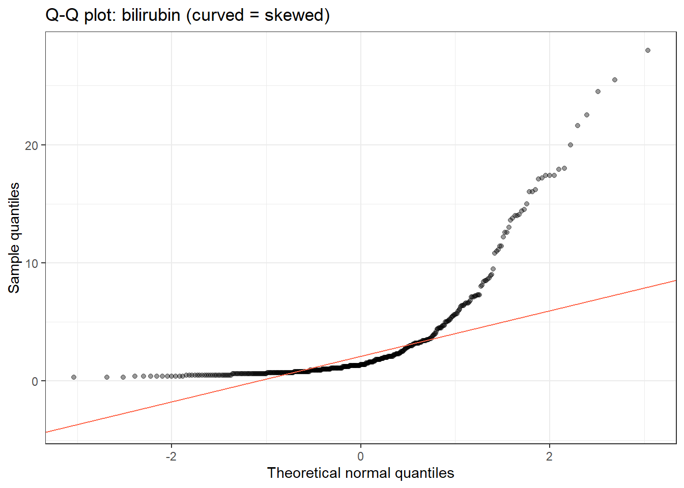
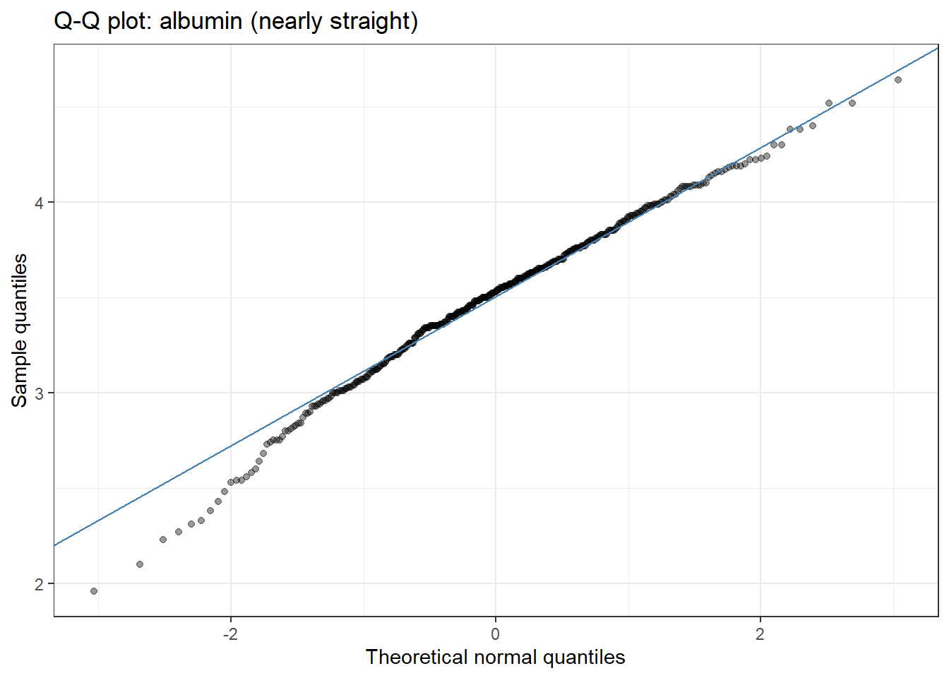
Q-Q plot – the single best check. It plots your sorted data against the values a perfect normal distribution would produce. If the data are normal, the points fall on the straight diagonal line. Systematic curves away from the line – especially at the ends – reveal skew or heavy tails.
Shapiro–Wilk test – a formal hypothesis test where the null is “the data are normal”. A small p-value rejects normality.
ggplot(pbc, aes(sample = albumin)) +stat_qq(alpha =0.4) +stat_qq_line(colour ="steelblue") +labs(title ="Q-Q plot: albumin (nearly straight)",x ="Theoretical normal quantiles", y ="Sample quantiles") +theme_bw()
shapiro.test(pbc$bili)
    Shapiro-Wilk normality test

data:  pbc$bili
W = 0.63197, p-value < 2.2e-16
shapiro.test(pbc$albumin)
    Shapiro-Wilk normality test

data:  pbc$albumin
W = 0.98652, p-value = 0.0006387
WarningRun It Yourself – the most important caveat in this session
Run the chunk above. Bilirubin’s Q-Q plot curves dramatically away from the line and Shapiro–Wilk gives a vanishingly small p-value – both agree it is not normal. No surprise.
But look at albumin: the histogram is bell-shaped, the Q-Q plot is nearly straight, and 68/95 held almost perfectly – yet Shapiro–Wilk returns p ≈ 0.0006 and “rejects” normality. Is albumin not normal after all? It is normal enough for any practical purpose. The catch is sample size: with 418 patients, Shapiro–Wilk has so much statistical power that it detects the tiniest, harmless deviation (albumin’s mild −0.5 skew) and flags it as “significant”.
The lesson: at large n, Shapiro–Wilk almost always says “not normal”, and at small n it almost never does – so it is least useful exactly when you most want an answer. Judge normality by the Q-Q plot and whether the deviation is big enough to matter, not by the p-value. And remember what needs to be normal: for regression it is the residuals, not the raw outcome (see Section 11.1).
2.7 “Normalize” Demystified: Transform, Standardize, or Scale?
Estimated time: ~20 minutes (worked example)
“You should normalise your data” is one of the most confusing pieces of advice in statistics, because the word means three completely different things. Sort out which one is meant before you touch your data.
2.7.1 1. Transform to normality (e.g. log)
Replace each value with its logarithm (or square root). This changes the shape – it pulls in a long right tail and can turn skewed, positive data into something roughly normal. Use it on right-skewed positive variables (concentrations, counts, biomarkers, costs).
exp(mean(pbc$log_bili)) # geometric mean, back on the original scale
[1] 1.77091
TipRun It Yourself
Run the chunk above. Logging bilirubin drops its skew from 2.70 to 0.66 – from severely skewed to nearly symmetric. But the transform changes the interpretation: the mean of the logs, back-transformed, is the geometric mean (≈ 1.77 mg/dL), a multiplicative “typical value” close to the median, not the ordinary arithmetic mean. When you log-transform, you analyse and report on the multiplicative scale, and that is a feature, not a bug, for this kind of data.
2.7.2 2. Standardize (z-score)
Subtract the mean and divide by the SD. Every value becomes “how many SDs from the mean am I?” The result has mean 0 and SD 1. This does not change the shape at all – a skewed variable stays exactly as skewed – it only changes the scale.
Use standardising when you need variables on a common scale: to compare regression coefficients of predictors measured in different units, for methods that are scale-sensitive (PCA, penalised regression such as glmnet, k-nearest neighbours), or to express a value as a z-score.
2.7.3 3. Min–max scaling (0–1)
Rescale so the smallest value becomes 0 and the largest becomes 1. Common as a pre-processing step for some machine-learning inputs. Like standardising, it changes scale, not shape.
   Min. 1st Qu.  Median    Mean 3rd Qu.    Max.
 0.0000  0.4785  0.5858  0.5737  0.6754  1.0000
ImportantWhen NOT to “normalize”
Do not transform just because Shapiro–Wilk is significant. As we saw, at large n it flags harmless deviations. Transform only when the skew is real and large enough to distort your analysis.
The Central Limit Theorem often makes it unnecessary. Tests about means (t-tests, regression) rely on the sampling distribution of the mean being normal, which the CLT delivers in large samples even when the raw data are skewed (see Section 3.1). The raw variable does not have to be normal.
Standardising does not fix skew. If your problem is shape, a z-score will not help – only a transform changes shape.
Transforming costs interpretability. A coefficient “per mg/dL” becomes “per log-unit”. Only pay that price when you gain something real.
In regression, it is the residuals that must be normal, not the predictors or the raw outcome (Section 11.1). Don’t transform a predictor just because its own histogram is skewed.
2.8 What Can Go Wrong
Warning
Reporting the mean for skewed data. A mean income, mean bilirubin, or mean length-of-stay can be wildly unrepresentative when the data are right-skewed. Report median [IQR] for skewed variables and mean (SD) for symmetric ones.
Confusing variance and SD. Variance is in squared units and is for calculation; SD is in the original units and is for interpretation and reporting.
Trusting a normality test over your eyes. A “significant” Shapiro–Wilk at large n does not mean your data are unusable, and a non-significant one at small n does not prove normality. The Q-Q plot is the better guide.
Calling everything “normalisation”. Transforming, standardising, and min–max scaling do different jobs. Saying “I normalised the data” tells a reader nothing – state exactly which one you did and why.
Standardising to fix skew. A z-score recentres and rescales but leaves the shape untouched. It is not a substitute for a transform.
2.9 Exercises
NoteTeacher Note
Exercise 1 builds the mean-vs-median intuition on a fresh variable; Exercise 2 forces the Q-Q-plot-vs-Shapiro judgement that trips up most learners. Encourage people to predict the shape from the mean/median gap before they plot, then check themselves.
2.9.1 Exercise 1 (Guided): Describe a Variable
Estimated time: ~10 minutes (Practice)
Using pbc, describe serum cholesterol (chol, which has some missing values).
Compute its mean and median (use na.rm = TRUE). Which is larger? What does that tell you about the shape?
Compute its SD and IQR.
Based only on the mean-vs-median gap, predict: skewed or symmetric?
# A tibble: 1 × 4
   mean median    sd   iqr
  <dbl>  <dbl> <dbl> <dbl>
1  370.   310.  232.  150.
NoteExercise 1: Solution
The mean (≈ 370) is far above the median (≈ 310), so cholesterol is right-skewed – a long tail of high-cholesterol patients. The SD (≈ 230) is large relative to the IQR, confirming a few extreme values inflate the spread. For reporting, median [IQR] is the honest summary, and if you needed to model chol you would consider a log transform.
2.9.2 Exercise 2 (Semi-guided): Assess Normality and Decide
Estimated time: ~15 minutes (Practice)
The variable protime (prothrombin time) is mildly right-skewed.
Draw a histogram and a Q-Q plot of protime.
Run shapiro.test(pbc$protime).
Create log(protime) and repeat the Q-Q plot.
Decide: does protime need transforming for a method that assumes normality? Justify your answer from the plots, not just the p-value.
NoteExercise 2: Solution
Shapiro–Wilk will reject normality for protime (n is large, and there is a real right skew plus a few high values). The Q-Q plot shows points lifting away from the line in the upper tail. Logging helps but does not fully straighten it, because a handful of very high values dominate. Judgement: the skew is modest; for a t-test or regression on a sample this size the CLT protects the inference, so transforming is optional and mostly cosmetic. This is the opposite of bilirubin, where the skew is severe enough that a transform genuinely matters. The point of the exercise is that “Shapiro said no” is not, by itself, a reason to transform.
2.9.3 Exercise 3 (Open-ended): Your Own Data
Estimated time: 15–30 minutes (Practice)
Take a continuous variable from your own research. Report its mean, median, SD, and IQR; draw a histogram and Q-Q plot; decide whether it is close enough to normal for your planned analysis; and if not, decide whether to transform, standardise, both, or neither – and write one sentence justifying the choice.
2.10 Comprehension Check
Estimated time: ~10 minutes (Self-test)
A variable has mean 50 and median 30. Is it skewed, and if so, which way? Which would you report?
Bilirubin’s variance is about 19.4 and its SD about 4.41. Which of these would you put in a results table, and why?
You have 2,000 observations and Shapiro–Wilk gives p < 0.001, but the Q-Q plot is almost perfectly straight. Are the data usable as “normal”? Explain.
What is the difference between standardising (z-score) and transforming (log) a variable? Which one changes the shape of the distribution?
A colleague log-transformed a right-skewed biomarker, then reports “the mean of the logged values was 0.57”. What is the more interpretable way to report the centre on the original scale?
NoteAnswers
Right-skewed (mean above median means a long right tail). Report the median – the mean is inflated by the tail.
The SD (4.41 mg/dL). Variance is in squared units (mg/dL²) with no physical meaning; SD is in the data’s own units and reads as “typical distance from the mean”.
Yes, treat them as normal. At n = 2,000 Shapiro–Wilk detects trivial deviations and will almost always be “significant”. A straight Q-Q plot is the stronger evidence; the p-value here reflects sample size, not a meaningful departure.
Standardising subtracts the mean and divides by the SD – it changes the scale (to mean 0, SD 1) but leaves the shape identical. Transforming (log) changes the shape, pulling in a skewed tail. Only the transform changes shape.
Back-transform: exp(0.57) ≈ 1.77, the geometric mean, on the original scale. It sits near the median and is a far more interpretable “typical value” than the mean of the logs.
2.11 How to Report
NoteReporting Descriptive Statistics
Symmetric variable: report mean (SD) – e.g. “albumin 3.50 (0.43) g/dL”.
Skewed variable: report median [IQR] – e.g. “bilirubin 1.40 [0.80–3.40] mg/dL”. Reporting a mean (SD) here would mislead.
State any transformation and why, and report results on an interpretable scale: “Bilirubin was log-transformed for analysis because of strong right skew; results are presented as geometric means.”
Do not report a Shapiro–Wilk p-value as your sole justification for a transform. “We assessed normality with Q-Q plots” is the defensible phrasing.
In a Methods section:
“Continuous variables are summarised as mean (SD) when approximately symmetric and median [IQR] when skewed. Normality was assessed visually with Q-Q plots. Serum bilirubin was log-transformed prior to analyses assuming normality.”
2.12 Further Reading
Spiegelhalter (2019): The Art of Statistics – distributions, summaries, and what they hide, with no formulae
Wickham, Çetinkaya-Rundel, and Grolemund (2023): R for Data Science (2nd ed.) – the exploratory data analysis chapter on describing distributions in R
Wickham, Hadley, Mine Çetinkaya-Rundel, and Garrett Grolemund. 2023. R for Data Science: Import, Tidy, Transform, Visualize, and Model Data. 2nd ed. O’Reilly Media, Inc. https://r4ds.hadley.nz/.