pbc <- survival::pbc %>%
  as_tibble() %>%
  clean_names() %>%
  filter(!is.na(albumin), !is.na(bili)) %>%
mutate(log_bili = log(bili))11 Simple Linear Regression
NoteSession at a Glance
Total core time: ~130 minutes, plus exercises.
| Section | Time | Type |
|---|---|---|
| When Do You Use This? + Learning Objectives | ~5 min | reading |
| The Key Idea: From Correlation to Prediction | ~10 min | reading/discussion |
| Background: The Linear Model | ~15 min | reading |
| Example 1: Clinical Data (PBC) | ~30 min | code-along |
| Example 2: Animal Data (palmerpenguins) | ~20 min | code-along |
| What Can Go Wrong | ~10 min | reading |
| Exercises 1 & 2 | ~30 min | guided practice |
| Comprehension Check | ~10 min | self-test |
If you are short on time, the two worked examples (Example 1 and Example 2) are the heart of the session. Exercise 3 is open-ended and can be assigned as take-home work rather than completed live.
TipHow to Use the Code in This Session
Every code chunk below is written so you can copy it into your R console (or an R script) and run it yourself, in the order shown. Where you see a “Run It Yourself” box, stop and run the code above it before reading the explanation that follows.
11.1 When Do You Use This?
Tip
You have a continuous outcome and a continuous predictor, and you want to quantify how much the outcome changes per unit increase in the predictor, and test whether that relationship is statistically meaningful. Simple linear regression gives you a straight-line model with an estimated slope and its confidence interval. For example: predicting albumin from bilirubin, or estimating how body mass changes with flipper length in penguins.
NoteTeacher Note
Ask the room: “Suppose you already know two variables are correlated (r = 0.6). What extra information does a regression slope give you that the correlation coefficient does not?” Steer toward: units and magnitude – “albumin drops by X g/dL per unit increase in log(bilirubin)” is something you can act on; “r = 0.6” on its own is not.
11.2 Learning Objectives
After completing this session you will be able to:
- Fit a simple linear regression model with
lm()in R - Interpret the intercept, slope, standard error, and \(R^2\)
- Check the four key regression assumptions using ggplot diagnostic plots
- Extract and present results with
broom::tidy()andbroom::glance() - Predict new values with
predict()and plot the regression line with uncertainty
11.3 The Key Idea: From Correlation to Prediction
Estimated time: ~10 minutes (reading/discussion)
In the correlation session we measured whether two variables are related. Linear regression goes further: it tells you how much one variable changes when the other increases by one unit, and it gives you a confidence interval for that change.
The key quantity is the slope (\(\beta_1\)): “for every one-unit increase in X, Y changes by \(\beta_1\) units, on average.” That is the number you will quote in a paper, a grant, or a presentation, not r, not R², but the slope with its uncertainty.
11.4 Background: The Linear Model
Estimated time: ~15 minutes (reading)
A simple linear regression models the relationship between a continuous outcome \(Y\) and a single predictor \(X\):
\[Y_i = \beta_0 + \beta_1 X_i + \varepsilon_i \quad \varepsilon_i \sim N(0, \sigma^2)\]
- \(\beta_0\): intercept: the expected value of \(Y\) when \(X = 0\)
- \(\beta_1\): slope: the expected change in \(Y\) for a one-unit increase in \(X\)
- \(\varepsilon_i\): residual: what the model does not explain
The model is fitted by minimising the sum of squared residuals (ordinary least squares, OLS).
Assumptions (LINE):
| Assumption | How to check |
|---|---|
| Linearity | Residuals vs fitted plot → no pattern |
| Independence | Study design → cannot check from data alone |
| Normality of residuals | QQ-plot of residuals |
| Equal variance (homoscedasticity) | Residuals vs fitted → no funnel shape |
11.5 Example 1: Clinical Data (PBC)
Estimated time: ~30 minutes (code-along)
NoteTeacher Note
Before running the model, ask learners to predict: do they expect the slope of albumin on log(bilirubin) to be positive or negative, and roughly how strong (in R² terms) do they expect the relationship to be? Most will correctly guess “negative” (sicker liver -> higher bilirubin, lower albumin), but few will guess that a single biomarker explains only around 10–15% of the variance in another. This sets up the “Is this R² any good?” discussion later in the example.
11.5.1 Predict Albumin from Log(Bilirubin)
Bilirubin is right-skewed; we log-transform it to achieve a more linear relationship with albumin.
Always plot first:
pbc %>%
  ggplot(aes(x = log_bili, y = albumin)) +
  geom_point(alpha = 0.4, size = 1.5) +
  geom_smooth(method = "lm", colour = "tomato", se = TRUE) +
  labs(title = "Albumin vs log(bilirubin) in PBC",
       x = "log(Bilirubin)", y = "Albumin (g/dL)") +
  theme_bw()
`geom_smooth()` using formula = 'y ~ x'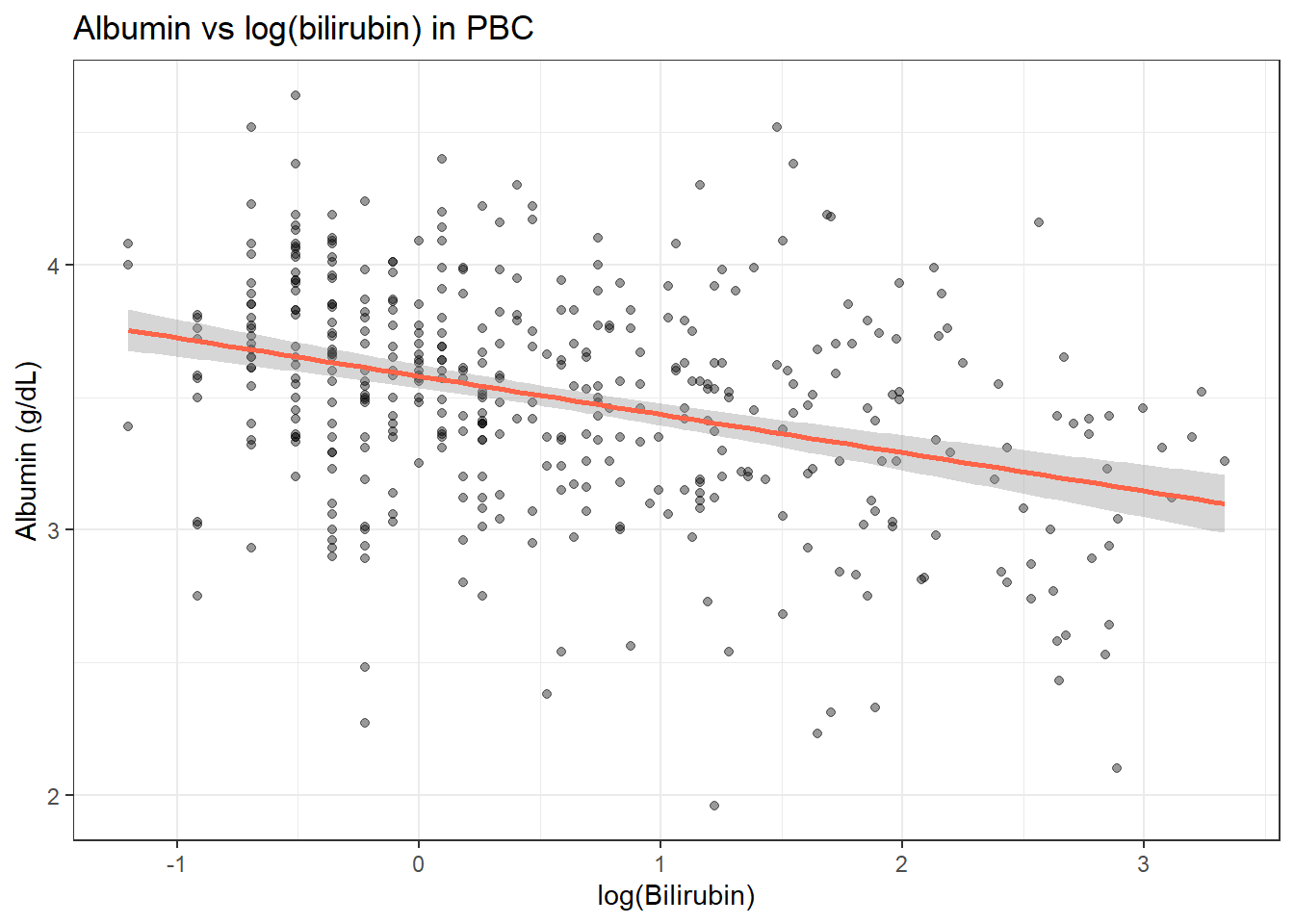
fit <- lm(albumin ~ log_bili, data = pbc)
summary(fit)
Call:
lm(formula = albumin ~ log_bili, data = pbc)

Residuals:
     Min       1Q   Median       3Q      Max
-1.44320 -0.23335  0.02731  0.24894  1.15405

Coefficients:
            Estimate Std. Error t value Pr(>|t|)
(Intercept)  3.58001    0.02235 160.180  < 2e-16 ***
log_bili    -0.14447    0.01908  -7.572 2.39e-13 ***
---
Signif. codes:  0 '***' 0.001 '**' 0.01 '*' 0.05 '.' 0.1 ' ' 1

Residual standard error: 0.3989 on 416 degrees of freedom
Multiple R-squared:  0.1211,    Adjusted R-squared:  0.119
F-statistic: 57.34 on 1 and 416 DF,  p-value: 2.391e-13
NoteReading the
summary() Output: Line by Line
When you run summary(fit), R prints several blocks. Here is what each one means.
Call: Just echoes back the formula you used: albumin ~ log_bili. Confirms R fitted the right model.
Residuals:
Min      1Q  Median      3Q     Max
-1.44   -0.23   0.03    0.25    1.15
These are the differences between each patient’s observed albumin and the model’s prediction. Ideally: - The Median should be close to 0 (no systematic over- or under-prediction) - The Min and Max should be roughly symmetric: if the biggest error is +1.15 and smallest is -1.44, that is reasonably balanced - Very large Max or very negative Min suggests outliers
Coefficients: table
              Estimate Std. Error t value Pr(>|t|)
(Intercept)   3.58      0.02      160.2   <2e-16 ***
log_bili -0.14 0.02 -7.57 2.39e-13 ***| Column | What it means |
|---|---|
| Estimate | The fitted value of the coefficient: the slope or intercept |
| Std. Error | How uncertain the estimate is: smaller is more precise |
| t value | Estimate / Std. Error: how many standard errors away from zero |
| Pr(>|t|) | p-value: probability of seeing a t-value this large if the true slope were zero |
| Stars (***) | Shorthand: *** = p < 0.001, ** = p < 0.01, * = p < 0.05, . = p < 0.1 |
Residual standard error: 0.40 on 416 degrees of freedom The typical size of a prediction error. On average, the model’s albumin prediction is off by about 0.40 g/dL. Degrees of freedom = observations minus parameters estimated (418 − 2 = 416).
Multiple R-squared: 0.12 Log(bilirubin) explains about 12% of the variability in albumin. The remaining 88% is explained by other factors not in this model.
Adjusted R-squared: 0.12 Almost the same here because we have one predictor. It drops relative to R² if many predictors are uninformative. Prefer adjusted R² when comparing models.
F-statistic: 57.3 on 1 and 416 DF, p-value: 2.39e-13 Tests whether the whole model explains significantly more variance than just predicting the mean for everyone. With one predictor, this is equivalent to the t-test on the slope.
TipRun It Yourself
Run the fit-lm chunk above. You should see (Intercept) = 3.58 and log_bili = -0.14 in the coefficients table, a residual standard error of about 0.40, and Multiple R-squared: 0.12. Does the sign of the slope match what you predicted in the Teacher Note before this example?
11.5.2 Interpreting the Output
tidy(fit, conf.int = TRUE)# A tibble: 2 × 7
term estimate std.error statistic p.value conf.low conf.high
<chr> <dbl> <dbl> <dbl> <dbl> <dbl> <dbl>
1 (Intercept) 3.58 0.0223 160. 0 3.54 3.62
2 log_bili -0.144 0.0191 -7.57 2.39e-13 -0.182 -0.107glance(fit)# A tibble: 1 × 12
r.squared adj.r.squared sigma statistic p.value df logLik AIC BIC
<dbl> <dbl> <dbl> <dbl> <dbl> <dbl> <dbl> <dbl> <dbl>
1 0.121 0.119 0.399 57.3 2.39e-13 1 -208. 422. 434.
# ℹ 3 more variables: deviance <dbl>, df.residual <int>, nobs <int>Reading the coefficients:
- Intercept (3.58): Expected albumin when log(bilirubin) = 0, i.e., bilirubin = 1 mg/dL, is 3.58 g/dL.
- Slope (−0.14): For each one-unit increase in log(bilirubin), albumin decreases by 0.14 g/dL on average.
- R² (0.12): Log(bilirubin) explains about 12% of the variability in albumin.
TipWhat Does This Actually Tell Us?
Translate the numbers into a scientific sentence before you report anything:
“In PBC patients, higher bilirubin is associated with lower albumin. For every approximate 2.7-fold increase in bilirubin (one unit on the log scale), albumin is on average 0.14 g/dL lower (95% CI: −0.18 to −0.11, p < 0.001). Log(bilirubin) explains about 12% of the variability in albumin across patients.”
Notice:
- You state the direction (lower albumin)
- You give the magnitude (0.14 g/dL)
- You give the uncertainty (95% CI)
- You give the p-value, but note it only tells you the effect is unlikely to be zero, not that it is large or clinically important
- You give R² to indicate how much of the outcome this one predictor explains
Is 12% a good R²? In clinical and biological data, a single biomarker rarely explains more than 20–30% of an outcome: there are too many other factors involved. R² = 0.12 is realistic for a single biomarker: log(bilirubin) alone leaves 88% of the variation in albumin unexplained, which is expected. R² of 0.90+ is typical in physics or engineering, not medicine.
11.5.3 Checking Assumptions
We use broom::augment() to extract residuals and fitted values, then plot with ggplot, consistent with the rest of the course.
aug <- augment(fit)

ggplot(aug, aes(x = .fitted, y = .resid)) +
  geom_point(alpha = 0.4) +
  geom_hline(yintercept = 0, linetype = "dashed", colour = "grey50") +
  geom_smooth(method = "loess", colour = "tomato", se = FALSE) +
  labs(x = "Fitted values", y = "Residuals", title = "Residuals vs Fitted") +
  theme_bw()
`geom_smooth()` using formula = 'y ~ x'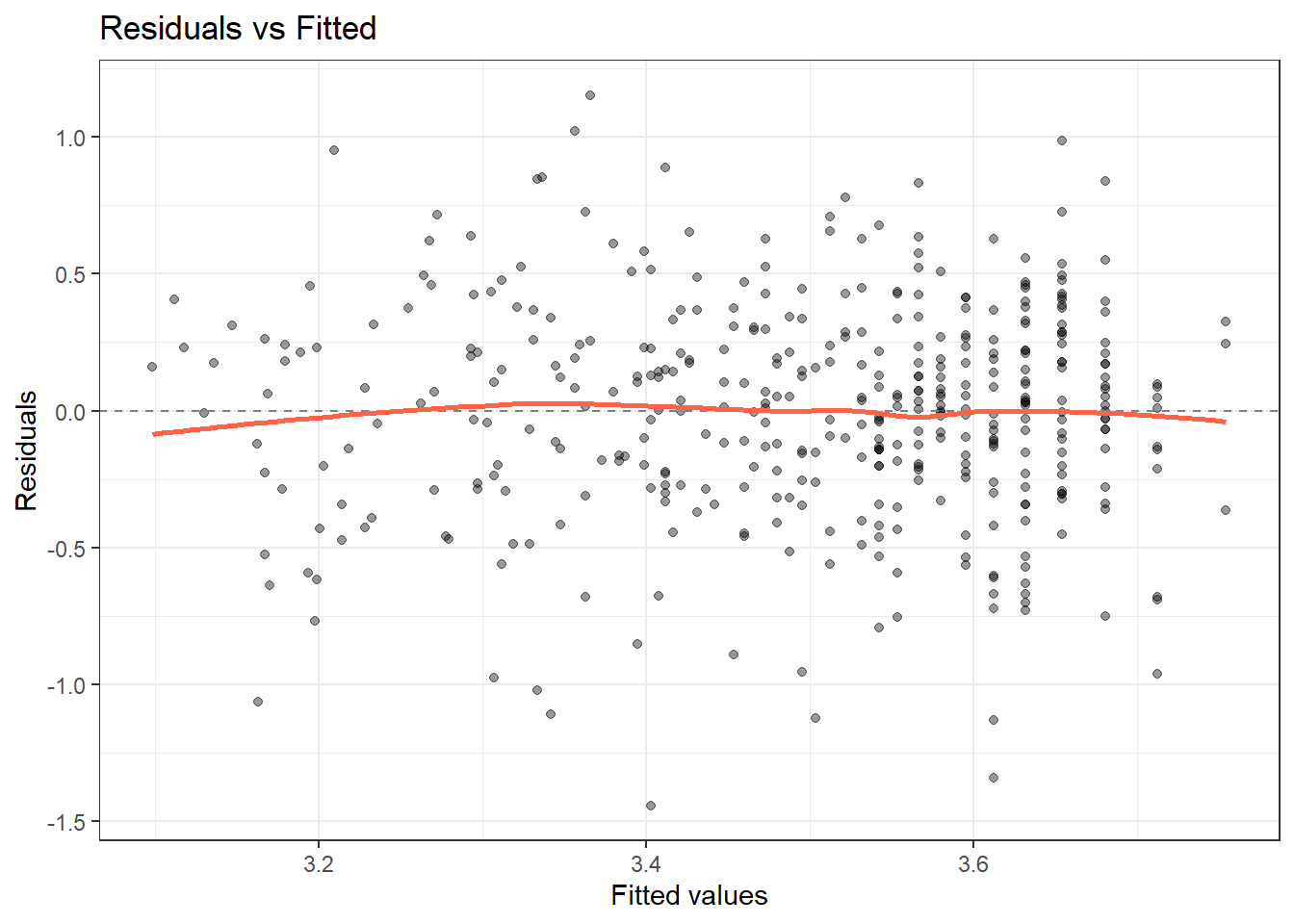
ggplot(aug, aes(sample = .std.resid)) +
  stat_qq() + stat_qq_line(colour = "tomato") +
  labs(x = "Theoretical quantiles", y = "Standardised residuals",
       title = "Normal Q-Q") +
  theme_bw()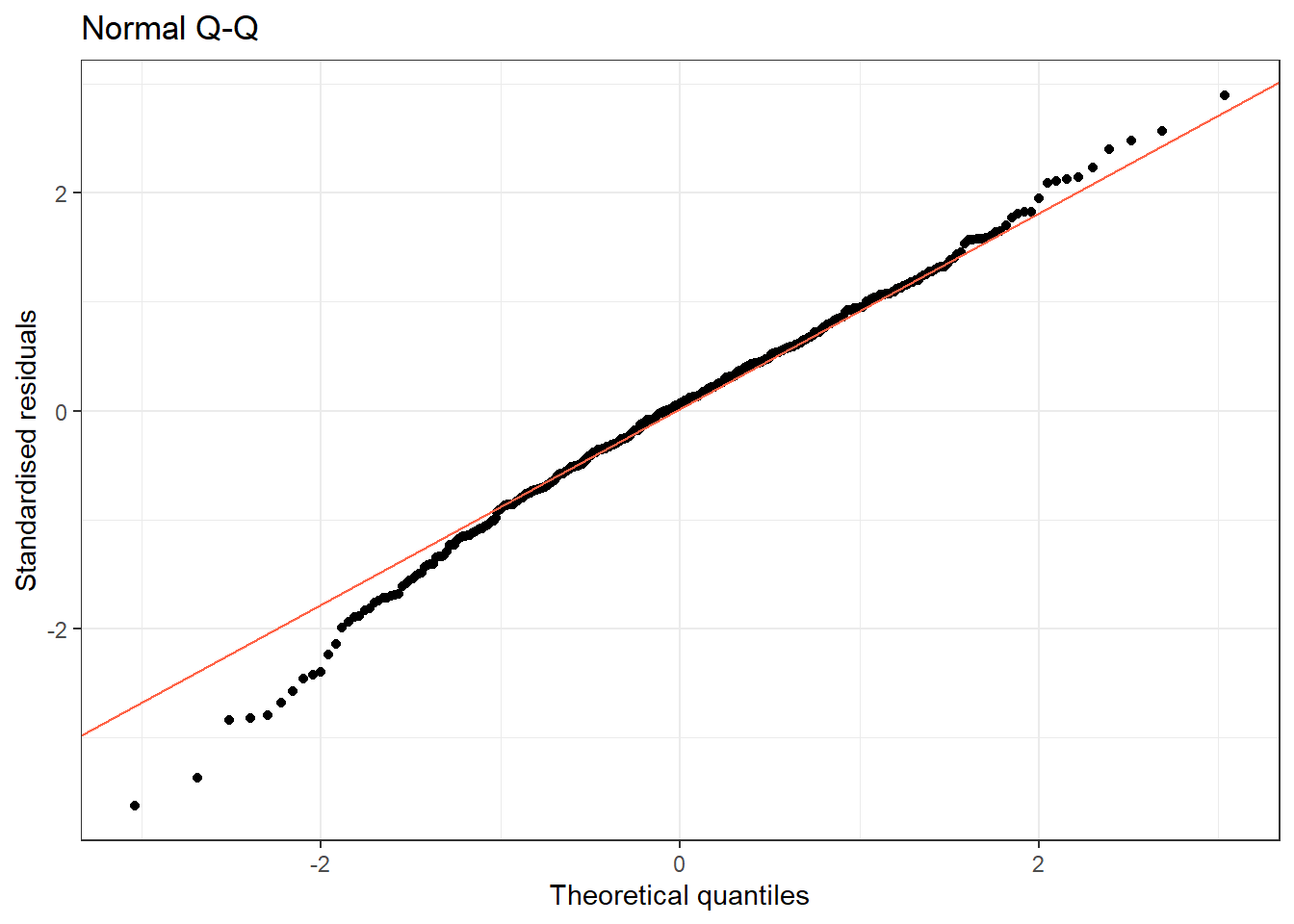
NoteHow to Read These Diagnostic Plots
Residuals vs Fitted You are looking for a flat, horizontal cloud of points with no pattern.
- ✓ Good: Points scattered randomly around zero, no trend.
- ✗ Bad (U-shape or arc): The relationship is non-linear; try log-transforming X.
- ✗ Bad (funnel shape): Variance increases with fitted values (heteroscedasticity); try log-transforming Y.
Normal Q-Q You are checking whether residuals follow a normal distribution.
- ✓ Good: Points follow the diagonal line closely.
- ✗ Bad (S-curve): Residuals are skewed.
- ✗ Bad (heavy tails): More extreme values than expected; mild deviation is usually acceptable for large samples.
11.5.4 Predictions
new_data <- tibble(log_bili = log(c(2, 5, 10)))
predict(fit, newdata = new_data, interval = "confidence")
fit lwr upr
1 3.479864 3.441244 3.518485
2 3.347484 3.292840 3.402128
3 3.247342 3.171939 3.322745
TipRun It Yourself
Run the chunk above. For bilirubin = 2, 5, and 10 mg/dL, the model predicts albumin of about 3.48, 3.35, and 3.25 g/dL respectively, with narrow confidence intervals because all three values are well within the range of observed bilirubin. Notice the predicted albumin keeps dropping as bilirubin rises, but more slowly each time, because the predictor is log(bilirubin): equal ratios of bilirubin (2 to 5 is roughly the same ratio as 5 to 12.5) produce roughly equal drops in albumin.
pred_df <- tibble(
  log_bili = seq(min(pbc$log_bili), max(pbc$log_bili), length.out = 100)
)
pred_df <- bind_cols(pred_df,
                     as_tibble(predict(fit, newdata = pred_df, interval = "prediction")))

pbc %>%
  ggplot(aes(x = log_bili, y = albumin)) +
  geom_ribbon(data = pred_df, aes(y = fit, ymin = lwr, ymax = upr),
              alpha = 0.15, fill = "steelblue") +
  geom_line(data = pred_df, aes(y = fit), colour = "steelblue", linewidth = 1) +
  geom_point(alpha = 0.3, size = 1.5) +
  labs(title = "Linear regression with 95% prediction interval",
       x = "log(Bilirubin)", y = "Albumin (g/dL)") +
  theme_bw()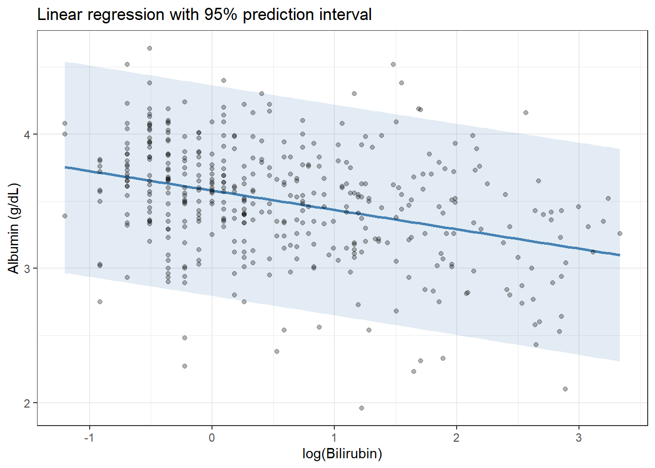
11.6 Example 2: Animal Data (palmerpenguins)
Estimated time: ~20 minutes (code-along)
NoteTeacher Note
Before running this chunk, ask learners to predict: do they expect flipper length to explain more or less of the variability in body mass than log(bilirubin) explained in albumin (R² = 0.12 in Example 1)? Both are single-predictor models, but morphological measurements within a species tend to be much more tightly linked to body size than a single blood biomarker is to a complex clinical outcome – so R² here will be substantially higher.
We predict body mass from flipper length, a practical calibration question in ecology.
peng <- penguins %>% drop_na(body_mass_g, flipper_length_mm, species)

fit_p <- lm(body_mass_g ~ flipper_length_mm, data = peng)
tidy(fit_p, conf.int = TRUE)
# A tibble: 2 × 7
term estimate std.error statistic p.value conf.low conf.high
<chr> <dbl> <dbl> <dbl> <dbl> <dbl> <dbl>
1 (Intercept) -5781. 306. -18.9 5.59e- 55 -6382. -5179.
2 flipper_length_mm 49.7 1.52 32.7 4.37e-107 46.7 52.7glance(fit_p)# A tibble: 1 × 12
r.squared adj.r.squared sigma statistic p.value df logLik AIC BIC
<dbl> <dbl> <dbl> <dbl> <dbl> <dbl> <dbl> <dbl> <dbl>
1 0.759 0.758 394. 1071. 4.37e-107 1 -2528. 5063. 5074.
# ℹ 3 more variables: deviance <dbl>, df.residual <int>, nobs <int>
TipRun It Yourself
Run the chunk above. You should get a slope of about 49.7 g per mm of flipper length (95% CI: 46.7 to 52.7, p < 0.001), and Multiple R-squared of about 0.76. Flipper length alone explains roughly three-quarters of the variability in body mass – much higher than the 12% from Example 1, as predicted in the Teacher Note above. The intercept (about −5781 g) is not meaningful on its own: a penguin with 0 mm flippers is impossible, so it is purely a mathematical anchor for the line.
peng %>%
  ggplot(aes(x = flipper_length_mm, y = body_mass_g)) +
  geom_point(aes(colour = species), alpha = 0.6) +
  geom_smooth(method = "lm", colour = "black", se = TRUE) +
  scale_colour_manual(values = c("steelblue", "tomato", "seagreen")) +
  labs(title = "Body mass predicted by flipper length",
       x = "Flipper length (mm)", y = "Body mass (g)") +
  theme_bw()
`geom_smooth()` using formula = 'y ~ x'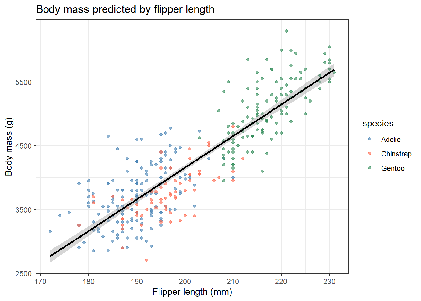
aug_p <- augment(fit_p)

ggplot(aug_p, aes(x = .fitted, y = .resid)) +
  geom_point(alpha = 0.4) +
  geom_hline(yintercept = 0, linetype = "dashed", colour = "grey50") +
  geom_smooth(method = "loess", colour = "tomato", se = FALSE) +
  labs(x = "Fitted values", y = "Residuals", title = "Residuals vs Fitted (penguins)") +
  theme_bw()
`geom_smooth()` using formula = 'y ~ x'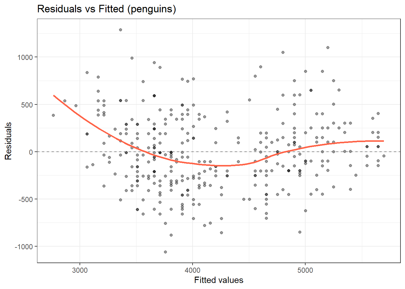
ggplot(aug_p, aes(sample = .std.resid)) +
  stat_qq() + stat_qq_line(colour = "tomato") +
  labs(x = "Theoretical quantiles", y = "Standardised residuals",
       title = "Normal Q-Q (penguins)") +
  theme_bw()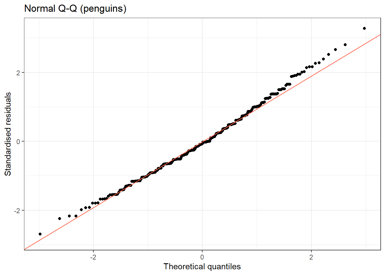
Notice that residuals may cluster by species, a sign that species confounds the relationship. This motivates multiple regression.
NoteWhere to Find Data Like This
PBC dataset: survival::pbc: multiple continuous variables with clinically interpretable relationships.
palmerpenguins: palmerpenguins::penguins: clean morphological measurements, ideal for regression with a natural grouping structure.
MASS::Boston: Housing data commonly used to teach regression; however, contains a problematic racial variable: examine the data carefully before use.
11.7 What Can Go Wrong
Estimated time: ~10 minutes (reading)
Warning
Extrapolation. A regression line is only valid within the range of the observed data. Predicting outside this range can produce nonsensical values, e.g., negative albumin.
Ignoring non-linearity. If the Residuals vs Fitted plot shows a U-shape, the linear model is misspecified. Try a log-transformation of X, or consider polynomial terms.
Heteroscedasticity. If variance increases with fitted values (fan-shaped residuals), OLS standard errors are incorrect. Consider transforming Y, or use heteroscedasticity-consistent (robust) standard errors.
Confounding. A simple regression coefficient is not causal. A third variable may drive both X and Y. See the multiple regression session for how to adjust for confounders.
Outliers and influential points. Check Cook’s distance via augment(), the .cooksd column. Values above 4/n flag cases to investigate; they may be data errors or genuinely unusual patients.
WarningCommon Misinterpretations
“p < 0.05 means the effect is large.” p < 0.05 means the effect is unlikely to be exactly zero given your sample size. A slope of −0.001 can be highly significant with 10,000 patients. Always report the magnitude (estimate and CI), not just the p-value.
“p = 0.06 means there is no effect.” It means you do not have enough evidence to rule out chance with this sample size. A study with 20 patients and p = 0.06 may simply be underpowered. Never say “no association” based on p > 0.05 alone.
“R² = 0.05 means the model is useless.” In medicine and biology, outcomes are driven by hundreds of factors. A single biomarker explaining 5% of variance may still be scientifically meaningful. Judge R² relative to what is realistic in your field.
“The intercept is always meaningful.” Only if X = 0 is a realistic value. In lm(albumin ~ log_bili), the intercept is albumin when bilirubin = 1 mg/dL. If few patients have bilirubin near 1 mg/dL, the intercept is a mathematical anchor, not a clinically interpretable number.
“A significant p-value means my model assumptions are met.” The p-value tells you nothing about model assumptions. Check the diagnostic plots regardless of the p-value.
NoteTeacher Note
A quick true/false check before moving to the exercises:
- “A slope’s 95% CI that excludes zero means the effect is large.” False – it means the effect is unlikely to be exactly zero, not that it is big.
- “If R² is low, the slope estimate is wrong.” False – R² and the slope answer different questions; a precise, statistically significant slope can coexist with a low R² when many other factors also affect the outcome.
- “The residuals-vs-fitted plot should be checked regardless of whether p < 0.05.” True – a significant p-value says nothing about whether the linearity, equal-variance, or normality assumptions hold.
11.8 Exercises
NoteTeacher Note
Pair learners up for Exercise 1 and 2. Before they start Exercise 1, ask them to predict: will the relationship between prothrombin time and albumin be stronger or weaker than the bilirubin-albumin relationship in Example 1 (R² = 0.12)? After Exercise 2, ask whether the species-specific slopes (bill length vs body mass within each species) are larger or smaller than the slope from the pooled model – this previews the confounding-by-species theme that multiple regression will address directly.
11.8.1 Exercise 1 (Guided): Prothrombin Time Predicts Albumin
Estimated time: ~15 minutes
- Plot albumin (y) vs prothrombin time (x) in
pbc. Log-transform prothrombin time. - Fit
lm(albumin ~ log(protime), data = pbc). Interpret the slope. - Check the residuals-vs-fitted and QQ plots using
broom::augment(). - Report the slope, 95% CI, and R².
TipExercise 1: Solution
pbc2 <- pbc %>% filter(!is.na(protime))

pbc2 %>%
  ggplot(aes(x = log(protime), y = albumin)) +
  geom_point(alpha = 0.4) +
  geom_smooth(method = "lm", colour = "tomato") +
  labs(x = "log(Prothrombin time)", y = "Albumin (g/dL)") +
  theme_bw()
`geom_smooth()` using formula = 'y ~ x'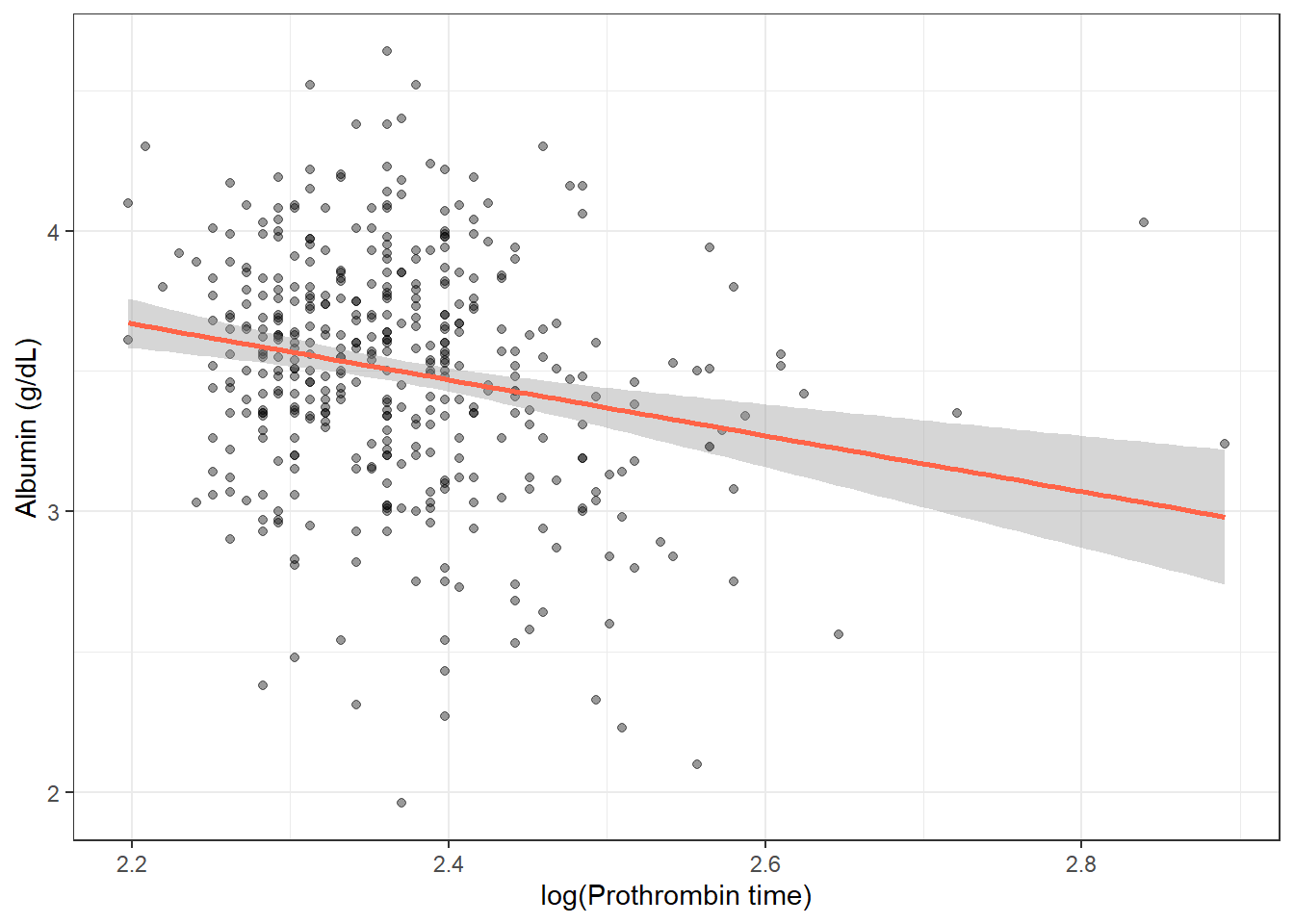
fit2 <- lm(albumin ~ I(log(protime)), data = pbc2)
tidy(fit2, conf.int = TRUE)
# A tibble: 2 × 7
term estimate std.error statistic p.value conf.low conf.high
<chr> <dbl> <dbl> <dbl> <dbl> <dbl> <dbl>
1 (Intercept) 5.86 0.546 10.7 7.52e-24 4.79 6.94
2 I(log(protime)) -0.997 0.231 -4.32 1.93e- 5 -1.45 -0.543glance(fit2)# A tibble: 1 × 12
r.squared adj.r.squared sigma statistic p.value df logLik AIC BIC
<dbl> <dbl> <dbl> <dbl> <dbl> <dbl> <dbl> <dbl> <dbl>
1 0.0432 0.0409 0.415 18.7 0.0000193 1 -223. 452. 464.
# ℹ 3 more variables: deviance <dbl>, df.residual <int>, nobs <int>aug2 <- augment(fit2)
ggplot(aug2, aes(x = .fitted, y = .resid)) +
geom_point(alpha = 0.4) +
geom_hline(yintercept = 0, linetype = "dashed", colour = "grey50") +
geom_smooth(method = "loess", colour = "tomato", se = FALSE) +
labs(x = "Fitted values", y = "Residuals") + theme_bw()`geom_smooth()` using formula = 'y ~ x'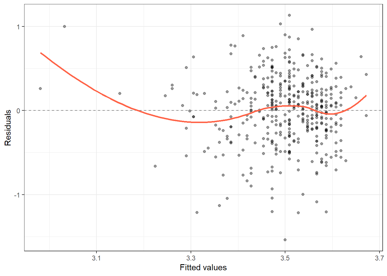
ggplot(aug2, aes(sample = .std.resid)) +
  stat_qq() + stat_qq_line(colour = "tomato") +
  labs(x = "Theoretical quantiles", y = "Standardised residuals") + theme_bw()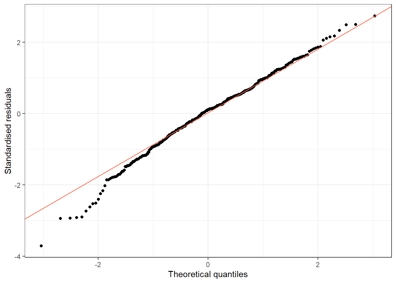
Run the chunk above. You should get a slope of about −1.00 for I(log(protime)) (95% CI: −1.45 to −0.54, p < 0.001), and Multiple R-squared of about 0.04. The direction is the same as the bilirubin-albumin relationship (longer prothrombin time -> lower albumin, both reflecting worse liver function), but the relationship is considerably weaker (R² ≈ 0.04 vs 0.12 for log(bilirubin)).
11.8.2 Exercise 2 (Semi-guided): Bill Length Predicts Body Mass (Penguins)
Estimated time: ~15 minutes
- Fit
lm(body_mass_g ~ bill_length_mm, data = penguins). - Check the diagnostic plots using
augment(). Do the residuals look well-behaved? - Fit the model separately for each species. Compare the slopes. How do they differ from the overall model?
TipExercise 2: Solution
peng2 <- penguins %>% drop_na()

fit_all <- lm(body_mass_g ~ bill_length_mm, data = peng2)
tidy(fit_all, conf.int = TRUE)
# A tibble: 2 × 7
term estimate std.error statistic p.value conf.low conf.high
<chr> <dbl> <dbl> <dbl> <dbl> <dbl> <dbl>
1 (Intercept) 389. 290. 1.34 1.81e- 1 -181. 959.
2 bill_length_mm 86.8 6.54 13.3 1.54e-32 73.9 99.7aug_all <- augment(fit_all)
ggplot(aug_all, aes(x = .fitted, y = .resid)) +
geom_point(alpha = 0.4) +
geom_hline(yintercept = 0, linetype = "dashed", colour = "grey50") +
geom_smooth(method = "loess", colour = "tomato", se = FALSE) +
labs(x = "Fitted values", y = "Residuals") + theme_bw()`geom_smooth()` using formula = 'y ~ x'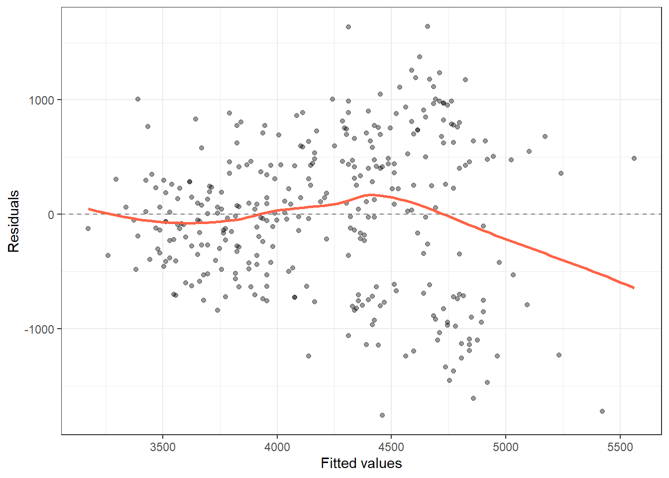
ggplot(aug_all, aes(sample = .std.resid)) +
  stat_qq() + stat_qq_line(colour = "tomato") +
  labs(x = "Theoretical quantiles", y = "Standardised residuals") + theme_bw()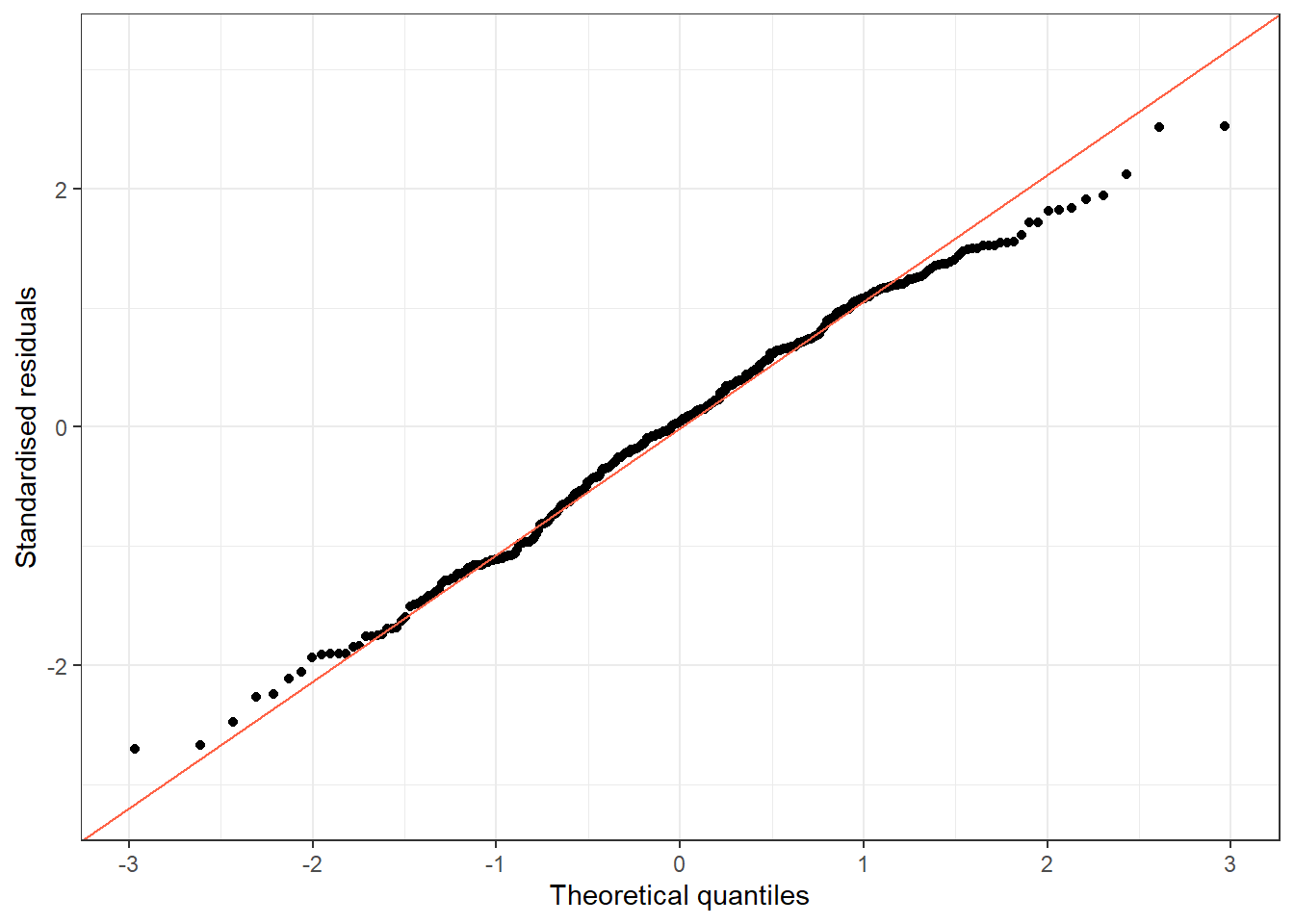
peng2 %>%
  group_by(species) %>%
  do(tidy(lm(body_mass_g ~ bill_length_mm, data = .), conf.int = TRUE)) %>%
  filter(term == "bill_length_mm") %>%
  select(species, estimate, conf.low, conf.high, p.value)
# A tibble: 3 × 5
# Groups: species [3]
species estimate conf.low conf.high p.value
<fct> <dbl> <dbl> <dbl> <dbl>
1 Adelie 93.7 69.9 118. 1.24e-12
2 Chinstrap 59.1 34.8 83.4 7.48e- 6
3 Gentoo 108. 85.6 130. 1.26e-16Run the chunk above. The pooled model gives a slope of about 86.8 g per mm of bill length (95% CI: 73.9 to 99.7). But the species-specific slopes are all noticeably larger: Adelie ≈ 93.7, Chinstrap ≈ 59.1, Gentoo ≈ 108 g per mm (all p < 0.001). Chinstrap’s slope of about 59 is actually smaller than the pooled estimate. This spread of species-specific slopes around the pooled value – with one species clearly out of line – is a sign that species is confounding the bill-length-body-mass relationship, the same theme you saw with flipper length and body mass earlier in this session.
11.8.3 Exercise 3 (Open-ended)
Estimated time: 15–30 minutes
In your own research, identify a continuous outcome and a single continuous predictor you expect to be linearly related. Fit a simple linear regression, check all assumptions, and write a Results paragraph including: the slope (95% CI), the R², and a sentence on whether the assumptions are satisfied.
11.9 Comprehension Check
Estimated time: ~10 minutes (self-test)
- You fit
lm(albumin ~ log_bili)and get slope = −0.14, SE = 0.02. Interpret the slope in plain language. - The QQ-plot of residuals shows a heavy right tail. Is this a problem? What would you do?
- R² = 0.05. Does this mean the model is useless?
- You predict albumin = 2.1 g/dL for a patient with bilirubin = 80 mg/dL. The maximum observed bilirubin in your data is 28 mg/dL. Should you trust this prediction?
- What does the intercept represent in
lm(albumin ~ log_bili)when many patients have bilirubin values far from 1 mg/dL?
NoteAnswers
- For every one-unit increase in log(bilirubin) (roughly a 2.7-fold increase in bilirubin on the original scale), albumin is expected to be 0.14 g/dL lower, on average.
- A heavy right tail means large positive residuals occur more often than expected under normality. For inference (CIs, p-values), mild non-normality is acceptable with large samples (Central Limit Theorem). For severe non-normality, try a log-transformation of the outcome or use robust standard errors.
- R² = 0.05 means the predictor explains 5% of the outcome’s variability. Whether this is “useful” depends on context. In complex biological systems, a single biomarker explaining even 5% of variance may be scientifically meaningful. The slope and CI are more informative than R² alone.
- No. Bilirubin = 80 mg/dL is well outside the range of the data used to fit the model (max = 28). Extrapolation is unreliable; the linear relationship may not hold at extreme values.
- The intercept is the predicted albumin when log(bilirubin) = 0, i.e., when bilirubin = 1 mg/dL. If few patients have bilirubin near 1 mg/dL, the intercept is an extrapolation with high uncertainty and limited clinical meaning.
11.10 How to Report
Note
In a methods section: “The association between [outcome] and [predictor] was estimated using linear regression. Potential confounders [list] were included in the model. Model assumptions (linearity, homoscedasticity, normality of residuals) were assessed using diagnostic plots.”
In results: “Each additional [unit] of [predictor] was associated with a [β] [unit] change in [outcome] (β = X, 95% CI [L, U], p = Y).”
Always include:
- Regression coefficient (β) with 95% CI and p-value
- Adjusted R² (proportion of variance explained)
- Number of observations and any excluded due to missing data
- Whether the model is unadjusted or adjusted (and for what)
Reporting R² alone is not enough: always report the coefficient and CI so readers know the direction and magnitude of the effect.
For models with multiple predictors, see the Multiple Regression session.
11.11 Further Reading
- Dalgaard (2008): Chapter on linear models in Introductory Statistics with R
- Bland (2015): Regression chapters in An Introduction to Medical Statistics
?lm,?predict.lmin R: full documentationbroompackage vignette for tidy model output
Bland, Martin. 2015. An Introduction to Medical Statistics. 4th ed. Oxford University Press.
Dalgaard, Peter. 2008. Introductory Statistics with r. 2nd ed. Springer.