pbc <- survival::pbc %>%
  as_tibble() %>%
  clean_names() %>%
  filter(!is.na(albumin), !is.na(bili), !is.na(protime), !is.na(stage)) %>%
  mutate(
    log_bili  = log(bili),
    log_proto = log(protime),
    stage     = factor(stage, levels = 1:4, labels = paste("Stage", 1:4))
  )

fit <- lm(albumin ~ log_bili + log_proto + stage, data = pbc)14 Model Building and Diagnostics
ImportantBefore You Start
This session covers model selection and diagnostics for regression models. Complete the Linear Regression, Multiple Regression, and Logistic Regression sessions before starting here.
NoteSession at a Glance
Total core time: ~170 minutes (plus extra time for Exercise 3, which is open-ended).
| Section | Time | Type |
|---|---|---|
| The Key Idea: Fit a Model, Then Check It | ~10 min | Concept |
| Background: A Model-Building Framework | ~15 min | Concept |
| Example 1: Linear Regression Diagnostics (PBC) | ~40 min | Walkthrough |
| Example 2: Logistic Regression Diagnostics (PBC Mortality) | ~25 min | Walkthrough |
| Example 3: Penalised Regression (Lasso) | ~15 min | Walkthrough |
| What Can Go Wrong | ~10 min | Reading |
| Exercise 1 (Guided) | ~15 min | Practice |
| Exercise 2 (Semi-guided) | ~15 min | Practice |
| Exercise 3 (Open-ended) | 15–30 min | Practice |
| Comprehension Check | ~10 min | Self-test |
If you are working through this self-paced and have limited time, Example 1 (linear regression diagnostics) is the core of this session – it introduces residual plots, Cook’s distance, VIF, and the Breusch-Pagan test, all of which reappear in Example 2. Example 3 (lasso) can be skimmed or done as homework if the glmnet package is not available. Exercise 3 is open-ended: budget extra time if you want to apply this to your own data.
TipHow to Use the Code in This Session
Every code chunk below is written so you can copy it into your R console (or an R script) and run it yourself, in the order shown. Where you see a “Run It Yourself” box, stop and run the code above it before reading the explanation that follows.
14.1 When Do You Use This?
Tip
You have fitted a regression model, but before trusting its conclusions you need to verify that the model is appropriate: are the assumptions met? Are there influential outliers? Is the model overfitted? Model building and diagnostics are the quality-control steps between fitting a model and reporting it.
NoteTeacher Note
This session reuses the PBC dataset and the fit_full-style model from Multiple Regression and the fit_log/fit_multi models from Logistic Regression. If learners remember those coefficients, ask them to predict: do they expect the residuals from albumin ~ log_bili + log_proto + stage to look “clean” (a flat band around zero) given that earlier sessions found R² ≈ 0.18–0.19 for similar models – i.e. most of the variance in albumin is not explained by these predictors?
14.2 Learning Objectives
After completing this session you will be able to:
- Apply a systematic model-building strategy for linear and logistic regression
- Diagnose assumption violations using ggplot-based residual plots and leverage diagnostics
- Detect influential observations with Cook’s distance
- Evaluate model performance: R², AIC, and cross-validation RMSE
- Apply penalised regression (lasso) when variable selection is needed
14.3 The Key Idea: Fit a Model, Then Check It
Estimated time: ~10 minutes (concept)
A common mistake is to fit a model, look at the p-values, and write up the results, without ever checking whether the model is appropriate. If the assumptions are violated, the p-values and confidence intervals are wrong, regardless of how elegant the model looks.
Think of diagnostic checks as the peer review step before you show anyone your results. Residual plots take a few lines of code. They can save you from a retraction.
14.4 Background: A Model-Building Framework
Estimated time: ~15 minutes (concept)
Good regression modelling is a structured process, not a p-value fishing expedition.
Steps:
- Define the research question: outcome, predictors, and target population
- Explore the data: distributions, missingness, correlations
- Pre-specify the model: driven by domain knowledge, not by initial results
- Fit and assess assumptions: residuals, influential points
- Compare models: use AIC/BIC or likelihood ratio tests, not stepwise selection
- Validate: internal (bootstrap) or external (hold-out data)
- Report: all results, including assumption checks
The selection problem: Choosing predictors based on their p-values from the same data you use to estimate coefficients inflates the apparent significance and overfits the model. Pre-specification and penalised methods address this.
14.5 Example 1: Linear Regression Diagnostics (PBC)
Estimated time: ~40 minutes (walkthrough)
NoteTeacher Note
This example has four stops: (1) fit the model and produce residual plots, (2) check Cook’s distance for influential points, (3) check VIF for multicollinearity, and (4) test for heteroscedasticity with ncvTest(). The model is the same albumin ~ log_bili + log_proto + stage model from Multiple Regression (there called fit_full-style), so learners already know its R² ≈ 0.18. Use that as a hook: a model that “only” explains 18% of the variance can still have well-behaved residuals – R² and diagnostics answer different questions.
14.5.1 Fit a Model
14.5.2 Residual Diagnostics
We use broom::augment() to extract residuals, fitted values, leverage, and Cook’s distance, then plot with ggplot.
diag_df <- augment(fit) %>%
  mutate(.row = row_number())

ggplot(diag_df, aes(x = .fitted, y = .resid)) +
  geom_point(alpha = 0.4) +
  geom_hline(yintercept = 0, linetype = "dashed", colour = "grey50") +
  geom_smooth(method = "loess", colour = "tomato", se = FALSE) +
  labs(x = "Fitted values", y = "Residuals", title = "Residuals vs Fitted") +
  theme_bw()
`geom_smooth()` using formula = 'y ~ x'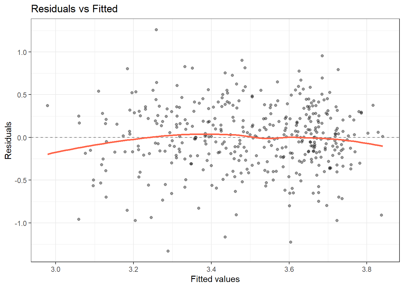
ggplot(diag_df, aes(sample = .std.resid)) +
  stat_qq() + stat_qq_line(colour = "tomato") +
  labs(x = "Theoretical quantiles", y = "Standardised residuals",
       title = "Normal Q-Q") +
  theme_bw()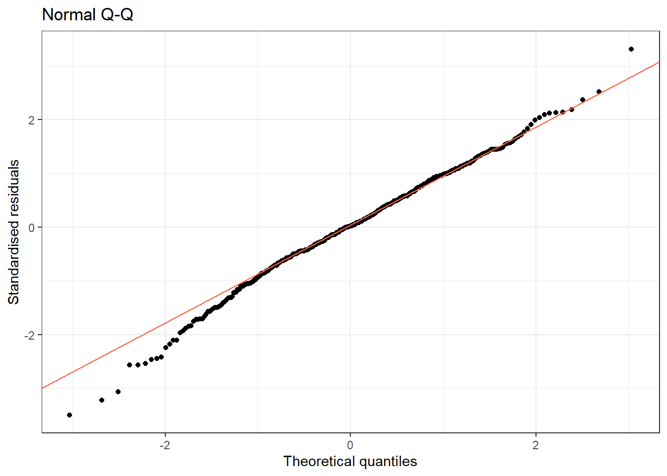
Reading the plots:
- Residuals vs Fitted: Should be a horizontal cloud around zero. Any systematic pattern (U-shape, funnel) indicates non-linearity or heteroscedasticity.
- Normal Q-Q: Residuals should follow the diagonal line. Systematic deviation indicates non-normality.
TipRun It Yourself
Run the chunk above. The Residuals vs Fitted plot shows a roughly flat LOESS line hovering near zero across the range of fitted values – there is no strong U-shape or funnel, so linearity and (visually) constant variance look reasonable. The Normal Q-Q plot tracks the diagonal closely through the middle, with mild deviation in both tails (a few points below −2 and above 2 sit slightly off the line). Check: later in this example we will run a formal test for heteroscedasticity (ncvTest()). Based on this plot alone, would you have predicted that test to come back significant or not?
14.5.3 Detecting Influential Observations
ggplot(diag_df, aes(x = .row, y = .cooksd)) +
  geom_col(fill = "steelblue", alpha = 0.7) +
  geom_hline(yintercept = 4 / nrow(pbc), linetype = "dashed", colour = "tomato") +
  annotate("text", x = nrow(pbc) * 0.85, y = 4 / nrow(pbc) * 1.3,
           label = "4/n threshold", colour = "tomato", size = 3) +
  labs(title = "Cook's distance: influential observations",
       x = "Observation", y = "Cook's distance") +
  theme_bw()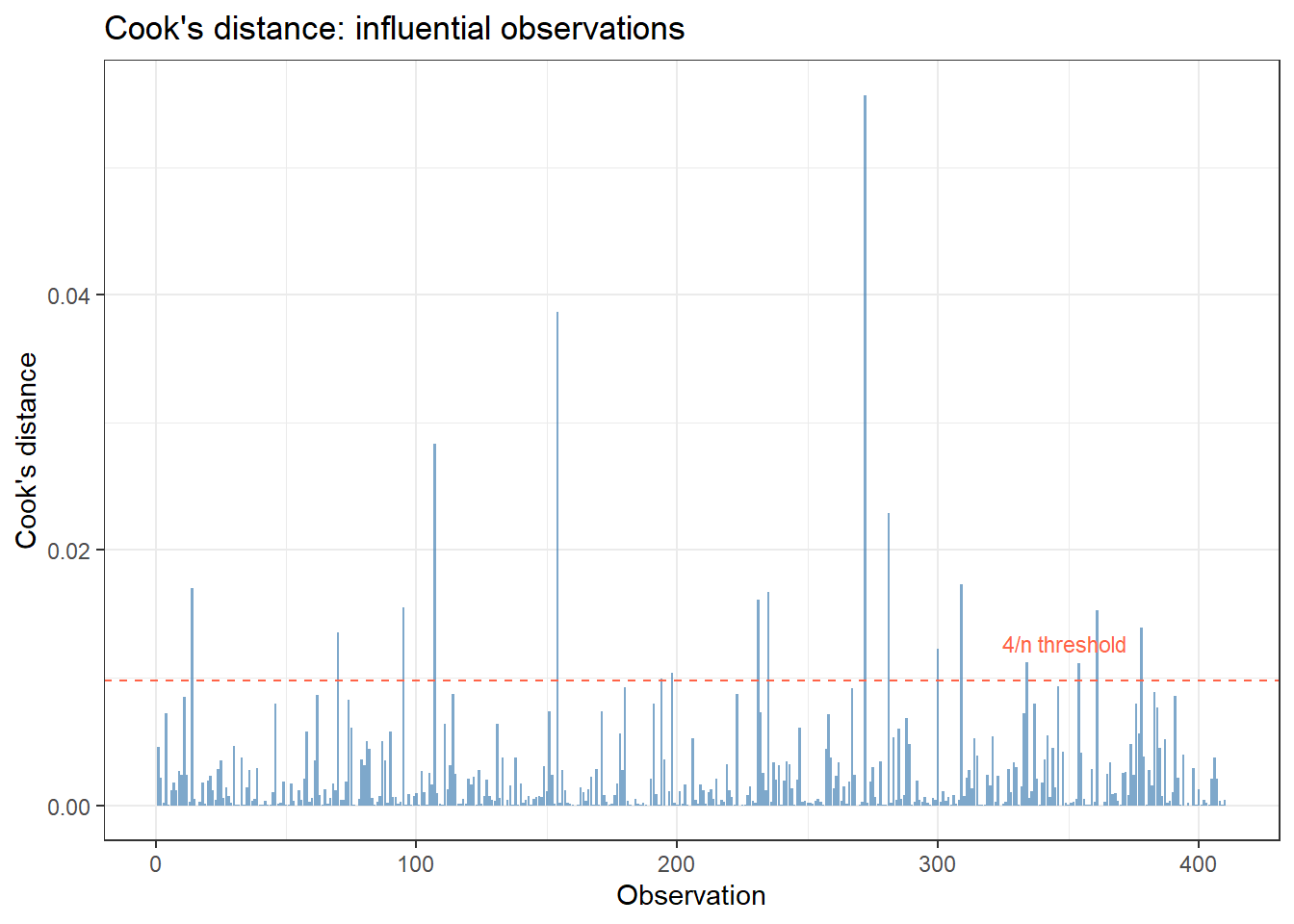
diag_df %>%
  arrange(desc(.cooksd)) %>%
  select(.row, albumin, log_bili, .fitted, .resid, .cooksd, .hat) %>%
  head(10)
# A tibble: 10 × 7
.row albumin log_bili .fitted .resid .cooksd .hat
<int> <dbl> <dbl> <dbl> <dbl> <dbl> <dbl>
1 272 2.93 -0.693 3.84 -0.908 0.0557 0.0530
2 154 2.56 0.875 3.46 -0.904 0.0387 0.0383
3 107 4.03 -0.511 3.66 0.369 0.0284 0.136
4 281 2.1 2.88 3.06 -0.959 0.0229 0.0209
5 309 2.75 -0.916 3.72 -0.973 0.0174 0.0155
6 14 2.27 -0.223 3.44 -1.17 0.0170 0.0107
7 235 4.16 2.56 3.33 0.828 0.0167 0.0205
8 231 1.96 1.22 3.29 -1.33 0.0161 0.00784
9 95 2.64 2.86 3.30 -0.658 0.0155 0.0295
10 361 4.52 1.48 3.26 1.26 0.0153 0.00825
TipRun It Yourself
Run the chunk above. With n = 410, the 4/n threshold is about 0.0098. The most influential observation is row 272 (Cook’s distance ≈ 0.056, about 5.7 times the threshold): a patient with albumin = 2.93 g/dL and log_bili = −0.693 (bilirubin ≈ 0.5 mg/dL), for whom the model predicts albumin ≈ 3.84 – a residual of about −0.91. Several of the top 10 rows have Cook’s distance well above 0.0098. Check: do these look like data-entry errors (e.g. implausible values), or genuinely unusual-but-real patients? This is the judgement call the next paragraph warns you not to skip.
Points above the 4/n threshold merit investigation. They may be data errors or genuinely extreme but valid cases. Do not remove them automatically: investigate first.
14.5.4 Checking Multicollinearity
vif(fit) GVIF Df GVIF^(1/(2*Df))
log_bili 1.180386 1 1.086456
log_proto 1.188617 1 1.090237
stage 1.188763 3 1.029238
TipRun It Yourself
Run the chunk above. All three predictors have GVIF^(1/(2*Df)) close to 1.03–1.09 (GVIF values around 1.18 for log_bili and log_proto, and 1.19 for stage), all far below the threshold of 5. Multicollinearity is not a concern for this model – consistent with what we found for the same predictors in Multiple Regression.
14.5.5 Testing for Heteroscedasticity
Estimated time: ~5 minutes
ncvTest(fit)Non-constant Variance Score Test
Variance formula: ~ fitted.values
Chisquare = 6.050681, Df = 1, p = 0.013901
TipRun It Yourself
Run the chunk above. You should get Chisquare = 6.05, Df = 1, p = 0.014. This is statistically significant (p < 0.05): the Breusch-Pagan test detects heteroscedasticity in this model, even though the Residuals vs Fitted plot above did not show an obvious funnel shape by eye. Check: does this change your answer to the question in the “Run It Yourself” box above the residual plots? This is a good example of why formal tests complement (not replace) visual checks – subtle heteroscedasticity can be hard to see but still statistically detectable in a sample of 410.
A significant p-value from the Breusch-Pagan test (from the car package) indicates heteroscedasticity. Consider transforming Y or using heteroscedasticity-consistent (HC) standard errors.
14.6 Example 2: Logistic Regression Diagnostics (PBC Mortality)
Estimated time: ~25 minutes (walkthrough)
NoteTeacher Note
fit_log here uses the same predictors as fit_multi from Logistic Regression (log_bili + log_proto + albumin + stage), so its AIC should match what learners already saw there (≈ 416). The deviance-residuals-vs-fitted-probability plot looks very different from the linear-regression residual plot: binary outcomes produce two curving bands of points (one for each outcome value) rather than a flat cloud. Warn learners not to mistake this expected pattern for a problem.
pbc2 <- pbc %>%
  mutate(
    died = as.integer(status == 2),
    sex  = factor(sex, levels = c("f", "m"), labels = c("Female", "Male"))
  ) %>%
  filter(!is.na(died))

fit_log <- glm(died ~ log_bili + log_proto + albumin + stage,
               data = pbc2, family = binomial)
14.6.1 Residual and Influence Diagnostics
diag_log <- augment(fit_log, type.predict = "response") %>%
  mutate(row = row_number())

ggplot(diag_log, aes(x = .fitted, y = .resid)) +
  geom_point(alpha = 0.4, size = 1.5) +
  geom_hline(yintercept = 0, linetype = "dashed") +
  geom_smooth(se = FALSE, colour = "tomato") +
  labs(title = "Deviance residuals vs fitted probabilities",
       x = "Fitted probability", y = "Deviance residual") +
  theme_bw()
`geom_smooth()` using method = 'loess' and formula = 'y ~ x'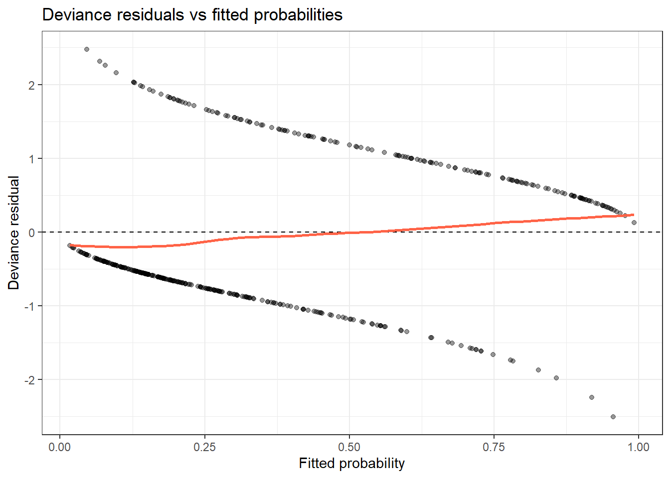
ggplot(diag_log, aes(x = row, y = .cooksd)) +
  geom_col(fill = "steelblue", alpha = 0.7) +
  geom_hline(yintercept = 4 / nrow(pbc2), linetype = "dashed", colour = "tomato") +
  labs(title = "Cook's distance: logistic model",
       x = "Observation", y = "Cook's distance") +
  theme_bw()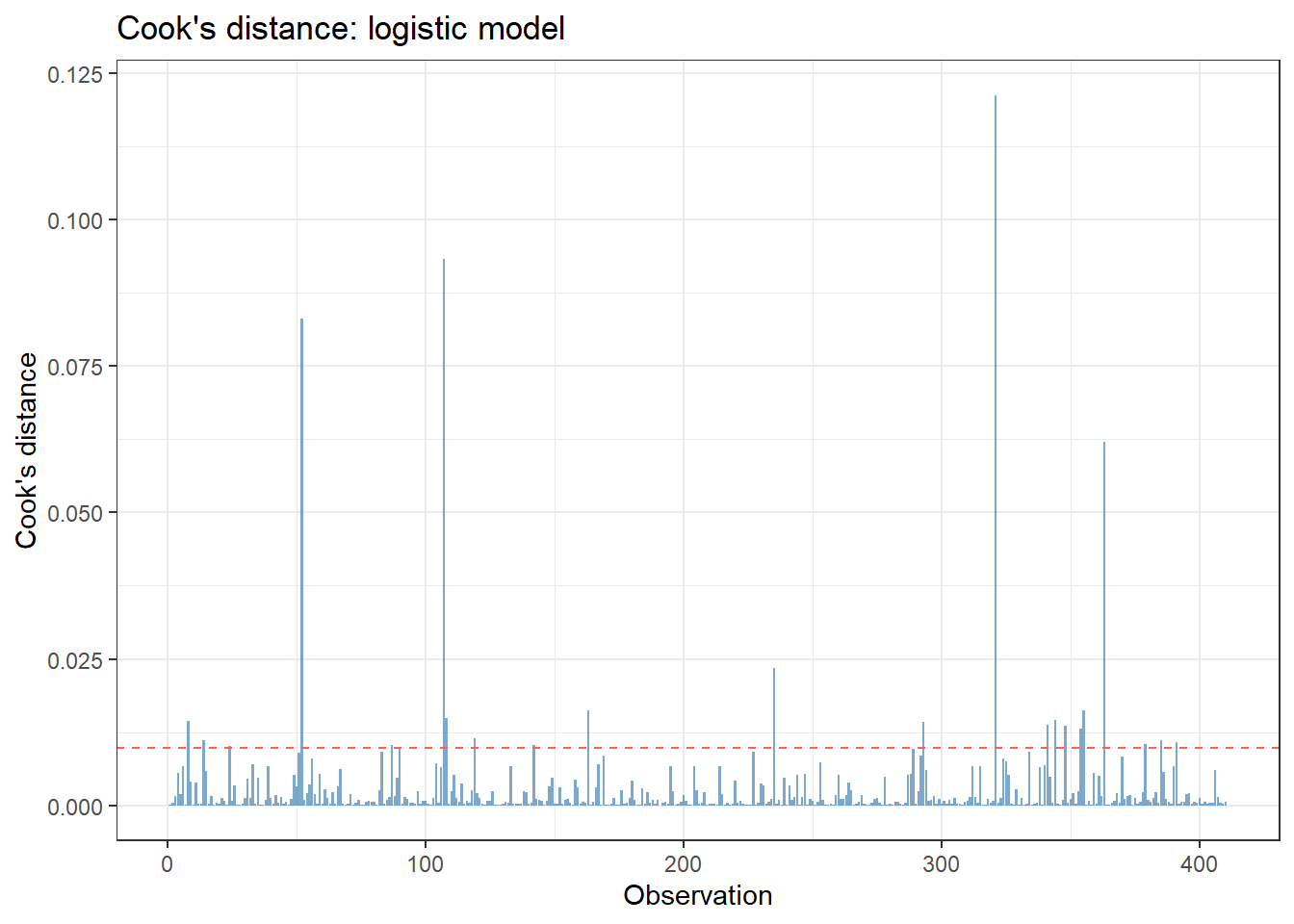
TipRun It Yourself
Run both chunks above. In the deviance-residuals plot, you will see two curving bands of points – one trending from a large positive residual down to near zero (the patients who survived, died = 0, moving from low to high fitted probability), and a mirror-image band for died = 1. This X-shaped pattern is expected for binary outcomes and is not, by itself, evidence of a problem; the red LOESS line staying close to zero across the range is the reassuring sign.
In the Cook’s distance plot, with n = 410 the 4/n threshold is again about 0.0098. A handful of points clearly exceed it, including one around Cook’s distance ≈ 0.12 – noticeably larger than anything we saw for the linear model. Check: would you expect a single PBC patient to have more influence on a model predicting their own death (binary) than on a model predicting their albumin level (continuous)? Why might that be?
14.6.2 AIC Comparison: Model Selection Without P-value Fishing
m1 <- glm(died ~ log_bili,                              data = pbc2, family = binomial)
m2 <- glm(died ~ log_bili + log_proto,                  data = pbc2, family = binomial)
m3 <- glm(died ~ log_bili + log_proto + albumin,        data = pbc2, family = binomial)
m4 <- glm(died ~ log_bili + log_proto + albumin + stage, data = pbc2, family = binomial)

AIC(m1, m2, m3, m4) %>%
  tibble::rownames_to_column("model") %>%
  arrange(AIC)
model df AIC
1 m4 7 415.9624
2 m3 4 417.9369
3 m2 3 418.5679
4 m1 2 446.7112
TipRun It Yourself
Run the chunk above. Sorted by AIC: m4 (all four predictors, AIC ≈ 415.96) is lowest, then m3 (log_bili + log_proto + albumin, AIC ≈ 417.94), then m2 (log_bili + log_proto, AIC ≈ 418.57), and m1 (log_bili alone, AIC ≈ 446.71) is clearly worst. Check: the gap between m4 and m3 is only about 2 AIC points – recall from the Comprehension Check guidance that models within about 2 AIC units are considered roughly equivalent. Does that change which model you would report as “the” final model, versus reporting both as comparable and letting your pre-specified hypothesis (about stage) decide?
Choose the model with the lowest AIC that aligns with your pre-specified hypotheses.
14.7 Example 3: Penalised Regression (Lasso)
Estimated time: ~15 minutes (walkthrough)
NoteTeacher Note
This example only has three candidate predictors (log_bili, log_proto, platelet), so it is a small-scale demonstration of the mechanism rather than a realistic variable-selection scenario – with so few predictors, lasso may not drop any of them. If glmnet is not installed, this chunk is skipped automatically (eval is conditional); tell learners what the output would look like using the numbers in the “Run It Yourself” box below.
When you have many candidate predictors and want data-driven selection, lasso (L1 penalisation) shrinks some coefficients to exactly zero.
pbc_mat <- pbc %>%
  select(albumin, log_bili, log_proto, platelet, bili, protime) %>%
  drop_na()

X <- model.matrix(albumin ~ log_bili + log_proto + platelet, data = pbc_mat)[, -1]
y <- pbc_mat$albumin

set.seed(2024)
cv_lasso <- cv.glmnet(X, y, alpha = 1)
plot(cv_lasso)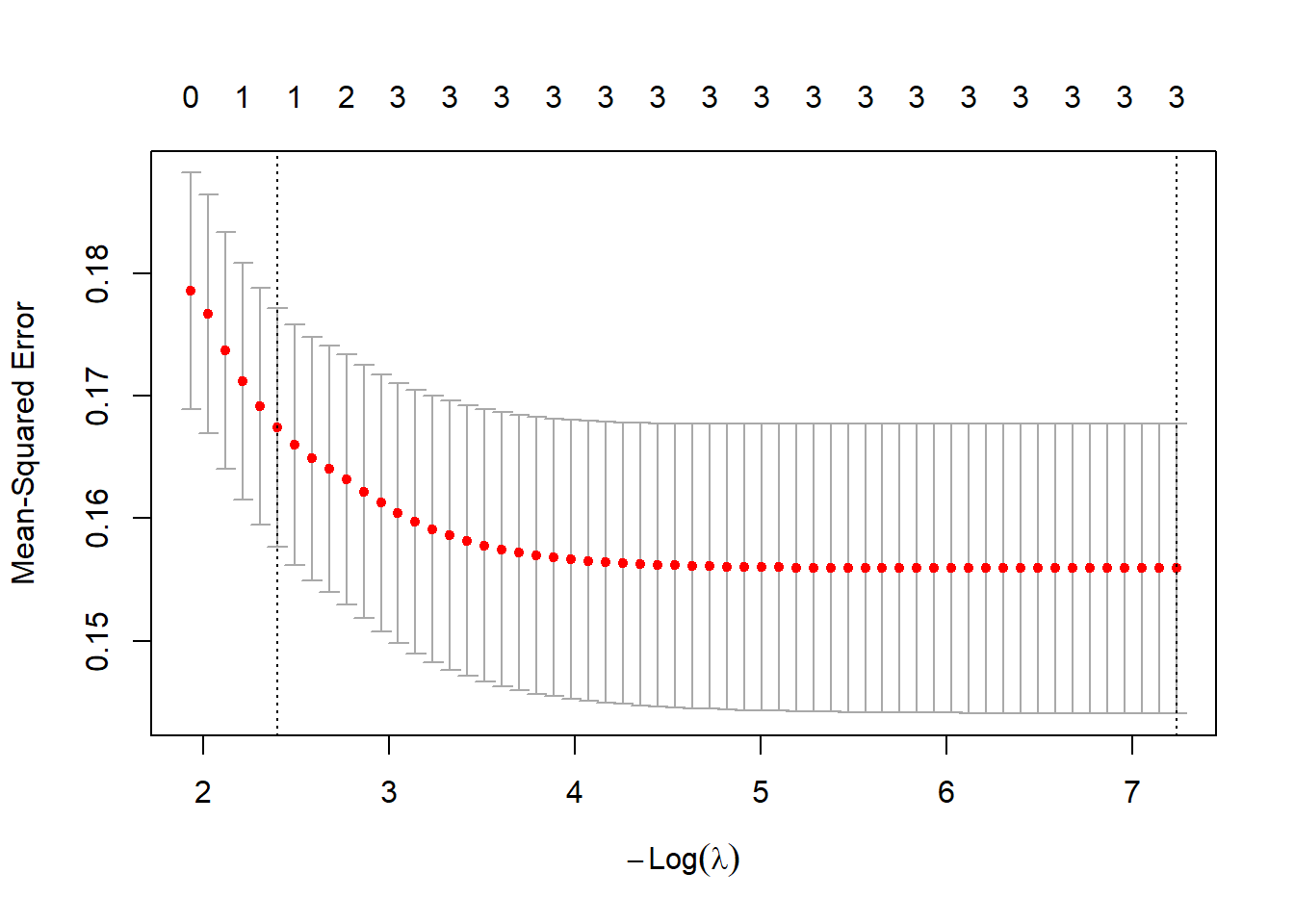
coef(cv_lasso, s = "lambda.min")4 x 1 sparse Matrix of class "dgCMatrix"
lambda.min
(Intercept) 4.4690606855
log_bili -0.1223933328
log_proto -0.4405941333
platelet 0.0005532384
TipRun It Yourself
Run the chunk above (it requires the glmnet package). At lambda.min, the coefficients are approximately: intercept ≈ 4.47, log_bili ≈ −0.122, log_proto ≈ −0.441, and platelet ≈ 0.00055. None of the three predictors were shrunk to exactly zero – with only three candidates, lasso has little to “select” here. The cross-validation plot shows mean-squared error decreasing as -log(lambda) increases (less shrinkage), levelling off once all three predictors are included. Check: try re-running with s = "lambda.1se" (a more conservative choice, one standard error away from the minimum). Does it drop any predictors? This illustrates the lambda.min vs lambda.1se trade-off: lambda.min minimises cross-validated error, while lambda.1se gives a simpler model that is still within one SE of the best.
Lasso selects predictors by shrinking small coefficients to zero. It is useful for exploratory modelling with many candidates, but coefficients are biased (shrunk toward zero) and should not be interpreted as effect estimates without post-selection inference.
NoteWhere to Find Data Like This
PBC dataset: survival::pbc: multiple correlated continuous and categorical predictors; good for demonstrating overfitting, VIF, and model selection.
MASS::Boston (or BostonHousing2 from mlbench): Housing data with correlated predictors, commonly used for penalised regression examples.
Any of your prior datasets: model building and diagnostics are always applied to real data from a research question.
Estimated time: ~10 minutes (reading)
WarningWhat Can Go Wrong
Stepwise selection. Automated forward/backward stepwise selection based on p-values produces overfit models with inflated effect estimates and incorrect standard errors. Avoid for inference; use only for exploration.
Ignoring assumption violations. A model that violates assumptions (non-linearity, heteroscedasticity, non-normality of residuals) gives incorrect CIs and p-values. Check diagnostics before reporting.
Removing outliers without justification. Influential observations may be genuine extreme cases, not errors. Removing them without documenting and justifying the decision is a form of selective reporting.
Confusing in-sample fit with predictive performance. R² and AIC measure in-sample fit. A model that fits the data well may not predict new observations accurately (overfitting). Use cross-validation or a hold-out test set to estimate predictive performance.
NoteTeacher Note
Exercise 1 fits the exact same model as Example 1’s fit, so learners should reproduce the VIF and ncvTest() numbers seen above (VIF ≈ 1.18 for log_bili and log_proto, ≈ 1.19 for stage; ncvTest Chisquare ≈ 6.05, p ≈ 0.014) and the same top-5 Cook’s distance rows (row 272 highest, ≈ 0.056). If their numbers differ, check they used pbc (not pbc2) and the same predictor set. For Exercise 2, the model a4 is the same as m4 from Example 2 (AIC ≈ 415.96), so the AIC ranking should also match.
14.8 Exercises
14.8.1 Exercise 1 (Guided): Full Diagnostic Workflow
Estimated time: ~15 minutes (practice)
Fit lm(albumin ~ log_bili + log_proto + stage, data = pbc) and:
- Produce ggplot residuals-vs-fitted and QQ-plots using
augment(). - Identify the top 5 observations by Cook’s distance. Are they plausible outliers?
- Check VIF. Is multicollinearity a concern?
- Run
ncvTest(). Is heteroscedasticity detected?
TipExercise 1: Solution
fit_ex <- lm(albumin ~ log_bili + log_proto + stage, data = pbc)
aug_ex <- augment(fit_ex) %>% mutate(.row = row_number())

ggplot(aug_ex, aes(x = .fitted, y = .resid)) +
  geom_point(alpha = 0.4) +
  geom_hline(yintercept = 0, linetype = "dashed", colour = "grey50") +
  geom_smooth(method = "loess", colour = "tomato", se = FALSE) +
  labs(x = "Fitted values", y = "Residuals") + theme_bw()
`geom_smooth()` using formula = 'y ~ x'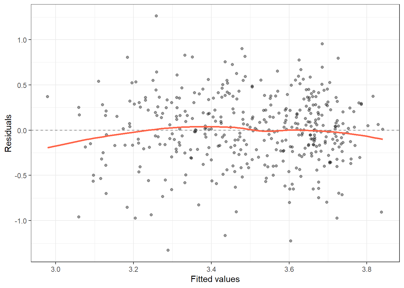
ggplot(aug_ex, aes(sample = .std.resid)) +
  stat_qq() + stat_qq_line(colour = "tomato") +
  labs(x = "Theoretical quantiles", y = "Standardised residuals") + theme_bw()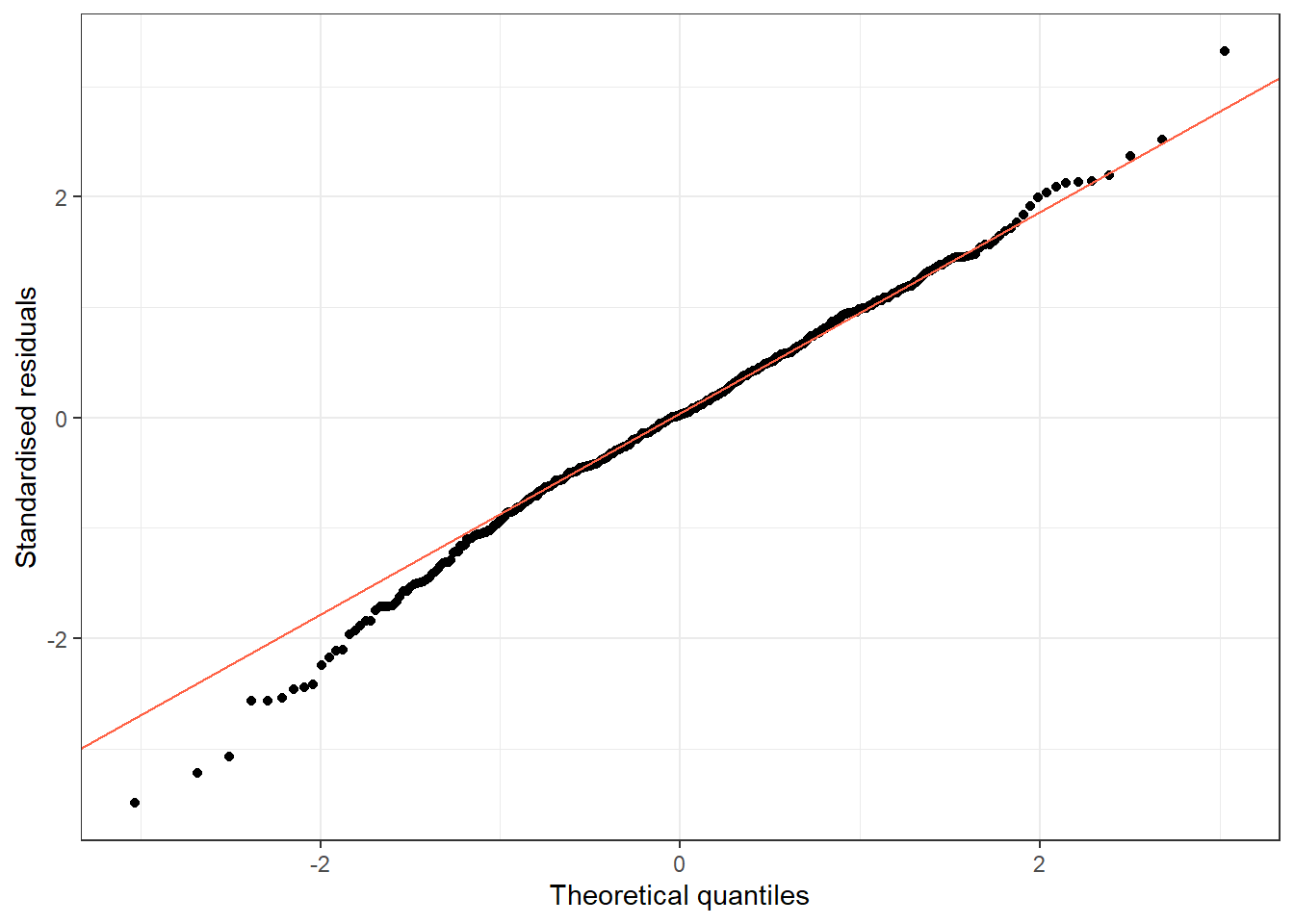
aug_ex %>%
  arrange(desc(.cooksd)) %>%
  select(.row, albumin, log_bili, .resid, .cooksd) %>%
  head(5)
# A tibble: 5 × 5
.row albumin log_bili .resid .cooksd
<int> <dbl> <dbl> <dbl> <dbl>
1 272 2.93 -0.693 -0.908 0.0557
2 154 2.56 0.875 -0.904 0.0387
3 107 4.03 -0.511 0.369 0.0284
4 281 2.1 2.88 -0.959 0.0229
5 309 2.75 -0.916 -0.973 0.0174vif(fit_ex) GVIF Df GVIF^(1/(2*Df))
log_bili 1.180386 1 1.086456
log_proto 1.188617 1 1.090237
stage 1.188763 3 1.029238ncvTest(fit_ex)Non-constant Variance Score Test
Variance formula: ~ fitted.values
Chisquare = 6.050681, Df = 1, p = 0.013901fit_ex is the same model as fit in Example 1, so the results match: the residual and Q-Q plots look the same as above; row 272 again has the highest Cook’s distance (≈ 0.056); all GVIFs are below 1.2, so multicollinearity is not a concern; and ncvTest() again gives Chisquare ≈ 6.05 (p ≈ 0.014), confirming mild but statistically significant heteroscedasticity. In a write-up, you would note this and either report robust (HC) standard errors or mention it as a limitation.
14.8.2 Exercise 2 (Semi-guided): AIC Model Selection for Logistic Regression
Estimated time: ~15 minutes (practice)
Using pbc2, fit four logistic models predicting mortality, adding one predictor at a time. Choose the best model by AIC. Then check Cook’s distance for the chosen model.
TipExercise 2: Solution
a1 <- glm(died ~ log_bili,                               data = pbc2, family = binomial)
a2 <- glm(died ~ log_bili + albumin,                     data = pbc2, family = binomial)
a3 <- glm(died ~ log_bili + albumin + log_proto,         data = pbc2, family = binomial)
a4 <- glm(died ~ log_bili + albumin + log_proto + stage, data = pbc2, family = binomial)

AIC(a1, a2, a3, a4) %>% tibble::rownames_to_column() %>% arrange(AIC)
rowname df AIC
1 a4 7 415.9624
2 a3 4 417.9369
3 a2 3 443.5458
4 a1 2 446.7112augment(a4, type.predict = "response") %>%
arrange(desc(.cooksd)) %>%
head(5)# A tibble: 5 × 11
died log_bili albumin log_proto stage .fitted .resid .hat .sigma .cooksd
<int> <dbl> <dbl> <dbl> <fct> <dbl> <dbl> <dbl> <dbl> <dbl>
1 0 0.588 3.24 2.89 Stage 2 0.956 -2.50 0.0361 0.992 0.121
2 0 -0.511 4.03 2.84 Stage 1 0.553 -1.27 0.276 0.997 0.0934
3 1 1.79 3.7 2.36 Stage 1 0.257 1.65 0.146 0.996 0.0831
4 1 1.99 3.52 2.41 Stage 1 0.379 1.39 0.179 0.997 0.0621
5 0 2.56 4.16 2.48 Stage 3 0.858 -1.98 0.0258 0.995 0.0234
# ℹ 1 more variable: .std.resid <dbl>Sorted by AIC: a4 (all four predictors) ≈ 415.96, a3 (log_bili + albumin + log_proto) ≈ 417.94, a2 (log_bili + albumin) ≈ 443.55, and a1 (log_bili alone) ≈ 446.71. a4 is the same model as m4 from Example 2, so it has the same AIC, as expected. The single largest jump in AIC is between a2 and a3 (adding log_proto drops AIC by about 26), much bigger than the gap between a3 and a4 (about 2).
For a4, the highest Cook’s distance (≈ 0.12) belongs to a patient who survived (died = 0) but whose predictors gave a predicted probability of death ≈ 0.96 – the model was confidently wrong about this patient, which is exactly the kind of case Cook’s distance is designed to flag. This matches the Cook’s distance plot from Example 2.
14.8.3 Exercise 3 (Open-ended)
Estimated time: 15–30 minutes (practice)
Take a model from your own research and apply the full diagnostic workflow: residual plots, QQ-plot, influence analysis, VIF. Write a one-paragraph Supplementary Methods section documenting your model-checking process and how you handled any issues found.
14.9 Comprehension Check
Estimated time: ~10 minutes (self-test)
- The Residuals vs Fitted plot shows a clear U-shape. What does this indicate, and how should you fix it?
- One observation has Cook’s distance = 0.8 (the threshold 4/n = 0.01). Should you automatically remove it?
- All VIFs are 1.1 except one predictor with VIF = 9.2. What does this mean, and what are your options?
- You compare three models with AIC: 312, 308, 307. Which should you prefer?
- A lasso model shrinks 14 out of 20 coefficients to zero, leaving 6 non-zero predictors. Can you interpret those 6 coefficients as the “true” effects?
NoteAnswers
- A U-shape indicates non-linearity; the linear model misses a curved relationship. Check whether X needs to be log-transformed, squared, or modelled with a spline. You can also use a LOESS smoother on the scatter plot to visualise the true shape.
- No; influential observations should be investigated, not automatically removed. Check whether the observation is a data entry error (correct it) or a genuinely extreme but valid case (keep it and report sensitivity analyses with and without that observation).
- VIF = 9.2 indicates severe collinearity with other predictors. Its coefficient estimate is unreliable (large SE, may flip sign). Options: (1) remove the collinear predictor if it is not the predictor of primary interest; (2) combine correlated predictors into a composite score; (3) use ridge regression.
- The third model (AIC = 307) is preferred; it has the lowest AIC. However, the difference from model 2 (AIC = 308) is only 1, which is not a meaningful improvement. Models within 2 AIC units of the minimum are considered roughly equivalent.
- No. Lasso coefficients are biased toward zero by the penalty. After lasso selects variables, you should refit the model using ordinary regression on those selected variables to obtain unbiased estimates and valid CIs. Even then, some caution is needed because variable selection inflates Type I error: ideally, treat lasso as exploratory and pre-specify variables for the confirmatory model.
14.10 How to Report
Note
In a methods section: “Model assumptions were assessed using residual vs. fitted plots (linearity, homoscedasticity), normal QQ-plots (residual normality), and Cook’s distance (influential observations; threshold: 4/n). Model selection was guided by AIC, with lower values indicating better relative fit.”
In results: “Diagnostic plots confirmed adequate model fit. [N] observations with Cook’s distance > 4/n were identified; excluding them did not materially change conclusions (β changed from X to Y). The final model had AIC = X vs. AIC = Y for the null model.”
Always include:
- Confirmation that residual diagnostics were performed
- Any influential observations identified and how they were handled
- Model comparison metric used (AIC, BIC, or likelihood ratio test)
- Whether a sensitivity analysis was performed
Avoid: Reporting only R² without diagnostic checks. A high R² with violated assumptions indicates a mis-specified model, not a good one.
14.11 Further Reading
- Harrell (2015): Regression Modeling Strategies, the definitive reference for clinical regression
- Fox and Weisberg (2019): An R Companion to Applied Regression, covering all diagnostics in R
?plot.lm,?augment,?vifin Rglmnetpackage vignette for penalised regression
Fox, John, and Sanford Weisberg. 2019. An r Companion to Applied Regression. 3rd ed. SAGE Publications.
Harrell, Frank E. 2015. Regression Modeling Strategies. 2nd ed. Springer.