adsl <- read_csv("data/adam/adsl.csv", show_col_types = FALSE)

n_arm <- adsl |> count(TRT01P, name = "N")
n_arm
# A tibble: 2 × 2
TRT01P N
<chr> <int>
1 GLPX 10 mg 200
2 Placebo 200Total core time: about 100 minutes.
| Section | Time | Type |
|---|---|---|
| When Do You Use This? + Learning Objectives | 5 min | Reading |
| Background: the shape nobody standardised | 15 min | Reading |
| Example 1: The demographics and disposition table | 20 min | Worked example |
| Example 2: A table and a listing, from the same events | 25 min | Worked example |
| Example 3: The figure the baseline machinery was for | 20 min | Worked example |
| What Can Go Wrong | 10 min | Reading |
| Exercises + Comprehension Check | 5 min | Practice / Self-test |
The first session of Part 4, and the one that closes the course’s data arc: raw, SDTM, ADaM, and now the document a reviewer actually reads. For self-paced study, split after Example 1, and again after Example 2.
Every code chunk below is written so you can copy it into your R console (or an R script) and run it yourself, in the order shown. Run R from the project root, as in earlier sessions.
This session reads data/adam/adsl.csv, data/adam/adae.csv and data/adam/adlb.csv: nothing new is built here. Every number in this session is arithmetic on datasets you have already built and cited.
Nobody in a regulatory submission reads ADSL. They read a table that says how many subjects were randomised, how many completed, and how the two arms compare. Nobody reads all 12,388 rows of ADLB either; they read a figure that shows HbA1c falling faster on drug than on placebo. A medical reviewer scanning for a single serious event does not filter a dataset. They read a listing built to show exactly that.
Every one of those documents is built from datasets you have already finished and already cited: ADSL in ADSL, ADAE in ADAE, ADLB in ADLB. None of them need a new derivation. They need a question, asked precisely enough that someone else can check the answer against the source. That raises this session’s question: once the data is standardised, who decides what the report looks like, and how do you prove the numbers in it are real?
Builds on ADSL, ADAE and ADLB, which built the datasets this session only reads.
After completing this session you will be able to:
CHG and connect what it shows back to the ABLFL definition that produced itEstimated time: ~15 minutes (reading)
A table, listing or figure is not a new dataset. It is a single, precise question asked of the ADaM datasets already built, answered in a shape a reviewer can check line by line back to source. CDISC standardised the data three sessions ago; nobody standardised the shape of the answer, and that is deliberate.
Every session since SDTM Concepts has cited a specific Implementation Guide with numbered sections: SDTMIG v3.4, ADaMIG v1.3, OCCDS v1.1. This session cannot do that, because no such document exists for the shape of a table, a listing or a figure. There is no TLFIG.
That is not a gap in this course. It is a fact about the standards. What a demographics table looks like (which rows, in which order, with what column headers) comes from the protocol, the statistical analysis plan, the sponsor’s house style, and the structure a clinical study report is expected to follow. CDISC’s own OCCDS guide makes the boundary explicit when it reaches for a display convention it does not own:
The basic summary of adverse event frequencies described in ICH Guideline E3 Sections 12.2.2 and 14.3.1 should be used to display frequencies in treatment and control groups (OCCDS v1.1, §4).
Read that sentence carefully. OCCDS defines TRTEMFL, AOCCFL and every variable this session uses, and then, for the one place it touches display, it points outside CDISC entirely, to an ICH guideline about clinical study reports. That is the honest answer to “where is the standard for what a table looks like”: there mostly isn’t one, and the document that comes closest is not a CDISC document.
This is the same shape of lesson you have met three times already, at progressively larger scale. AGEGR1 had no codelist because an age grouping is a sponsor decision. PARAMCD had no codelist because an analysis parameter is a sponsor decision. Now: an entire report has no CDISC-mandated layout, because reporting is a sponsor decision too. CDISC’s job ends at making the data trustworthy and traceable. What you build from it is yours to design, and yours to be able to defend.
Production TLFs are typically built with a package that handles typesetting: gt, flextable, or the pharma-specific rtables. None of those are used here, deliberately. This session builds every table as a plain tibble and prints it with knitr::kable().
That is not a shortcut around the real thing. It is a decision about what this session is teaching. gt/flextable/rtables are a formatting layer over the same derived numbers. They control borders, fonts, page breaks and titles, none of which changes what a number means or where it came from. The lesson here is what question a table answers and how its numbers trace back to source. A prettier table answering the wrong question, or one nobody can check, is worse than a plain one that is right.
You met it in ADAE as the denominator trap, and it applies identically here: a denominator comes from ADSL, never from the dataset you are summarising. A subject with no adverse event has no row in ADAE; a subject with no lab result at a visit has no row in ADLB. Count from either of those and you have quietly narrowed the population to “people something happened to.” Every table below states its denominator from ADSL before it states anything else.
Estimated time: ~20 minutes (worked example)
Read the one dataset every table in this session ultimately answers to:
adsl <- read_csv("data/adam/adsl.csv", show_col_types = FALSE)
n_arm <- adsl |> count(TRT01P, name = "N")
n_arm# A tibble: 2 × 2
TRT01P N
<chr> <int>
1 GLPX 10 mg 200
2 Placebo 200200 and 200. Every percentage in this table divides by one of these two numbers, and every percentage in this table states which one.
age_tbl <- adsl |>
  group_by(TRT01P) |>
  summarise(
    `Mean (SD)` = sprintf("%.1f (%.1f)", mean(AGE, na.rm = TRUE), sd(AGE, na.rm = TRUE)),
    Missing     = as.character(sum(is.na(AGE))),
    .groups = "drop"
  )

kable(age_tbl, caption = "Age (years)")| TRT01P | Mean (SD) | Missing |
|---|---|---|
| GLPX 10 mg | 58.4 (8.4) | 2 |
| Placebo | 58.3 (9.3) | 2 |
sex_tbl <- adsl |>
  count(TRT01P, SEX) |>
  left_join(n_arm, by = "TRT01P") |>
  mutate(stat = sprintf("%d (%.1f%%)", n, 100 * n / N)) |>
  select(TRT01P, SEX, stat) |>
  pivot_wider(names_from = TRT01P, values_from = stat)

kable(sex_tbl, caption = "Sex, n (%)")| SEX | GLPX 10 mg | Placebo |
|---|---|---|
| F | 88 (44.0%) | 92 (46.0%) |
| M | 112 (56.0%) | 108 (54.0%) |
race_tbl <- adsl |>
  count(TRT01P, RACE) |>
  left_join(n_arm, by = "TRT01P") |>
  mutate(stat = sprintf("%d (%.1f%%)", n, 100 * n / N)) |>
  select(TRT01P, RACE, stat) |>
  pivot_wider(names_from = TRT01P, values_from = stat)

kable(race_tbl, caption = "Race, n (%)")| RACE | GLPX 10 mg | Placebo |
|---|---|---|
| ASIAN | 31 (15.5%) | 31 (15.5%) |
| BLACK OR AFRICAN AMERICAN | 15 (7.5%) | 19 (9.5%) |
| OTHER | 9 (4.5%) | 7 (3.5%) |
| WHITE | 145 (72.5%) | 143 (71.5%) |
disp_tbl <- adsl |>
  count(TRT01P, EOSSTT) |>
  left_join(n_arm, by = "TRT01P") |>
  mutate(stat = sprintf("%d (%.1f%%)", n, 100 * n / N)) |>
  select(TRT01P, EOSSTT, stat) |>
  pivot_wider(names_from = TRT01P, values_from = stat)

kable(disp_tbl, caption = "Disposition, n (%)")| EOSSTT | GLPX 10 mg | Placebo |
|---|---|---|
| COMPLETED | 181 (90.5%) | 186 (93.0%) |
| DISCONTINUED | 19 (9.5%) | 14 (7.0%) |
Run all four chunks. Every row of every one of these tables is a count() or a summarise() on ADSL alone: no new logic, only presentation of a value derived in ADSL and cited there.
Two things worth checking on the numbers themselves. First, AGE’s two missing subjects per arm are exactly the four subjects from D1, whose incomplete birth dates you met in The DM Domain. They are still missing here, four sessions later, because nothing between then and now had a reason to impute them. Second, EOSSTT here reads 181/19 for GLPX and 186/14 for Placebo, which is the same 367/33 split you first counted in The GLPX-1 Trial, now shown by arm rather than pooled. Same subjects, same numbers, different question asked of them.
A table entry is only as good as your ability to point at the row it came from. Pick a cell (GLPX1-101-010, Placebo, WHITE, COMPLETED) and check it:
adsl |>
  filter(USUBJID == "GLPX1-101-010") |>
  select(USUBJID, TRT01P, AGE, SEX, RACE, EOSSTT)
# A tibble: 1 × 6
USUBJID TRT01P AGE SEX RACE EOSSTT
<chr> <chr> <dbl> <chr> <chr> <chr>
1 GLPX1-101-010 Placebo 58 M WHITE COMPLETEDThat one row is why the WHITE count under Placebo includes this subject, and why the COMPLETED count does too. A number that cannot be walked back to a row like this one is not a result. It is a claim.
Estimated time: ~25 minutes (worked example)
A table counts. A listing enumerates. They can describe exactly the same underlying records and still look nothing alike, because they answer different questions: “how many?” against “which ones, in full?” GLPX-1 gives you a case where you can watch both happen to the same event.
adae <- read_csv("data/adam/adae.csv", show_col_types = FALSE)

n_saf <- adsl |> filter(SAFFL == "Y") |> count(TRT01P, name = "N")
n_saf
# A tibble: 2 × 2
TRT01P N
<chr> <int>
1 GLPX 10 mg 200
2 Placebo 200Declare the denominator first, as above: 200 and 200, the safety population from ADSL, not a count of who happens to have a row in ADAE.
teae_tbl <- adae |>
  filter(TRTEMFL == "Y") |>
  distinct(USUBJID, TRT01A) |>
  count(TRT01A, name = "n") |>
  rename(TRT01P = TRT01A) |>
  left_join(n_saf, by = "TRT01P") |>
  mutate(stat = sprintf("%d (%.1f%%)", n, 100 * n / N)) |>
  select(TRT01P, stat)

kable(teae_tbl, col.names = c("Treatment", "Subjects with ≥1 TEAE, n (%)"))| Treatment | Subjects with ≥1 TEAE, n (%) |
|---|---|
| GLPX 10 mg | 151 (75.5%) |
| Placebo | 110 (55.0%) |
distinct(USUBJID, TRT01A) is doing the entire job of this table
Look back at the code. TRTEMFL == "Y" filters to treatment-emergent event rows. distinct(USUBJID, TRT01A) collapses those rows to one per subject before counting. Drop that one line and a subject with four events is counted four times, and the percentages could exceed 100%.
This is AOCCFL’s job by another route. ADAE derived AOCCFL for exactly this purpose, flagging one row per subject as the “first occurrence” so a table can filter to it directly instead of de-duplicating by hand. Either approach gives the same answer; using AOCCFL is closer to how a production table would be built, because the flag, not an inline distinct(), is what a reviewer expects to find documented in the analysis metadata.
Now severity, where AOCCIFL: the worst-severity occurrence flag, does the same job for a different question:
sev_tbl <- adae |>
  filter(TRTEMFL == "Y", AOCCIFL == "Y") |>
  count(TRT01A, ASEV) |>
  rename(TRT01P = TRT01A) |>
  left_join(n_saf, by = "TRT01P") |>
  mutate(stat = sprintf("%d (%.1f%%)", n, 100 * n / N)) |>
  select(TRT01P, ASEV, stat) |>
  pivot_wider(names_from = TRT01P, values_from = stat)

kable(sev_tbl, caption = "Subjects by Worst Treatment-Emergent Severity, n (%)")| ASEV | GLPX 10 mg | Placebo |
|---|---|---|
| Mild | 71 (35.5%) | 63 (31.5%) |
| Moderate | 67 (33.5%) | 38 (19.0%) |
| Severe | 13 (6.5%) | 9 (4.5%) |
75.5% of GLPX subjects and 55.0% of Placebo subjects had at least one TEAE: the same two numbers ADAE’s denominator-lesson chunk produced, arrived at the same way, now sitting in the shape a CSR table would actually publish them in.
Filtering to AOCCIFL == "Y" for severity, rather than TRTEMFL == "Y" alone, is what stops a subject with one Mild and one Severe event from appearing in both rows of the severity table. Every subject contributes to exactly one severity cell: the same “exactly one flag per subject” discipline ABLFL enforced for baseline in ADLB.
Worth pausing on, because it is the wrong instinct made concrete: 151 GLPX subjects had any TEAE, but only 13 + 67 + 71 = 151 appear across the three severity rows: the arithmetic checks, because AOCCIFL gives exactly one severity per subject who had any event. Had the table instead filtered only on TRTEMFL == "Y" and counted every severity a subject ever reached, those three numbers would sum to more than 151, because a subject can be Mild once and Moderate later.
You have seen this exact failure mode before, but it is worth one more look now that it sits beside the correct table:
adae |>
  filter(TRTEMFL == "Y") |>
  distinct(USUBJID, TRT01A) |>
  count(TRT01A, name = "n") |>
  mutate(pct_of_subjects_with_ae = round(100 * n / sum(n), 1))
# A tibble: 2 × 3
TRT01A n pct_of_subjects_with_ae
<chr> <int> <dbl>
1 GLPX 10 mg 151 57.9
2 Placebo 110 42.157.9% and 42.1%. Identical n values to the correct table above, different percentages, and these two sum to 100%, which is the signal that this column answers “what share of affected subjects were on each arm,” not “what share of each arm was affected.” Same records, same code up to the last mutate(), a materially different (and wrong) clinical claim.
GLPX-1 has exactly one serious adverse event. That is a small enough number to show you the entire listing, and it is the best possible size for seeing what a listing is for:
sae_listing <- adae |>
  filter(AESER == "Y") |>
  transmute(
    Subject           = USUBJID,
    `Adverse Event`   = AETERM,
    `Start Date`      = ASTDT,
    Severity          = ASEV,
    `Treatment Emerg.` = TRTEMFL,
    Arm               = TRT01A
  )

kable(sae_listing, caption = "Listing of Serious Adverse Events")| Subject | Adverse Event | Start Date | Severity | Treatment Emerg. | Arm |
|---|---|---|---|---|---|
| GLPX1-110-004 | Hypoglycaemia | 2024-03-23 | Severe | Y | GLPX 10 mg |
One row: GLPX1-110-004, Hypoglycaemia, 2024-03-23, Severe, treatment-emergent, GLPX 10 mg. You met this subject in ADAE as the study’s single serious event.
Now count the same event, the way a table would:
adae |> filter(AESER == "Y") |> count(TRT01A, name = "n_serious_events")# A tibble: 1 × 2
TRT01A n_serious_events
<chr> <int>
1 GLPX 10 mg 1One row either way, because there is only one event, which makes this a poor example of the volume difference between a table and a listing, and a very good one for the purpose difference. The count tells a reviewer “there was 1 serious event on GLPX 10 mg.” It does not say what it was, when it happened, or how severe. The listing exists because “1” is not an answerable safety question on its own: a medical reviewer’s next question is always “which one, and show me,” and a table cannot answer that. A listing is built to be read row by row, by a person deciding whether to worry; a table is built to be scanned, by a person deciding where to look next.
Estimated time: ~20 minutes (worked example)
Every argument ADLB made about ABLFL, why “the BASELINE visit” was the wrong definition, why the SAP’s “last value on or before first dose” was the right one, why it mattered enough to check against the data rather than assume, existed to produce one chart: the mean change from baseline in HbA1c over time, by arm. This is that chart.
adlb <- read_csv("data/adam/adlb.csv", show_col_types = FALSE)

hba1c <- adlb |>
  filter(PARAMCD == "HBA1C", !is.na(CHG), AVISIT != "SCREENING")

plot_data <- hba1c |>
  group_by(AVISIT, AVISITN, TRTA) |>
  summarise(n = n(), mean_chg = mean(CHG), se = sd(CHG) / sqrt(n()),
            .groups = "drop")

plot_data |> arrange(AVISITN, TRTA) |>
  mutate(across(c(mean_chg, se), \(x) round(x, 3)))
# A tibble: 14 × 6
AVISIT AVISITN TRTA n mean_chg se
<chr> <dbl> <chr> <int> <dbl> <dbl>
1 BASELINE 2 GLPX 10 mg 200 -0.051 0.032
2 BASELINE 2 Placebo 200 -0.003 0.02
3 WEEK 4 3 GLPX 10 mg 200 -0.204 0.035
4 WEEK 4 3 Placebo 200 -0.033 0.024
5 WEEK 8 4 GLPX 10 mg 196 -0.433 0.037
6 WEEK 8 4 Placebo 198 -0.095 0.023
7 WEEK 12 5 GLPX 10 mg 191 -0.692 0.036
8 WEEK 12 5 Placebo 193 -0.138 0.026
9 WEEK 16 6 GLPX 10 mg 189 -0.831 0.038
10 WEEK 16 6 Placebo 191 -0.211 0.027
11 WEEK 20 7 GLPX 10 mg 183 -1.06 0.04
12 WEEK 20 7 Placebo 189 -0.22 0.025
13 WEEK 26 8 GLPX 10 mg 181 -1.41 0.038
14 WEEK 26 8 Placebo 186 -0.298 0.026SCREENING is excluded on purpose: it is a pre-dose visit, and CHG is only non-null there for the subset of subjects whose own baseline happens to fall on the screening record, plotting it would show a partial, artificially-flat point that means something different from every point after it.
BASELINE is not exactly 0.000, and this is the whole course arc closing
Look at the BASELINE row above: -0.051 for GLPX, -0.003 for Placebo. Not zero. If you have been following the baseline thread since The DM Domain, that number should stop you, and it is worth stopping on rather than rounding away.
CHG is exactly 0 on the row where ABLFL == "Y", that was checked and confirmed in ADLB. But ABLFL does not always land on the visit labelled BASELINE. Split this trial’s HbA1c subjects by where their own baseline actually fell:
bl_source <- adlb |>
  filter(PARAMCD == "HBA1C") |>
  group_by(USUBJID) |>
  summarise(baseline_landed_at = AVISIT[which(ABLFL == "Y")], .groups = "drop")

count(bl_source, baseline_landed_at)
# A tibble: 2 × 2
baseline_landed_at n
<chr> <int>
1 BASELINE 156
2 SCREENING 244244 subjects have their true baseline at SCREENING, recall from ADLB that this happens whenever the scheduled BASELINE visit fell after first dose. For those 244, the row labelled BASELINE is not their baseline at all. It is an early post-baseline measurement, with a real, usually small, CHG already on it. Only the other 156 have CHG = 0 at the BASELINE visit. Average all 400 together and you get a small non-zero number: the visible fingerprint, in this figure, of the exact mechanism ADLB spent an entire session deriving correctly.
This is not noise to smooth over. A course (or a study) that plotted BASELINE and saw a clean 0.000 either got lucky with its schedule or made the mistake ADLB warned against: using the visit label instead of the dosing date. Seeing a small, explainable non-zero number here is confirmation the baseline logic is doing its job, not a sign that something is wrong.
ggplot(plot_data, aes(x = AVISITN, y = mean_chg, colour = TRTA, shape = TRTA)) +
  geom_hline(yintercept = 0, linetype = "dashed", colour = "grey60") +
  geom_line(linewidth = 0.8) +
  geom_point(size = 2.5) +
  geom_errorbar(aes(ymin = mean_chg - se, ymax = mean_chg + se), width = 0.15) +
  scale_colour_manual(values = arm_colours) +
  scale_x_continuous(
    breaks = sort(unique(plot_data$AVISITN)),
    labels = plot_data |> distinct(AVISITN, AVISIT) |> arrange(AVISITN) |> pull(AVISIT)
  ) +
  labs(x = NULL, y = "Mean Change from Baseline in HbA1c (%)",
       colour = "Treatment", shape = "Treatment") +
  theme_bw() +
  theme(axis.text.x = element_text(angle = 45, hjust = 1),
        legend.position = "bottom")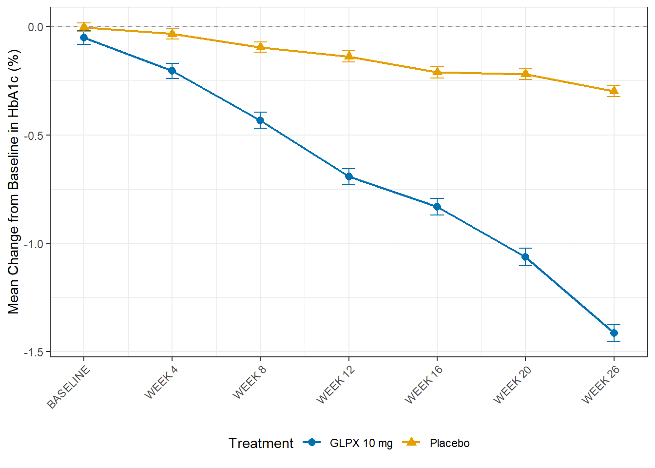
Run the chunk. GLPX 10 mg separates from placebo almost immediately and the gap widens every visit, reaching -1.41 against -0.30 by week 26: the same treatment effect ADLB reported as a table of numbers, now as the chart a clinical study report would actually publish.
Colour and shape both carry treatment arm, using R/palette.R’s arm_colours: the same Okabe-Ito palette convention established for the very first figure in The GLPX-1 Trial, carried through every figure in this course without exception. A colourblind reader loses nothing; identity never rests on colour alone.
Error bars are standard error at each visit, computed from the same n and CHG values in the table above them, another number you can trace back, this time to a formula rather than a single row, but no less checkable for it.
teae_n <- adae |> filter(TRTEMFL == "Y") |> distinct(USUBJID) |> nrow()
sev_n  <- adae |> filter(TRTEMFL == "Y", AOCCIFL == "Y") |> nrow()

tibble(
  check = c("every table's denominator stated and sourced from ADSL",
            "AE table has exactly one row per subject with a TEAE",
            "severity rows sum to the same subject count as the AE table",
            "figure's SCREENING row excluded (partial data, would mislead)",
            "figure uses the course's established arm_colours palette"),
  pass = c(
    TRUE,   # by construction: every *_tbl above joins n_arm / n_saf first
    teae_n == nrow(adae |> filter(TRTEMFL == "Y") |> distinct(USUBJID, TRT01A)),
    sev_n == teae_n,
    !("SCREENING" %in% plot_data$AVISIT),
    all(arm_colours %in% okabe_ito)
  )
)
# A tibble: 5 × 2
check pass
<chr> <lgl>
1 every table's denominator stated and sourced from ADSL TRUE
2 AE table has exactly one row per subject with a TEAE TRUE
3 severity rows sum to the same subject count as the AE table TRUE
4 figure's SCREENING row excluded (partial data, would mislead) TRUE
5 figure uses the course's established arm_colours palette TRUE With this session, every dataset built in Parts 2 and 3 has been read back out into a document a reviewer could actually be handed: a demographics table, a safety table and its listing, and the efficacy figure the entire baseline argument existed to produce.
Estimated time: ~10 minutes (reading)
Computing a denominator from the dataset being summarised. The single most consequential error in this session, exactly as it was in ADAE. A table’s N comes from ADSL, stated before anything else is computed.
Counting events instead of subjects. A TEAE table answers “how many subjects,” not “how many events.” Skip the de-duplication (distinct() or an occurrence flag) and a subject with several events inflates the count and can push a percentage past 100%.
Filtering severity on the wrong flag. TRTEMFL == "Y" alone lets a subject appear in more than one severity row. AOCCIFL == "Y" restricts to each subject’s single worst occurrence, so the severity rows sum to the same total as the any-TEAE table.
Treating a listing as a small table. A listing does not de-duplicate, does not aggregate, and does not have a denominator in the way a table does. Running count() on a listing’s source and reporting that instead defeats its purpose, which is to show every instance in full for individual review.
Plotting a visit label instead of asking what baseline actually is. The BASELINE-visit mean in this session’s figure is not exactly zero, and that is correct. A figure that assumed it should be, and “corrected” it, would be hiding the exact mechanism ADLB argued for at length: baseline is a dosing-date decision, not a visit-label one.
Reaching for a CDISC citation that does not exist. There is no CDISC standard for what a table, listing or figure must look like. Citing one anyway (inventing a section number because every other session had one) is worse than citing nothing.
“This isn’t a real TLF because it’s not in gt/flextable.” The numbers, the denominators and the traceability are the real content of a TLF. Typesetting is a formatting layer applied on top of exactly these derived values, in a later step this course does not build.
“CDISC must specify the table layout somewhere; I just haven’t found it.” It does not, and OCCDS says so implicitly by reaching outside CDISC to ICH E3 for the one display convention it discusses. The standardisation stops at the data.
“A listing is just a table without the aggregation.” A listing is built for a different reading pattern, row by row, in full, by someone deciding whether to act on any single record, not merely a table with one fewer group_by().
Practice: Exercise 7: Tables, Listings and Figures.
N before it states any percentage, and that N always comes from ADSL. Why not compute it from whichever dataset the table is summarising?AOCCIFL == "Y", not TRTEMFL == "Y" alone. What would go wrong with the severity row totals if you filtered on TRTEMFL alone?n = 1 in both a table count and the listing. In what sense are these two views of the same event still doing different jobs?SCREENING and shows a BASELINE mean of -0.051 rather than 0. Explain both decisions from what you already know about ABLFL from ADLB.TRTEMFL alone and counting every severity a subject ever reached would let that subject appear in two rows of the table, so the three severity counts would sum to more than the number of subjects with any TEAE. AOCCIFL restricts to exactly one row, the subject’s single worst occurrence, so the rows sum correctly.SCREENING is excluded because CHG is only defined there for subjects whose own baseline happens to be the screening record, plotting it would show a partial, misleadingly flat data point built from a different subset of subjects than every later visit. The non-zero BASELINE mean follows from the same fact from the other direction: 244 of 400 subjects have ABLFL == "Y" at SCREENING, not BASELINE, because their scheduled BASELINE visit landed after first dose (ADLB). For those subjects the row labelled BASELINE is a small post-baseline measurement, not their baseline, so it carries a small non-zero CHG that pulls the arm mean away from exactly zero.