Example 2: Reading the Trial’s Story in the Raw Data
20 min
Worked example
What Can Go Wrong
10 min
Reading
Comprehension Check
10 min
Self-test
For self-paced study this splits naturally into two sittings: Background and Example 1 first, the rest later. Every later session uses this trial, so time spent here repays itself for the remainder of the course.
TipHow to Use the Code in This Session
Every code chunk below is written so you can copy it into your R console (or an R script) and run it yourself, in the order shown. Where you see a “Run It Yourself” box, stop and run the code above it before reading the explanation that follows.
As in Why Standards, run R from the project root, so that data/raw/dm_raw.csv means what it says.
3.1 When Do You Use This?
Tip
A data transfer arrives from the lab vendor and someone asks you: “is it complete?” Or you are handed a study’s raw data on your first day and need to know what you are looking at before the Monday meeting. Or a listing you produced has 181 subjects at the final visit and a reviewer wants to know where the other 219 went.
None of these questions is answerable from the data alone. They are answerable from the data plus the design. This session asks: what must you know about a trial before you can judge whether its data is complete?
This session builds directly on Why Standards, which showed that raw data cannot be read without trial-specific knowledge. Here you acquire that knowledge for the one trial this course uses throughout.
3.2 Learning Objectives
After completing this session you will be able to:
Describe the design of GLPX-1 (population, arms, duration, endpoints, visit schedule) from its summary
Predict the expected shape of every raw file from the design alone, before opening it
Account for every gap between prediction and reality, and say which gaps are the trial’s history and which are data problems
Name the two organisations that produced the raw files and the conventions each brought with it
Read the emerging treatment effect out of raw lab data, and explain why that number is not yet an analysis
3.3 Background: The Protocol Is a Prediction Machine
Estimated time: ~20 minutes (reading)
ImportantThe one thing to remember
The design tells you what the data must look like before you open a single file. Every gap between that prediction and the files is a piece of the trial’s real history, and your job is to account for all of it.
A clinical trial is one of the most pre-specified activities in science. Who can enrol, what they receive, when they are seen, what is measured at each visit: all of it is written down before the first subject walks in. That has a consequence which this session exploits: you can compute the shape of the data from the design. If 400 subjects each attend 8 visits and give 4 lab tests per visit, the lab file has 12,800 rows. Before you open it.
Reality then edits that prediction. Subjects leave early. Someone is enrolled twice. A vendor transmits a record twice. Each edit leaves an arithmetic trace, and the discipline of this session (predict first, then look, then account for the difference) is the single most useful habit you can bring to a new study. It converts “here are five mysterious files” into “here are two discrepancies I need to explain.”
3.3.1 The trial
GLPX-1 is a simulated Phase III, randomised, double-blind, placebo-controlled trial of GLPX, a fictional GLP-1-class agent, in adults with type 2 diabetes.
Design element
GLPX-1
Phase
III
Population
Adults with type 2 diabetes
Arms
GLPX 10 mg once weekly vs placebo, randomised 1:1
Blinding
Double-blind
Treatment duration
26 weeks
Primary endpoint
Change in HbA1c from baseline to week 26 (central lab)
Key secondary endpoint
Percent change in body weight (vital signs)
Planned enrolment
400 subjects across 12 sites
Every value in the data is synthetic, generated by R/simulate_trial.R with a fixed seed. No real patient information exists anywhere in this course. The structure, however, is deliberately realistic. This is what a study team receives.
3.3.2 The visit schedule
Subjects are screened two weeks before dosing, then seen at baseline and every four weeks (with a final gap of six) until week 26:
Visit
Nominal study day
SCREENING
−14
BASELINE
1
WEEK 4
29
WEEK 8
57
WEEK 12
85
WEEK 16
113
WEEK 20
141
WEEK 26
182
“Nominal” is doing real work in that column heading: day 29 is when the week-4 visit is supposed to happen. Actual visit dates scatter around the nominal day, because subjects have lives. You will see this in Example 2.
3.3.3 Two sources, two sets of habits
The five raw files come from two different organisations, and everything about their formatting reflects that:
File
Source
One row is…
dm_raw.csv
EDC (site-entered)
one subject’s demographics and randomisation
ae_raw.csv
EDC (site-entered)
one adverse event
vs_raw.csv
EDC (site-entered)
one vital-sign measurement at one visit
ex_raw.csv
EDC (site-entered)
one subject’s dosing record
lb_raw.csv
Central laboratory vendor
one lab result at one visit
The EDC (electronic data capture) system is where site staff type what happens: demographics, adverse events, vital signs, dosing. The central lab is a separate company that receives blood samples and returns results in its own file, with its own column conventions. You saw in Why Standards that it lower-cases its column names and carries its own copy of each subject’s sex. Four lab tests are measured at every visit: HbA1c, glucose, ALT and creatinine.
This split matters beyond formatting. The trial’s primary endpoint lives in the vendor’s file, not in the EDC. When you standardise this trial’s data in Part 2, the lab file’s conventions (not the EDC’s) will be the ones you spend the most time reconciling.
NoteWhy measure the primary endpoint centrally?
Twelve sites could each measure HbA1c locally. The trial instead ships every sample to one laboratory. The reason is comparability: a single assay, calibrated once, produces values that can be compared across sites and visits without asking whether site 104’s analyser runs high. The cost is operational, samples travel, results arrive on the vendor’s schedule in the vendor’s format, and the study team must reconcile a file it does not control. That trade (scientific consistency for logistical dependence) is typical of how trials allocate measurement, and it is why “which source produced this number?” is always worth asking.
3.4 Example 1: Predict the Data Before Opening It
Estimated time: ~20 minutes (worked example)
The design table above is enough to predict four of the five file shapes. Do the arithmetic first, honestly, before looking:
Run the chunk above. Two files match the prediction and two miss by hundreds: dm_raw is +1, ex_raw is exactly right, lb_raw is −411, and vs_raw is −412.
Before reading on, try to explain the pattern yourself. Why would the two visit-driven files be short by almost exactly the same amount? And why is dm_raw: the simplest file in the study: the one with too many rows?
NoteReading the Output Line by Line
Row
What the gap means
dm_raw +1
401 rows for 400 subjects. You met this in Why Standards: one subject enrolled at two sites. A data problem, resolved in The DM Domain.
ex_raw 0
One dosing record per randomised subject, and every subject was dosed. The tidiest file in the trial.
lb_raw −411
Hundreds of lab results that “should” exist don’t. This is not a data problem. It is the trial’s history, and the next chunk accounts for it.
vs_raw −412
The same history, seen by the other measuring instrument, and one row more missing than the lab file. That difference of exactly 1 matters.
3.4.1 Accounting for every missing row
The prediction assumed every subject attends every visit. Check that assumption:
lb <- raw[["lb_raw.csv"]]visits_per_subject <- lb |>distinct(subjid, visit) |>count(subjid, name ="visits")visits_per_subject |>count(visits, name ="subjects")
Not everyone reached week 26: 367 subjects completed all 8 visits, and 33 left early, after as few as 3 visits. Trials call this early discontinuation, and at roughly 8% of subjects over 26 weeks it is unremarkable. Now make the corrected prediction:
The 400 subjects actually attended 3,097 subject-visits between them. Four lab tests per attended visit predicts 3,097 × 4 = 12,388 rows; the file has 12,389: one row too many. Four vitals per attended visit plus 400 height measurements predicts 12,788; the file has exactly 12,788.
So after accounting for dropout, vs_raw reconciles to the row and lb_raw carries exactly one surplus record. You do not yet know which record it is or why it is there, that is a job for Events and Findings, but you know it exists, you found it with arithmetic rather than by staring at 12,000 rows, and you know the vendor file is the one carrying it.
This is the method in miniature: dropout explained 411 missing rows and 412 missing rows in one stroke, and what refused to reconcile (one single row) is precisely the thing worth investigating.
And ae_raw? Its row count was never predictable. Adverse events are not on the visit schedule; they happen when they happen, to some subjects and not others. The file has 389 rows covering 262 subjects, 138 subjects have no rows at all, and nothing about the design could have told you those numbers in advance. Scheduled data can be reconciled against the protocol; event data cannot. That distinction (findings on a schedule versus events as they occur) becomes a load-bearing idea in SDTM Concepts.
3.5 Example 2: Reading the Trial’s Story in the Raw Data
Estimated time: ~20 minutes (worked example)
Shape is only the first layer. The values tell the trial’s story: who was randomised where and when, who stayed, and what the drug did.
# A tibble: 2 × 2
  ARM            n
  <chr>      <int>
1 GLPX 10 mg   200
2 Placebo      200
range(dm$RANDDT)
[1] "2024-01-16" "2024-07-13"
Exactly 200 per arm, but note what the code had to do to show it. count(ARM) on the raw file gives 200 and 201, because of the duplicated subject; only after distinct(SUBJID, ARM) does the true 1:1 randomisation appear. The first subject was randomised in mid-January 2024 and the last in mid-July: enrolment took about six months, which means the trial’s calendar spans well over a year and no two subjects are at the same visit on the same date. Keep that in mind whenever you are tempted to think of “week 26” as a point in time. It is a point in each subject’s time.
3.5.2 The primary endpoint, emerging
The primary endpoint is the change in HbA1c from baseline to week 26. The raw lab file already contains its raw material. Look at the group means by visit, remembering from Why Standards that the lab file names things its own way, and noting that because we read everything as text, result must be converted before it can be averaged:
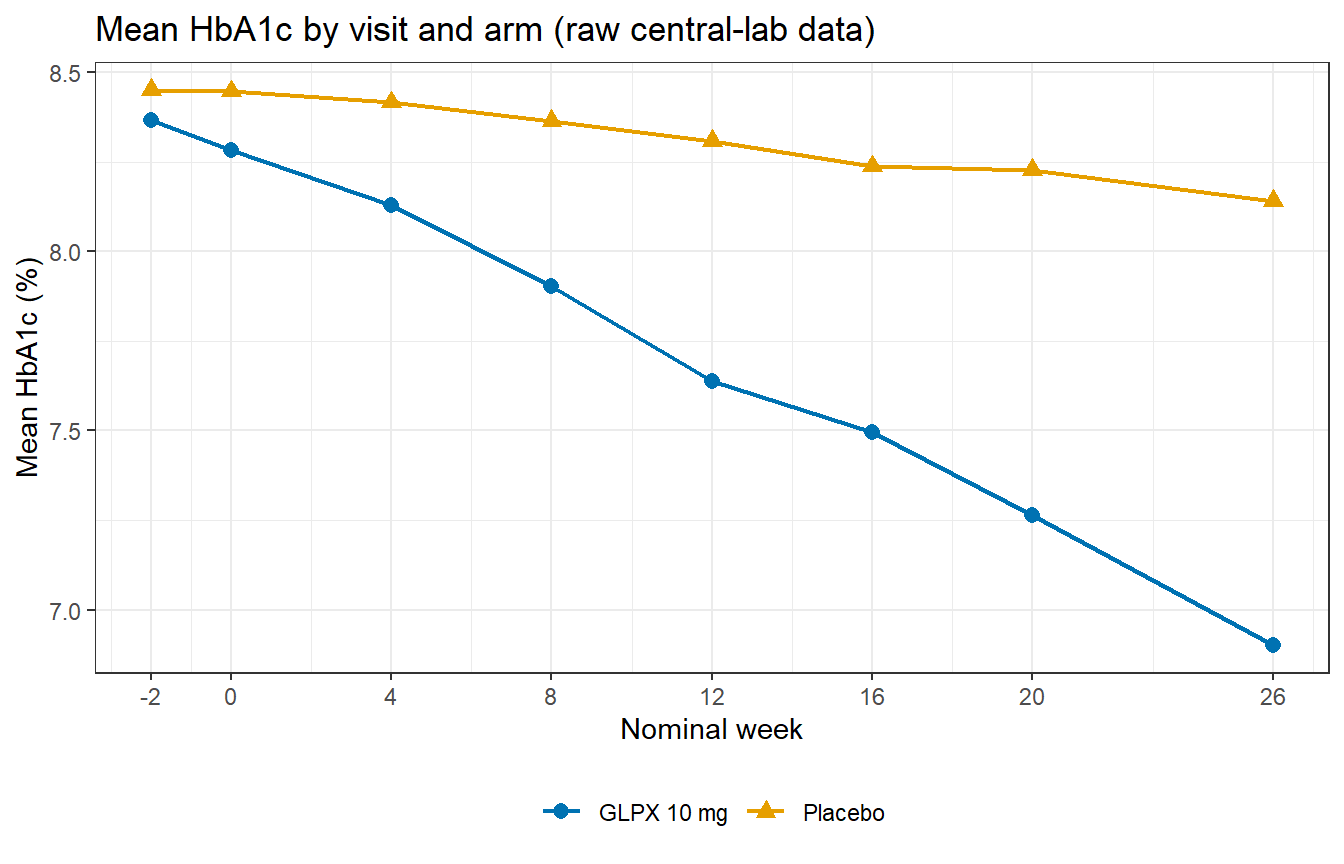
Run both chunks. In the table, both arms should start indistinguishable (screening means 8.37 vs 8.45) and then separate: by week 26 the GLPX arm mean is 6.90% against placebo’s 8.14%. The plot shows the same story as two diverging lines.
Now look at the n column and answer honestly: what is quietly happening to the denominators as the weeks pass?
NoteReading the Output Line by Line
What you see
What it means
Screening means 8.37 / 8.45
The arms start balanced. This is what successful randomisation looks like, the same baseline comparability you would check in any trial.
GLPX falls to 6.90, placebo drifts to 8.14
A treatment effect of roughly 1.2 percentage points is emerging, alongside a small placebo response. For a 26-week glucose-lowering trial, an entirely plausible picture.
n falls from 200/201 to 181/186
The denominators shrink as subjects discontinue. Each week’s mean describes the subjects still present that week: a subtly different population at every visit.
Placebo n is 201 at screening
The duplicated subject again, still inflating any count that forgets about them.
The n column is the important one, and it is why this plot is a description, not an analysis. If subjects who leave early differ from those who stay (sicker, less tolerant of side effects) then comparing week-26 means among survivors quietly changes the question being asked. Deciding what “change from baseline to week 26” means when some week-26 values are missing is a genuine analytical decision, made in advance and documented, and building the datasets that carry such decisions is exactly what Part 3 of this course is about. For now, the honest statement is: the raw data shows the arms separating. How much, in whom, under what handling of the missing, that is what the rest of the pipeline exists to answer.
3.5.3 Nominal versus actual dates
One last look, this time at a single subject. The schedule says the week-4 blood draw happens on study day 29. Did it?
Subject 101-026 attended every visit, but almost never on the nominal day: the draws land a day or two either side of schedule. Nothing is wrong here, visit windows exist precisely because humans cannot be scheduled to the day. But it means “week 4” is a label, not a date, and any analysis that needs elapsed time must compute it from actual dates, per subject. The + 1 in the study-day arithmetic is itself a convention (here, counting the randomisation day itself as day 1) and the exact rule (including how days before the reference date are numbered) is one of the things a standard pins down so that every programmer computes it identically. You will meet study days formally, and precisely, in SDTM Concepts.
3.6 What Can Go Wrong
Estimated time: ~10 minutes (reading)
Treating the data as the trial
The files record what was captured, not everything that happened. ae_raw holds the adverse events that sites entered; a symptom a subject never mentioned is nowhere. The 33 early discontinuations appear only as absent rows: the data does not say why any of them left. Statements like “there were 389 adverse events” should always be heard as “389 were recorded.”
Assuming the schedule describes the data
Every prediction in Example 1 that used “8 visits” was wrong until corrected for dropout. Any code that hard-codes the visit count (a loop over 8 visits, a join against a complete subject-visit grid) will silently invent rows for visits that never happened. Build the attended-visit set from the data, then reconcile it against the schedule; never the other way round.
Averaging over shrinking denominators without noticing
The week-26 means in Example 2 describe 367 of 400 subjects. Nothing in mean(result) warns you. Whenever a summary spans visits, put n beside it, as a habit, not a flourish. A mean whose denominator you have not checked is a number you do not yet understand.
Trusting the tidy file more
ex_raw reconciled perfectly and lb_raw is machine-generated, yet the lab file carries the surplus record and (as you saw in Why Standards) a sex value that contradicts the EDC. Tidiness measures formatting discipline, not truth.
WarningCommon misinterpretations
“400 subjects means 400 rows” Only in subject-level files, and even there only after the one-row-per-subject rule is actually enforced - dm_raw has 401. Every file’s row count follows from its granularity: per subject, per event, or per subject-visit-measurement.
“The gap between predicted and actual rows means the transfer is broken” Most of the gap (411 of 412 rows here) was the trial’s legitimate history, dropout. The skill is not “expect the prediction to hold”; it is “account for every unit of the difference, and investigate the remainder.”
“The treatment effect is visible in the raw data, so the analysis is basically done” The raw means answer “what did surviving subjects average, per visit?” The trial’s question: the effect of treatment on change from baseline, in everyone randomised, with missing data handled as pre-specified, is a different and harder question. The distance between those two questions is Parts 2 through 4 of this course.
“Screening values and baseline values are the same thing” GLPX-1 measures HbA1c at both, two weeks apart, and the means differ (8.37 at screening, 8.28 at baseline for GLPX). Which one is “baseline” for analysis is a definition, not an observation, and defining it is a decision you will make explicitly in ADSL.
3.7 Exercises
This session has no exercise set: its method is the exercise. If you want to practise it now: re-derive vs_raw’s row count from total_visits without looking back at Example 1, and confirm your arithmetic against nrow(). Then try the same style of reconciliation on ae_raw and articulate, in one sentence, why it cannot be done.
The first full exercise set arrives with The DM Domain.
3.8 Comprehension Check
Estimated time: ~10 minutes
Why did ex_raw match its predicted row count exactly while lb_raw fell 411 rows short? Both cover the same 400 subjects.
count(ARM) on dm_raw gives 200 and 201. Is the trial’s randomisation unbalanced? What is the correct check?
After correcting for attended visits, vs_raw reconciled exactly and lb_raw had one extra row. Why was the surplus findable without inspecting a single record?
Where does the primary endpoint’s raw data live, which organisation produced it, and why does that arrangement exist?
A colleague reports “mean HbA1c at week 26 was 6.90% on GLPX” and moves on. What should you ask before letting that number into a report?
NoteAnswers
Their granularities respond differently to reality. ex_raw has one row per subject, and every randomised subject has a dosing record, so dropout does not remove rows. It only shortens the dosing period recorded in EXENDT. lb_raw has one row per subject per attended visit per test, so every visit a subject missed removes four rows. Same subjects, different units of observation.
No. It is exactly 200 per arm. The raw count is inflated by the subject with two DM rows, who happens to sit in the placebo arm. The correct check counts subjects, not rows: distinct(SUBJID, ARM) |> count(ARM). The general habit: know a file’s granularity before trusting any count over it.
Because both findings files are driven by the same attended visits. Once total_visits was known, each file had an exact expected count (× 4 tests; × 4 vitals + 400 heights). vs_raw landing exactly on its prediction confirmed the accounting was right, which made lb_raw’s +1 a real anomaly rather than a rounding error in the method. Arithmetic isolated one suspect row out of 12,389 without reading any of them.
HbA1c is measured by the central laboratory and arrives in lb_raw.csv, the vendor’s file, not the EDC. One lab, one assay, one calibration makes values comparable across 12 sites and 8 visits. The price is a file whose conventions the study team does not control, which is where much of Part 2’s reconciliation work comes from.
At minimum: what was the denominator? (181 of 200 randomised: the survivors), compared to what? (placebo also fell, to 8.14, so the drug’s effect is the difference, not the drop), and change from which baseline, handled how for the missing? None of these has a wrong answer in the raw data; they have undefined answers until the analysis datasets define them. That is why the pipeline continues past the raw files.